

Message page
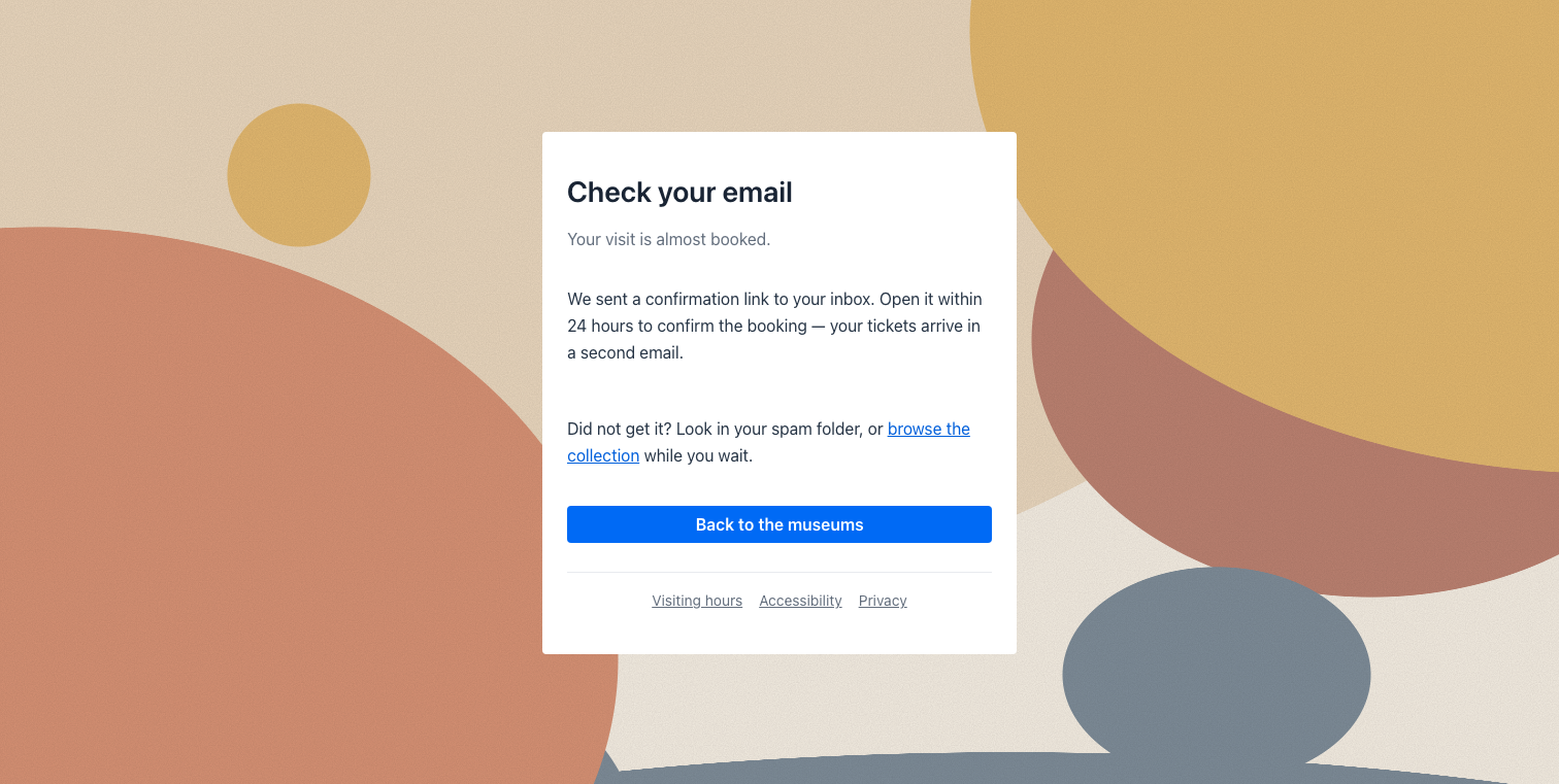
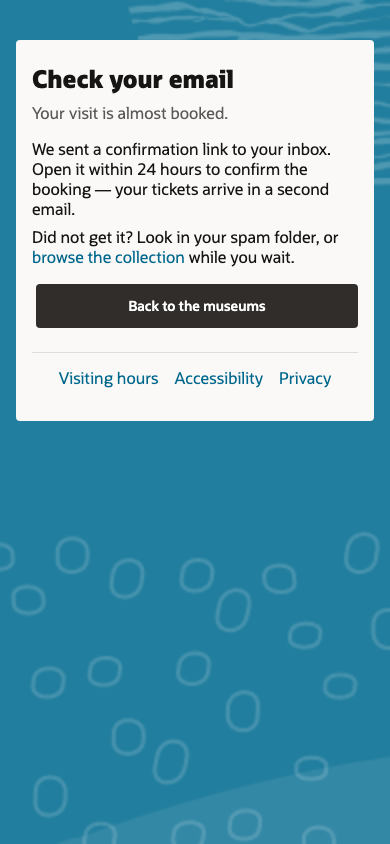
A message page is one card over an illustrated background, with nothing else on screen — no header, no menu. It is the page for a moment that stands on its own:
- a confirmation (“Your request was sent”),
- “Check your email”,
- an error or “This link has expired”,
- a signed-out page,
- a simple entry page, such as the first step of a sign-in.
The card holds a heading, a short body (text, links, fields, buttons), its actions and, at its foot, a row of small links (terms, privacy, help).
In YAML
Section titled “In YAML”A type: Form fills it with template: {type: MessagePage}:
| Part | Where it comes from |
|---|---|
| The card’s heading (the page’s h1) | the form’s title |
| The lines around it | the form’s overline (above) and subtitle (below) |
| The card’s body | the form’s content — any components: text, Markdown with inline links, FormFields, Anchors, buttons |
| The card’s actions | the form’s toolbar (a single primary action spans the card) |
| The links at the card’s foot | the template’s footer slot |
| The background | the template’s background (a tone: ocean, pine, lilac, teal, rose, pebble, slate, plum, sienna; Spectra’s dark-<tone> is accepted too; none = the default illustration) or image (your own background image’s URL, which wins) |
| The card’s width | the template’s width (a CSS length such as 32rem); 460px when absent |
type: Formtitle: Check your emailsubtitle: Your visit is almost booked.toolbar: - {type: Button, label: Back to the museums, buttonStyle: primary, actionable: {type: RouteLink, route: welcome}}template: type: MessagePage footer: - {type: Anchor, text: Visiting hours, url: /museums} - {type: Anchor, text: Privacy, url: /privacy}content: - type: Markdown markdown: >- We sent a confirmation link to your inbox. Open it within 24 hours to confirm the booking. - type: Markdown markdown: Did not get it? Look in your spam folder, or [browse the collection](/artworks) while you wait.A sign-in step is the same template holding a field:
type: Formtitle: Sign in to Museumstoolbar: - {type: Button, label: Next, buttonStyle: primary, actionable: {type: RouteLink, route: visit-booked}}template: type: MessagePage background: slate footer: - {type: Anchor, text: Terms of use, url: /terms} - {type: Anchor, text: Privacy, url: /privacy}content: - {type: FormField, id: username, label: Username or email, required: true} - {type: Anchor, text: "Forgot username?", url: /forgot}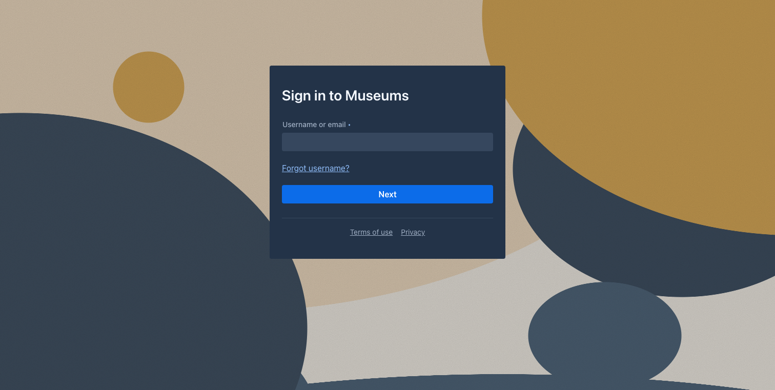
How it behaves
Section titled “How it behaves”- The page owns the viewport. A message page can be any route of any app: while it is on
screen, the app shell puts its header, menu, drawer and floating buttons away, and they come back
on the next page. Shown without a shell, the page is the document’s
mainlandmark. - The card sits near the top, not vertically centred, so a long body never pushes the heading off screen. On a phone it takes the width, with 16px gutters.
- The background is full-bleed. Each renderer draws it with its design system’s own imagery
(see Renderers below); on Vaadin the default illustration is Mateu’s own — organic shapes in
ochre, terracotta, sand and slate with a light grain — drawn in CSS. It is anchored at the top-left corner on a 2560px-wide canvas, so
its shapes keep their size whatever the window. A
backgroundtone tints its two dominant shapes;image:replaces it (only a plain URL is accepted — anything that could escape the CSS is dropped). - Accessibility. The title is the page’s only
h1; the first Tab reaches the skip link, then the card’s links, fields and buttons in reading order. The card is the theme’s surface with its text tokens, so it stays readable in dark mode.
Renderers
Section titled “Renderers”- Vaadin draws it with Lumo tokens: the card on
--lumo-base-color, the small border radius, no shadow, the heading in--lumo-font-size-xxl. In dark mode the illustration deepens with the theme. - Redwood — here Redwood’s design guidance decides. Spectra ships no component for this pattern
(Oracle’s own sign-in and confirmation pages are applications of their own) and the Redwood guide
has no message or sign-in page template, so the page is composed from Redwood’s own pieces, with
none of Mateu’s illustration:
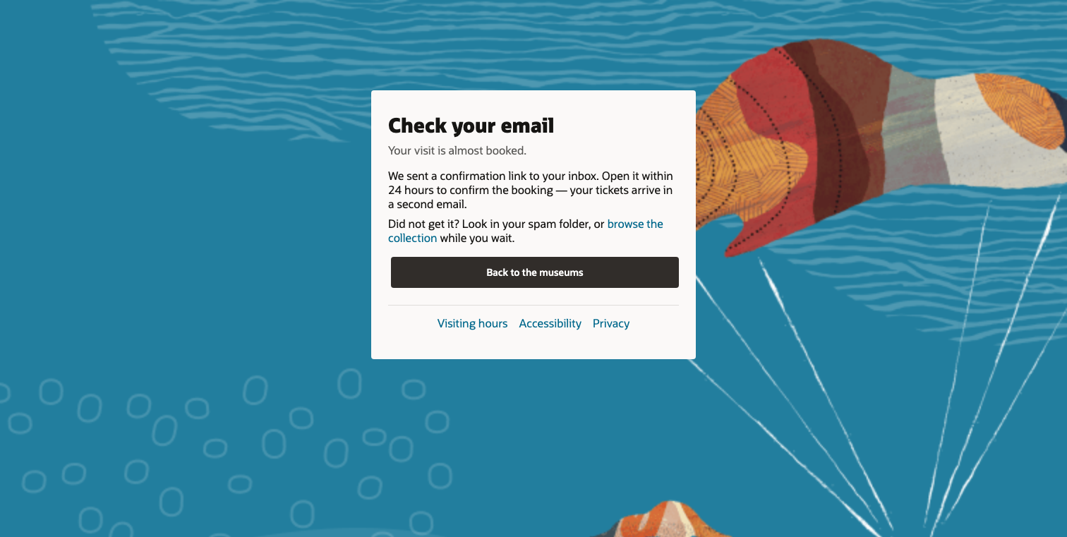
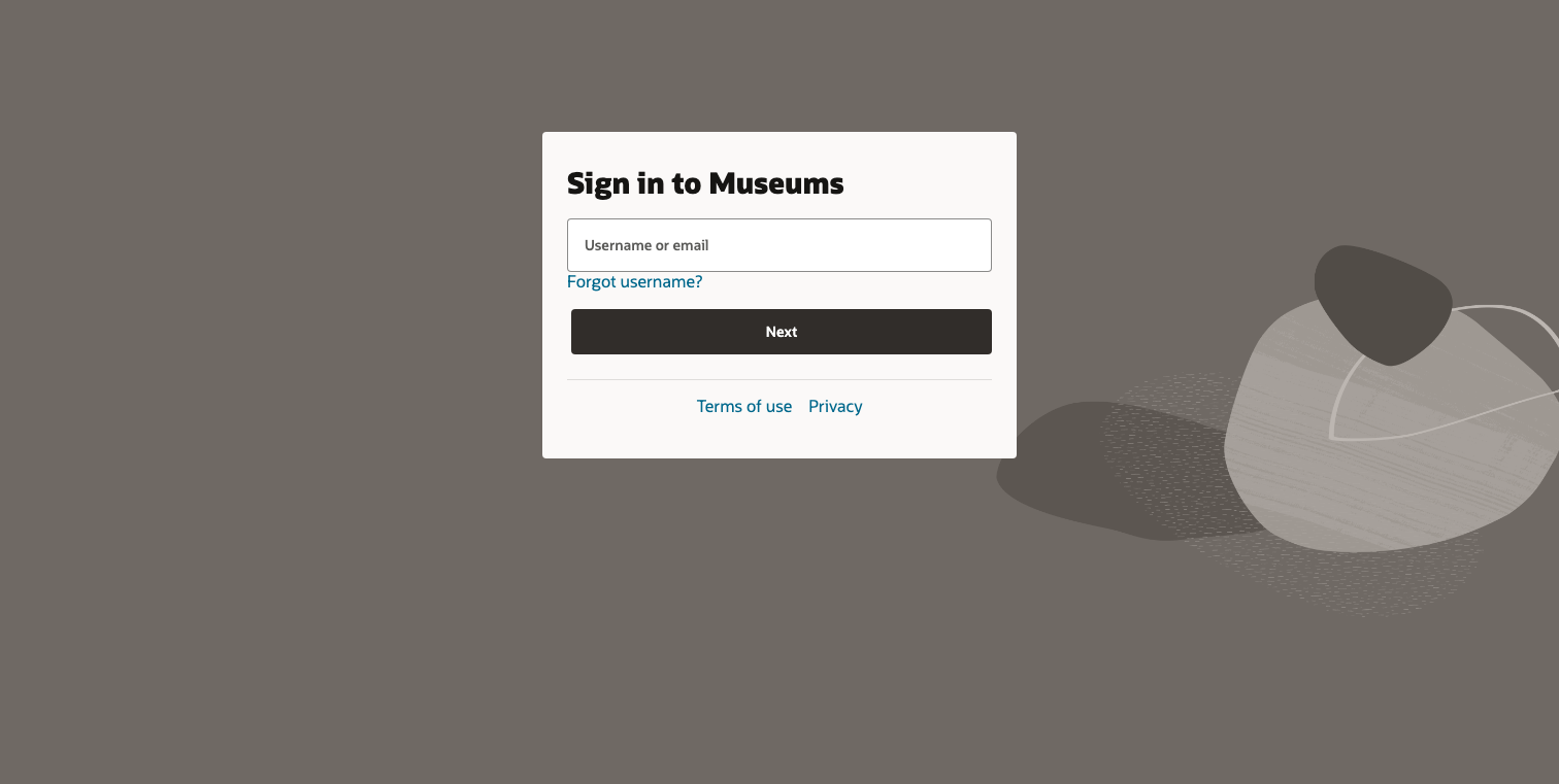
- The background is Redwood’s imagery, used the way the guide uses it on the welcome banner: a
dark tone of the Redwood palette (the same
ocean…siennavocabulary asbackground, with the colours Spectra gives its banner) under the gallery illustration and its texture. A tone the gallery has no illustration for gets Spectra’s own themed image, since the guide treats the banner’s image as required. With no tone declared, the page takes a stable look of its own, as a welcome page does. The images come from Oracle’s CDN, or your organisation’s mirror (mateu.oracle-cdn.url); nothing is bundled. - The card is Redwood’s Neutral 10 surface, the light off-white of Redwood’s own sign-in card rather than pure white. It uses Redwood’s small border radius, no shadow, Oracle Sans, and Redwood buttons and links.
- The global header, subheader, navigator and Ask button are put away while the page is on screen.
- The background is Redwood’s imagery, used the way the guide uses it on the welcome banner: a
dark tone of the Redwood palette (the same
- React Native and IntelliJ draw the components the template is laid out as — a card with the heading, the body, the actions and the footer links — inside their own window; the illustration and the chrome hiding are web-only.
- It works served by the Java, .NET and Python backends, pre-rendered into a static
bundle and expanded in the browser from a
specsOnlybundle.
On the wire
Section titled “On the wire”The server lays the template out as ordinary components, each in a container whose id names its
part: message-page (the background, with the class mateu-message-page and, with a tone,
mateu-message-page--<tone>) holding the message-card card, whose content is message-overline,
message-title (a Text h1), message-subtitle, message-body, message-actions and
message-footer. The own image and the card’s width travel as the custom properties
--mateu-message-page-image and --mateu-message-card-width on message-page; the form carries
template: {type: MessagePage} and no header or toolbar of its own.
MessagePage is experimental (@Experimental("page templates (3.0 GA)")). Demo:
demo/demo-museum — visit-booked.yaml and sign-in.yaml (Operations › Members’ sign-in).