

Section Annotations
These annotations control the structural slots of a page — named form sections, the header area, the footer area, and the toolbar strip. They let you organise fields and actions without writing any layout code.
@Section
Section titled “@Section”Target: FIELD, METHOD
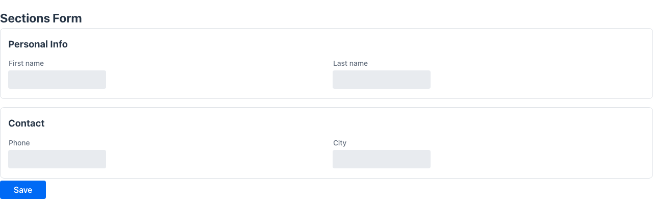
Groups the annotated field and all subsequent fields under a named section heading within a form. A new section begins at each @Section annotation and ends at the next one. Each section can have its own column count, giving you fine-grained layout control within a single page.
@Retention(RetentionPolicy.RUNTIME)@Target({ElementType.FIELD, ElementType.METHOD})public @interface Section { String value(); // section title (required) int columns() default 0; // 0 = inherit the form's column count String style() default ""; String zone() default "";}Attributes
Section titled “Attributes”| Attribute | Type | Default | Description |
|---|---|---|---|
value | String | — | Section heading label, displayed as a visible separator (required) |
columns | int | 0 | Number of form columns inside this section. 0 (unset) inherits the form-level count (@FormLayout(columns = …) on the class, else 2). Any explicit value ≥ 1 wins — including 1 to force single-column stacking on a form whose other sections stay multi-column |
style | String | "" | Inline CSS applied to the section container |
zone | String | "" | Name of the layout zone this section belongs to. Only meaningful when the enclosing class is annotated with @Zones; sections sharing a zone name are stacked inside that zone’s column |
Example
Section titled “Example”public class CustomerForm { @Section("Personal data") String firstName; String lastName; LocalDate birthDate;
@Section(value = "Contact", columns = 1) String email; String phone; String address;}The Personal data section inherits the form’s column count (two by default). The Contact section forces single-column stacking with an explicit columns = 1. Fields belong to whichever section was declared most recently above them.
@Header
Section titled “@Header”Target: FIELD
Marks a field to be rendered in the page header area, above the main form content. Use this for prominent display components such as avatars, banners, or status summaries.
No attributes.
@Retention(RetentionPolicy.RUNTIME)@Target({ElementType.FIELD})public @interface Header {}Example
Section titled “Example”public class UserProfilePage { @Header Component profileBanner;
String username; String email;}@Footer
Section titled “@Footer”Target: FIELD
Marks a field to be rendered in the page footer area, below the main form content. Suitable for summary statistics, legal notices, or secondary action areas.
No attributes.
@Retention(RetentionPolicy.RUNTIME)@Target({ElementType.FIELD})public @interface Footer {}Example
Section titled “Example”public class ReportPage { List<ReportRow> rows;
@Footer Component totalsSummary;}@Toolbar
Section titled “@Toolbar”Target: FIELD, METHOD
Places the annotated field or method in the view toolbar, the strip displayed at the top of the page. Methods annotated with @Toolbar become toolbar buttons; fields become toolbar components.
Combine @Toolbar with @Action to add behaviour such as form validation or confirmation dialogs before the method runs.
@Retention(RetentionPolicy.RUNTIME)@Target({ElementType.FIELD, ElementType.METHOD})public @interface Toolbar { ButtonStyle buttonStyle() default ButtonStyle.none; ButtonColor buttonColor() default ButtonColor.none; ButtonSize buttonSize() default ButtonSize.none; String group() default ""; boolean separatorBefore() default false; int order() default 0;}Attributes
Section titled “Attributes”| Attribute | Type | Default | Description |
|---|---|---|---|
buttonStyle | ButtonStyle | none | Visual style: primary, secondary, tertiary, tertiaryInline |
buttonColor | ButtonColor | none | Colour theme: success, error, warning, contrast, normal |
buttonSize | ButtonSize | none | Size: small, normal, large |
group | String | "" | Group name — methods sharing the same group collapse into a single dropdown button |
separatorBefore | boolean | false | Renders a visual divider before this button |
order | int | 0 | Explicit position in the toolbar (lower = first). Declare order explicitly because Java reflection does not preserve declaration order |
Example — toolbar buttons on a form
Section titled “Example — toolbar buttons on a form”@UI("/all-types")@Title("All Types Form")public class AllTypesForm {
@NotEmpty String text; int count; boolean active;
@Button public Message save() { return new Message("Saved: " + text); }
@Toolbar public Message refresh() { return new Message("Refreshed!"); }}Example — toolbar with validation
Section titled “Example — toolbar with validation”From the CreateReleaseForm demo:
@Toolbar@Action(validationRequired = true)Object create() { var businessKey = UUID.randomUUID().toString(); return URI.create("/workflow/processes/" + businessKey + "?returnTo=/controlPlane/releases");}Example — record with toolbar method
Section titled “Example — record with toolbar method”The Product record in the admin-panel demo places a doNothing method in the detail toolbar:
record Product(    @NotEmpty @EditableOnlyWhenCreating String id,    @NotEmpty String name,    @HiddenInList String description,    boolean certified,    ProductStatus status,    ColumnActionGroup action,    @Colspan(2) List<ProductComponent> components) implements Identifiable {
    @Toolbar    public void doNothing() {        log.info("do nothing");    }}
Combining section annotations
Section titled “Combining section annotations”The annotations compose naturally. The following OrderForm example shows sections with different column counts, toolbar actions for save and cancel, and a footer summary component:
public class OrderForm {
    @Section(value = "Customer", columns = 2)    String customerId;    String customerName;
    @Section(value = "Items", columns = 1)    List<OrderLine> lines;
    @Section(value = "Totals", columns = 2)    double subtotal;    double vatAmount;    double total;
    @Footer    Component paymentTerms;
    @Toolbar    void save() { /* persist the order */ }
@Toolbar void cancel() { /* discard and navigate back */ }}- The
Customersection renderscustomerIdandcustomerNameside-by-side in two columns. - The
Itemssection stretcheslinesacross the full width. - The
Totalssection returns to a two-column layout for the numeric fields. paymentTermsappears in the footer slot below all sections.saveandcancelare rendered as buttons in the toolbar at the top of the page.