

Action Annotations
These annotations add interactive buttons and actions to pages, forms, and listings. They control where buttons appear, how they behave before executing (validation, confirmation), and what happens after they run.
@Action
Section titled “@Action”Attaches a configurable action to a method. Repeatable via the @Actions container, so multiple @Action entries can stack on the same method.
@Repeatable(Actions.class)@Retention(RetentionPolicy.RUNTIME)public @interface Action { String id() default ""; boolean background() default false; boolean validationRequired() default false; boolean confirmationRequired() default false; boolean rowsSelectedRequired() default false; String confirmationTitle() default ""; String confirmationMessage() default ""; String confirmationText() default ""; String confirmationDenialText() default ""; String modalStyle() default ""; String modalTitle() default ""; String customEventName() default ""; String customEventDetail() default ""; String href() default ""; String js() default ""; boolean sse() default false; String fieldsToValidate() default ""; boolean bubble() default false;}Attributes
Section titled “Attributes”| Attribute | Type | Default | Description |
|---|---|---|---|
id | String | "" | Action ID. Auto-inferred from the method name when empty. |
background | boolean | false | Run the action without blocking the UI. |
validationRequired | boolean | false | Validate the form before executing. |
confirmationRequired | boolean | false | Show a confirmation dialog before executing. |
rowsSelectedRequired | boolean | false | Require at least one row selected in a listing. |
confirmationTitle | String | "" | Title shown in the confirmation dialog. |
confirmationMessage | String | "" | Body text of the confirmation dialog. |
confirmationText | String | "" | Label for the confirm button. |
confirmationDenialText | String | "" | Label for the cancel button. |
modalStyle | String | "" | Inline CSS applied to the confirmation modal. |
modalTitle | String | "" | Title of the modal wrapper. |
customEventName | String | "" | Browser custom event to fire on completion. |
customEventDetail | String | "" | Payload attached to the custom event. |
href | String | "" | Navigate to this URL instead of calling a method. |
js | String | "" | Execute JavaScript on the client side. |
sse | boolean | false | Stream results to the UI via Server-Sent Events. |
fieldsToValidate | String | "" | Comma-separated field IDs to validate (subset validation). |
bubble | boolean | false | Bubble the action result to the parent component. |
Example
Section titled “Example”public class OrderForm { String orderId;
@Action( validationRequired = true, confirmationRequired = true, confirmationTitle = "Delete order", confirmationMessage = "This cannot be undone. Continue?", confirmationText = "Delete", confirmationDenialText = "Cancel" ) void delete() { orderRepository.delete(orderId); }}@Action is most useful when combined with @Toolbar to place the button in a specific location on the screen.
@Button
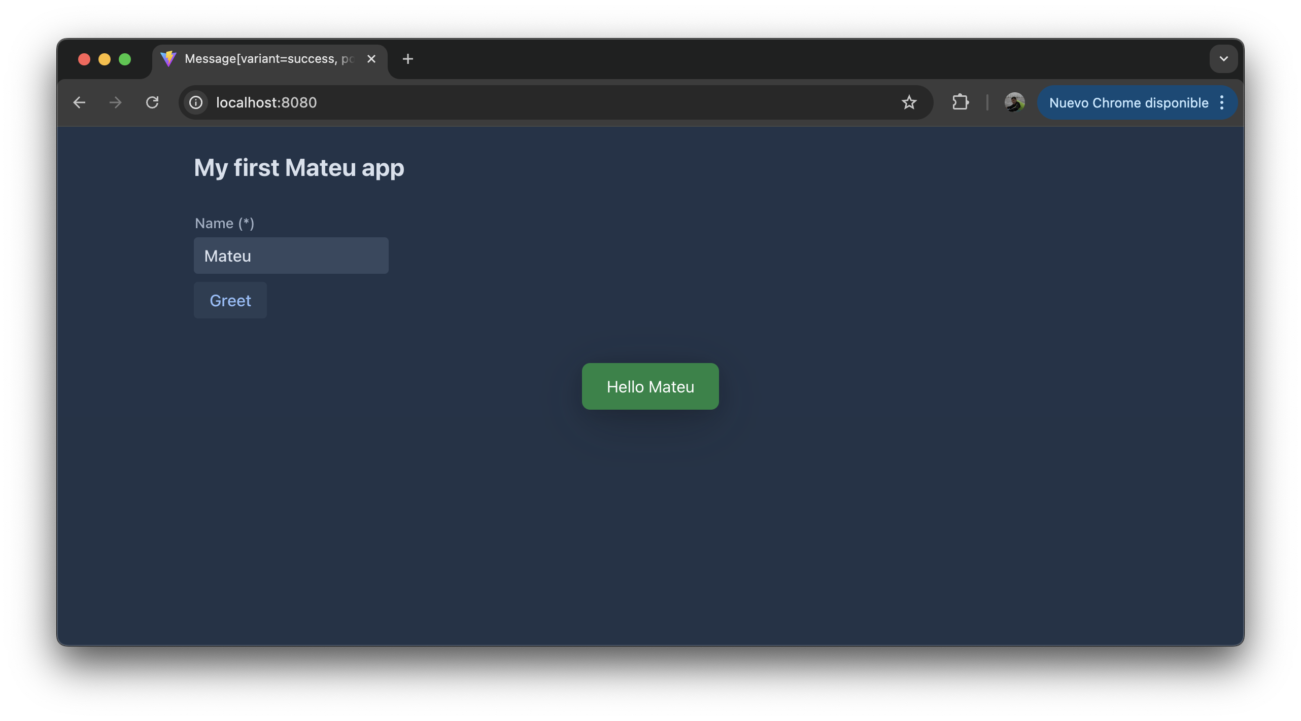
Section titled “@Button”Marks a field or method as a button rendered at the bottom of the form body.
@Target({ElementType.FIELD, ElementType.METHOD})@Retention(RetentionPolicy.RUNTIME)public @interface Button { ButtonStyle buttonStyle() default ButtonStyle.none; ButtonColor buttonColor() default ButtonColor.none; ButtonSize buttonSize() default ButtonSize.none; String group() default ""; boolean separatorBefore() default false; int order() default 0;}The button label is derived from the method or field name (unless overridden with @Label).
Attributes
Section titled “Attributes”| Attribute | Type | Default | Description |
|---|---|---|---|
buttonStyle | ButtonStyle | none | Visual style (primary, secondary, tertiary, tertiaryInline). |
buttonColor | ButtonColor | none | Color theme (success, error, warning, contrast, normal). |
buttonSize | ButtonSize | none | Size (small, normal, large). |
group | String | "" | Group name. Methods sharing the same group are merged into a single dropdown button. The group label is derived from the group name. |
separatorBefore | boolean | false | Renders a visual separator before this button (or group). |
order | int | 0 | Explicit position in the button bar. Lower values appear first. Use this to guarantee ordering because Java reflection does not preserve declaration order. |
Example
Section titled “Example”@UI("")@Title("Simple Form")public class SimpleForm {
@NotEmpty String name;
@Button public Message greet() { return new Message("Hello " + name + "!"); }}Button groups
Section titled “Button groups”Methods sharing the same group value are collapsed into a single dropdown button:
@Button(group = "exports", order = 10)void exportCsv() { ... }
@Button(group = "exports", order = 11)void exportExcel() { ... }
@Button(group = "exports", order = 12)void exportPdf() { ... }
Separators
Section titled “Separators”@Button(order = 1)void save() { ... }
@Button(order = 2, separatorBefore = true)void delete() { ... }Unlike @Toolbar, @Button places the button at the bottom of the form rather than in the toolbar strip at the top.
@RowAction
Section titled “@RowAction”Marks a method to appear as a row-level action in a listing. The method receives the selected row as its parameter.
public @interface RowAction {}No attributes. The action ID is derived from the method name.
Example
Section titled “Example”public class InvoiceListing implements Listing<InvoiceRow> {
@RowAction void approve(InvoiceRow row) { invoiceService.approve(row.id()); }}Row actions are displayed inside each row (for example as a dropdown or icon button) rather than in the page toolbar.
@ListToolbarButton
Section titled “@ListToolbarButton”Marks a method as a toolbar button in a listing view. The method receives the list of currently selected rows. rowsSelectedRequired defaults to true, so the button stays disabled until the user selects at least one row; set confirmationRequired = true to ask for confirmation before destructive operations.
@Target({ElementType.METHOD})@Retention(RetentionPolicy.RUNTIME)public @interface ListToolbarButton { boolean confirmationRequired() default false; boolean rowsSelectedRequired() default true;}Attributes
Section titled “Attributes”| Attribute | Type | Default | Description |
|---|---|---|---|
confirmationRequired | boolean | false | Show a confirmation dialog before executing. |
rowsSelectedRequired | boolean | true | Disable the button until at least one row is selected. |
Example
Section titled “Example”@UI("/products")@Slf4jpublic class Products extends AutoCrud<Product> {
@ListToolbarButton void doSomethingOnRows(List<Product> selection) { log.info("do something on {}", selection); }}To skip confirmation or allow execution without row selection, set the corresponding attribute to false:
@ListToolbarButton(confirmationRequired = false)public Object refresh(List<Grupo> selection) { return Message.builder().text("Refreshed " + selection.size() + " items").build();}@ViewToolbarButton
Section titled “@ViewToolbarButton”Marks a method as a toolbar button on a detail or editor screen.
@Target({ElementType.METHOD})@Retention(RetentionPolicy.RUNTIME)public @interface ViewToolbarButton { boolean confirmationRequired() default true;}Attributes
Section titled “Attributes”| Attribute | Type | Default | Description |
|---|---|---|---|
confirmationRequired | boolean | true | Show a confirmation dialog before executing. |
Example
Section titled “Example”public class OrderDetailPage { String orderId;
@ViewToolbarButton(confirmationRequired = false) void printOrder() { pdfService.print(orderId); }}@Toolbar
Section titled “@Toolbar”Places a method or field in the toolbar area of the current view. Combine with @Action to add fine-grained behaviour (validation, confirmation, etc.).
@Target({ElementType.FIELD, ElementType.METHOD})@Retention(RetentionPolicy.RUNTIME)public @interface Toolbar { ButtonStyle buttonStyle() default ButtonStyle.none; ButtonColor buttonColor() default ButtonColor.none; ButtonSize buttonSize() default ButtonSize.none; String group() default ""; boolean separatorBefore() default false; int order() default 0;}Attributes
Section titled “Attributes”| Attribute | Type | Default | Description |
|---|---|---|---|
buttonStyle | ButtonStyle | none | Visual style (primary, secondary, tertiary, tertiaryInline). |
buttonColor | ButtonColor | none | Color theme (success, error, warning, contrast, normal). |
buttonSize | ButtonSize | none | Size (small, normal, large). |
group | String | "" | Group name. Methods sharing the same group are merged into a single dropdown button. The group label is derived from the group name. |
separatorBefore | boolean | false | Renders a visual separator before this button (or group). |
order | int | 0 | Explicit position in the toolbar. Lower values appear first. Use this to guarantee ordering because Java reflection does not preserve declaration order. |
Example
Section titled “Example”@Toolbar@Action(validationRequired = true)Object create() { var businessKey = UUID.randomUUID().toString(); return URI.create("/workflow/processes/" + businessKey + "?returnTo=/controlPlane/releases");}Button groups
Section titled “Button groups”Methods sharing the same group value are collapsed into a single dropdown button in the toolbar:
@Toolbar(group = "exports", order = 10)void exportCsv() { ... }
@Toolbar(group = "exports", order = 11)void exportExcel() { ... }
Separators
Section titled “Separators”@Toolbar(order = 1)void save() { ... }
@Toolbar(order = 2, separatorBefore = true)void dangerousAction() { ... }@Toolbar can also be placed on a field when the field holds a pre-built component that should appear in the toolbar.
Keyboard shortcuts
Section titled “Keyboard shortcuts”Any action annotated with @Action(shortcut = "...") is triggered automatically when the user presses the configured key combination. No button click is required.
@Toolbar@Action(shortcut = "ctrl+s")Object save() { ... }
@Button@Action(shortcut = "ctrl+t", validationRequired = true)Object test() { ... }
Shortcut format
Section titled “Shortcut format”Shortcuts are expressed as a +-separated string. Modifier keys (ctrl, alt, shift, meta) can appear in any order before the main key. The main key is the last segment and must match the browser’s KeyboardEvent.key value (case-insensitive).
| Example | Triggers on |
|---|---|
"ctrl+s" | Ctrl + S |
"ctrl+shift+z" | Ctrl + Shift + Z |
"alt+f4" | Alt + F4 |
"enter" | Enter (no modifier) |
"meta+s" | Cmd + S (macOS) |
Shortcuts in subforms
Section titled “Shortcuts in subforms”Shortcuts also work on buttons inside nested types (subforms). Mateu propagates the shortcut through the ButtonDto and the parent component picks it up by scanning the component tree.

public record ShippingDetails(String address, String city) {
    @Button    @Action(shortcut = "ctrl+t")    Object confirm() { ... }}
runOnEnter
Section titled “runOnEnter”runOnEnter = true on an Action is equivalent to shortcut = "enter". Both use the same keyboard listener mechanism.
@AutoSave
Section titled “@AutoSave”Target: TYPE
Automatically triggers a save action whenever the user changes a field value, without requiring them to click a button. The action is debounced: the framework waits until the user has stopped making changes for at least debounceMillis milliseconds before dispatching the call.
@Retention(RetentionPolicy.RUNTIME)@Target({ElementType.TYPE})public @interface AutoSave { int debounceMillis() default 800; String action() default "save";}Attributes
Section titled “Attributes”| Attribute | Type | Default | Description |
|---|---|---|---|
debounceMillis | int | 800 | Milliseconds to wait after the last field change before calling the action. Resets on each new change. |
action | String | "save" | ID of the action method to invoke. Matches the method name (or @Action(id = ...) if set). |
Example
Section titled “Example”@UI("/settings")@AutoSave // debounceMillis=800, action="save" by defaultpublic class SettingsForm {
String displayName; String email;
@Toolbar public Message save() { settingsService.update(displayName, email); return new Message("Saved"); }}With a longer debounce and a custom action name:
@AutoSave(debounceMillis = 1500, action = "persist")public class DraftEditor {
    @Stereotype(FieldStereotype.richText)    String content;
    @Toolbar    public void persist() {        draftService.save(content);    }}
How debounce works
Section titled “How debounce works”Every time the user edits a field, a timer starts counting down debounceMillis ms. If the user edits another field before the timer expires, it resets. The action fires only once the user has been idle for the full debounce window.
debounceMillis | Typical use |
|---|---|
| 500–800 ms | Settings screens, short fields |
| 1000–1500 ms | Rich text editors, longer inputs |
| 2000+ ms | High-latency backends or expensive saves |
@WizardCompletionAction
Section titled “@WizardCompletionAction”Marks the final action in a multi-step wizard flow. When the annotated method is invoked, Mateu collects the state from all wizard steps before calling it.
@Target({ElementType.FIELD, ElementType.METHOD})@Retention(RetentionPolicy.RUNTIME)public @interface WizardCompletionAction {}No attributes.
Example
Section titled “Example”public class SetupWizard extends Wizard { StepOne stepOne; StepTwo stepTwo; StepThree stepThree;
@WizardCompletionAction Object finish() { setupService.apply(stepOne, stepTwo, stepThree); return URI.create("/dashboard"); }}The framework calls the @WizardCompletionAction method only after all steps have been filled in. It is the last visible button rendered in the wizard navigation.
@Banner
Section titled “@Banner”Target: METHOD
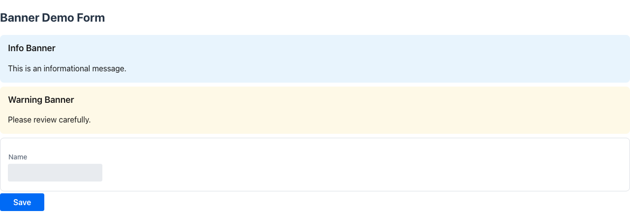
Marks a method as a page banner — a highlighted message block rendered below the page header and above the first form section. Banners are built once alongside the component metadata and appear on every render.
@Retention(RetentionPolicy.RUNTIME)@Target(ElementType.METHOD)public @interface Banner { BannerTheme theme() default BannerTheme.INFO; String title() default ""; boolean closeable() default false; int timeoutSeconds() default 0;}Attributes
Section titled “Attributes”| Attribute | Type | Default | Description |
|---|---|---|---|
theme | BannerTheme | INFO | Visual theme of the banner |
title | String | "" | Banner heading. Falls back to the method name if empty. |
closeable | boolean | false | Shows a dismiss button so the user can hide the banner |
timeoutSeconds | int | 0 | Auto-dismisses the banner after N seconds (0 = never) |
BannerTheme values
Section titled “BannerTheme values”| Value | Appearance |
|---|---|
INFO | Blue — informational |
SUCCESS | Green — positive outcome |
WARNING | Amber — caution |
DANGER | Red — error or critical message |
NONE | Default / unstyled |
Declarative banner (method returns String)
Section titled “Declarative banner (method returns String)”The annotated method may return String to supply a dynamic description; returning null or blank hides the banner.
@UI("/maintenance")public class MaintenancePage {
    @Banner(theme = BannerTheme.WARNING, title = "Maintenance window")    String maintenanceNotice() {        return scheduled ? "Scheduled maintenance on Sunday 02:00–04:00 UTC." : null;    }
    boolean scheduled = true;}
Fixed banner (void method)
Section titled “Fixed banner (void method)”If the method returns void, the banner is always shown with the title text.
@Banner(theme = BannerTheme.INFO, title = "Read-only mode", closeable = true)void readOnlyBanner() {}Programmatic: BannerSupplier
Section titled “Programmatic: BannerSupplier”Implement BannerSupplier when banner logic is too complex for a single annotation or you need multiple banners. It takes precedence over @Banner methods.
@UI("/orders")public class OrdersPage implements BannerSupplier {
    @Override    public List<PageBanner> banners() {        if (serviceDown) {            return List.of(                new PageBanner(BannerTheme.DANGER, "Service unavailable",                    "Order processing is currently offline.")            );        }        return List.of();    }}
PageBanner constructor:
// Full constructornew PageBanner(BannerTheme theme, String title, String description,               boolean closeable, int timeoutSeconds)
// Convenience constructor (closeable=false, timeoutSeconds=0)new PageBanner(BannerTheme theme, String title, String description)
Action-returned banners
Section titled “Action-returned banners”Action methods (e.g. @Toolbar, @Button) can return PageBanner, List<PageBanner>, or PageBanners to show banners dynamically after an action completes.
@ToolbarObject validate() { if (hasErrors()) { return new PageBanner(BannerTheme.DANGER, "Validation failed", errorSummary()); } return new PageBanner(BannerTheme.SUCCESS, "All checks passed", "Ready to submit.");}Replace vs append: by default, returning a PageBanner or List<PageBanner> replaces any banners previously shown by actions. Use PageBanners to control this explicitly:
// Replace existing action bannersreturn PageBanners.replace(new PageBanner(BannerTheme.INFO, "Step 1 complete", ""));
// Accumulate banners across multiple action callsreturn PageBanners.append(new PageBanner(BannerTheme.WARNING, "Warning", details));
Action banners are cleared automatically when the user navigates to a different page.
Target: METHOD
Marks a method as a Floating Action Button (FAB) — a round button fixed to the bottom-right of the screen.
@Retention(RetentionPolicy.RUNTIME)@Target(ElementType.METHOD)public @interface Fab { String icon() default "vaadin:plus"; String label() default ""; ButtonStyle buttonStyle() default ButtonStyle.primary; int order() default 0;}Attributes
Section titled “Attributes”| Attribute | Type | Default | Description |
|---|---|---|---|
icon | String | "vaadin:plus" | Vaadin icon name displayed inside the button |
label | String | "" | Tooltip / aria-label for the button |
buttonStyle | ButtonStyle | primary | Visual style (same values as @Button) |
order | int | 0 | Stack order when multiple FABs are present (lower = closer to the edge) |
App-level FABs
Section titled “App-level FABs”A @Fab on a method of an @UI-annotated app class creates a global FAB visible on every page, stacked above the AI assistant FAB at right: 1.5rem.
@UI("/app")@App(AppVariant.HAMBURGUER_MENU)public class MyApp {
    @Fab(icon = "vaadin:plus", label = "New order", order = 0)    Object newOrder() {        return new CreateOrderForm();    }}
Page-level FABs
Section titled “Page-level FABs”A @Fab on a method of a page class creates a page-scoped FAB visible only while that page is active, stacked at right: 5.5rem (to avoid overlapping global FABs).
@UI("/customers")public class CustomerListPage {
    @Fab(icon = "vaadin:plus", label = "Add customer")    Object addCustomer() {        return new CreateCustomerForm();    }}
Action method return values
Section titled “Action method return values”Action methods can return different types to drive the UI after execution:
| Return type | Effect |
|---|---|
void / null | Nothing happens; the current view stays open. |
| A Java object or record (a form, a listing, etc.) | Mateu navigates to that object as a new view. |
URI | The browser navigates to the given URL. |
Message | A toast notification is shown (Message.builder().text("...").build()). |
PageBanner / List<PageBanner> | Shows banners on the current page (replaces existing). |
PageBanners | Shows banners with explicit replace/append semantics. |
// Navigate to a URLObject create() {    return URI.create("/workflow/processes/" + UUID.randomUUID());}
// Open another componentCreateReleaseForm createRelease(List<ChangeRow> selectedRows, HttpRequest httpRequest) {    return createReleaseForm.withUser(extractUser(httpRequest));}
// Show a toast@ListToolbarButton(confirmationRequired = false)public Object refresh(List<Grupo> selection) {    return Message.builder().text("Refreshed " + selection.size() + " items").build();}
// Show a banner dynamically@ToolbarObject check() {    return new PageBanner(BannerTheme.SUCCESS, "Check passed", "System is healthy.");}