

Welcome page
Status: ✅ Implemented
Intent
Section titled “Intent”Give first-time or occasional users a friendly entry point to a flow: a big hero that explains what this is, one or two clear calls to action, and highlight tiles with the most important information or steps.
Problem
Section titled “Problem”Dropping occasional users straight into a dense operational screen forces them to reconstruct “what do I do first?” every time. A hand-built landing page is easy to write once but tends to drift stylistically from the rest of the app.
Solution
Section titled “Solution”Extend Welcome. Button fields become call-to-action buttons inside the hero; component fields annotated with @Panel become highlight tiles on a responsive grid below.
@UI("/welcome")@Title("Welcome")public class WelcomeDemo extends Welcome {
    Button start = Button.builder()            .label("Start check-in").actionId("startCheckin")            .buttonStyle(ButtonStyle.primary).build();
    @Panel(title = "1 · Search the booking")    Markdown step1 = new Markdown("Find the reservation by locator, guest name or room.", null, null);
    @Panel(title = "2 · Verify the guests")    Markdown step2 = new Markdown("Scan documents and confirm the cardex.", null, null);
    @Override protected String heroTitle() { return "Front desk check-in"; }    @Override protected String heroSubtitle() { return "Everything you need, in three steps"; }
    @Action    Object startCheckin() { return URI.create("/checkin"); }}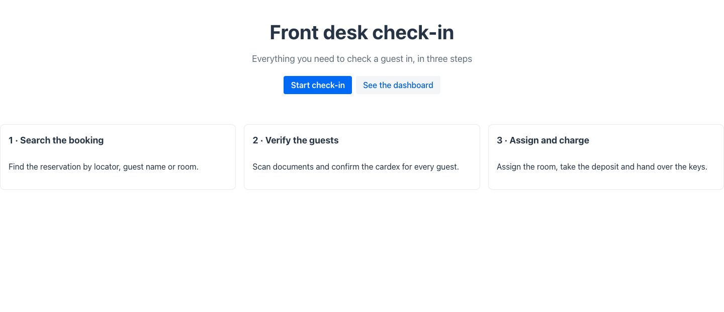
The CTA’s actionId runs the matching @Action method — return a URI to navigate into the flow. Override heroImage() for a background image (a dark overlay keeps text readable).
The welcome banner element (and the accent strip rule)
Section titled “The welcome banner element (and the accent strip rule)”The hero the archetype renders is the Redwood Welcome Banner element — a branded band with a
big title, subtitle and optional background image. You can put one at the top of any page
(archetype or not) with the @WelcomeBanner annotation on the view class:
@UI("/onboarding")@Title("Onboarding")@WelcomeBanner(title = "Find your flow", subtitle = "Three steps and you are done")public class Onboarding { /* … */ }The banner title falls back to the page @Title when left blank. Redwood’s anatomy rule: the
accent color strip only shows on pages WITHOUT a welcome banner — so on any page that carries
one (this annotation, or a HeroSection anywhere in the content, like Welcome and
HeroSearch), the Redwood renderer suppresses the strip automatically.
Redwood parameter and slot reference
Section titled “Redwood parameter and slot reference”What the Redwood welcome-page template exposes, and what Mateu gives you for it. The canonical
page-header elements shared by every template are documented once in
Page templates; this table covers what is specific to this one.
Legend: ✅ supported · 🟡 partial · — not supported · ⚪ deliberately out of scope
| Redwood prop / slot | Mateu | |
|---|---|---|
pageTitle (hero title) | heroTitle(), or @WelcomeBanner(title=…) on any page | ✅ |
descriptionText | heroSubtitle() / @WelcomeBanner(subtitle=…) | ✅ |
overlineText (small text above the title) | @Overline("Reservations"), or OverlineSupplier when it depends on runtime state | ✅ |
primaryAction / secondaryAction / secondaryActions | Button fields; the fluent Button carries iconOnLeft/iconOnRight, disabled and actionId | ✅ |
backgroundColor: 9 dark tones + auto | — the Redwood/VB bridge rotates tones on its own (mateuWelcomeTheme), but the archetype cannot declare one, so the other renderers do not follow | — |
illustrationBackground + illustrationForeground (two illustration layers) | heroImage() — a single background image with a dark overlay | 🟡 |
themedImage: pebbles | none | ⚪ an Oracle illustration asset; design-system-specific by nature | ⚪ |
displayOptions.imageStretch: none | full | — | — |
displayOptions.mobileImage | — | — |
displayOptions.responsivePadding | — | — |
displayOptions.inFlowBack + spInFlowBack | back/cancel affordances approximate it; no explicit in-flow back | 🟡 |
| Slot default (tiles under the hero) | component fields annotated @Panel, on a responsive grid | ✅ |
Slot search | the app-level smart search bar / ⌘K palette, not a page slot | 🟡 |
spPrimaryAction / spSecondaryAction {actionId} | the @Action method matching the button’s actionId; return a URI to navigate | ✅ |
One anatomy rule from Redwood that Mateu applies automatically: the accent colour strip only
shows on pages without a welcome banner, so any page carrying one — this archetype,
@WelcomeBanner, or a HeroSection anywhere in the content — suppresses the strip.
When to use it
Section titled “When to use it”Use a welcome page as the entry route of flows used by occasional or first-time users (self-service portals, guided processes, seasonal tasks). Power users working the same screen all day are better served by a Dashboard or by the operational screen itself.