

Callout card
Status: ✅ Implemented
Intent
Section titled “Intent”Draw attention to a single message with an action — an upgrade prompt, a “you’re all set” confirmation, a trial-ending warning, a payment-failed alert — as a themed, accented block with an optional call-to-action button.
Solution
Section titled “Solution”Use the CalloutCard component: an icon, a title, a description and an optional CTA (ctaLabel + actionId). theme — info, success, warning or danger — tints the background and accent and colors the CTA; the button dispatches the standard action-requested event.
CalloutCard.builder() .theme("warning").icon("⚠️") .title("Trial ends in 3 days") .description("Upgrade now to keep your projects and data.") .ctaLabel("Upgrade").actionId("upgrade") .build();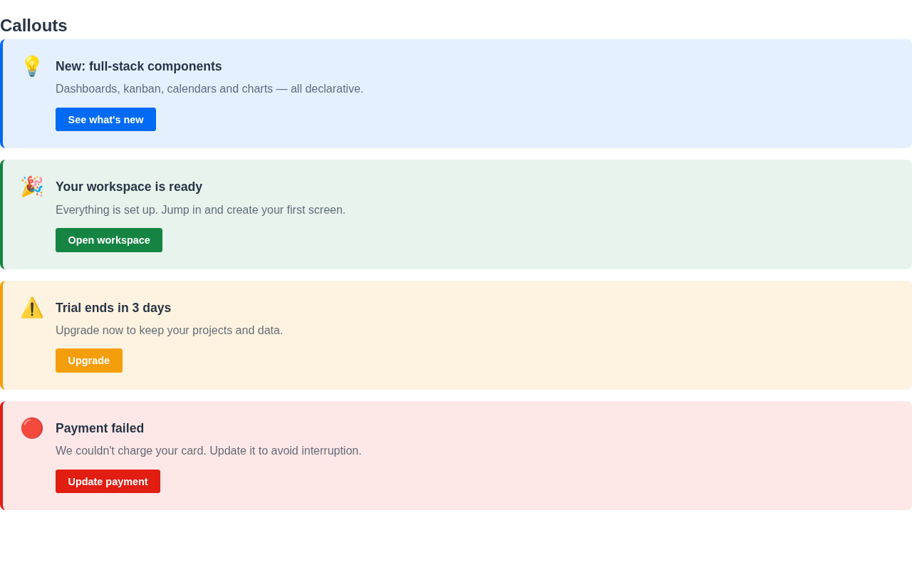
The renderer is dependency-free, themes through the standard CSS variables and works in dark mode. Unlike @Banner (page-level notices below the header), a CalloutCard is a first-class component you place anywhere in the layout.
When to use it
Section titled “When to use it”Use a CalloutCard for an inline, actionable highlight. For page-level notices use @Banner; for a friendly empty screen use EmptyState. Demo: /callout-demo.