1. Structure of an app
The shell and its variants, the app header, navigation and menus, the content area, overlays, and the anatomy every page shares (header, banners, body, footer, FABs). Structure of an app →
You declare a Mateu UI once, without naming a design system: as YAML (by hand or in the visual editor) or as code in Java, C# or Python. Mateu renders that one declaration on the web with Vaadin or Redwood, on phones with the Mateu app and on the desktop in IntelliJ, whether a backend serves it or it ships as a static bundle.
So “the UX” of a Mateu app is not something each screen invents. It is a grammar that every screen follows and every renderer paints. This guide explains that grammar from the outside in. What a Mateu UI is made of maps the building blocks (mount, routes, pages, actions, sources…); this guide is what those blocks look like to the person using the app.
flowchart TD Mount["Mount<br/>an app at a base path"] --> Shell["App shell<br/>variant · header · menu"] Shell --> Header["App header<br/>context pickers · header actions · bell · search · theme"] Shell --> Nav["Navigation<br/>menu · card menus · remote menus · command center"] Shell --> Content["Content area<br/>the current route's page"] Content --> Page["Page<br/>one of six page types"] Page --> PHeader["Page header<br/>overline · title · badges · KPIs · toolbar"] Page --> Banners["Banners"] Page --> Body["Body<br/>components: layouts, fields, listings, displays"] Page --> Footer["Footer buttons · FABs"] Page -. "opens" .-> Overlays["Overlays<br/>dialogs · drawers · popovers · toasts"]1. Structure of an app
The shell and its variants, the app header, navigation and menus, the content area, overlays, and the anatomy every page shares (header, banners, body, footer, FABs). Structure of an app →
2. Page types
Every page is one of six types: collection, detail, form, process, dashboard or landing. Each type, its templates, its anatomy and a minimal example. Page types →
3. Components
The catalogue, by role: layouts, fields, displays, collections, navigation, feedback, overlays and specialised canvases, plus field types and how renderers map them. Components →
4. Extending it
A ladder from least to most effort: semantic annotations, field types, custom components, adapters, micro-frontends, design systems and your own renderer. Extending the UI →
5. How quality is kept
The principles, how they are checked, accessibility on every renderer, and behaviour on slow networks. UX quality →
The model says what, the renderer says how. A page declares that it has a title, a
listing with a status column and a primary New button. It never says “a vaadin-grid” or “an
oj-table”. That is why the same declaration looks native in Vaadin, Redwood, React Native and
IntelliJ, and why a renderer cannot add UI the model did not ask for (see
the authoring rule).
You choose the page type, Mateu fills in below it. Listing the screens your app needs and picking a type for each is the design step, and it is yours. Below that choice, Mateu infers a lot: widgets from field types, columns and sections from the amount of data, tabs for long read-only records (layout inference). Explicit declarations always win over inference.
Patterns are a library, not a syllabus. The pattern catalogue documents more than ninety patterns (smart search, drawers, kanban, Gantt, undo, optimistic locking…). You do not need to read it. When you need “totals under a grid” or “a side panel that doesn’t lose the page”, the pattern page names the one annotation, key or archetype that does it.
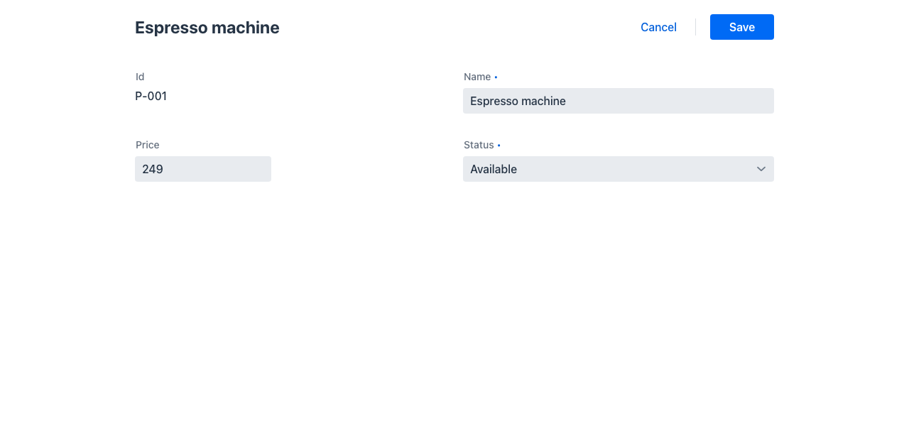
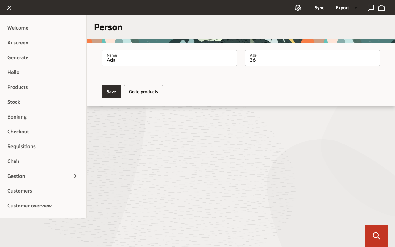
The same form, declared once, painted by the Vaadin renderer and by the Redwood renderer: