Layout Annotations
These annotations are placed on a class or field to control how its content is arranged on screen — columns, tabs, accordion panels, split panes, and more.
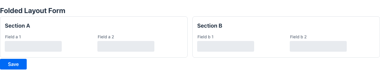
@FoldedLayout
Section titled “@FoldedLayout”Renders each @Section of the page as a collapsible panel. The user can expand or collapse individual sections independently, reducing visual noise on forms with many fields.
No attributes.
@Retention(RetentionPolicy.RUNTIME)public @interface FoldedLayout {}Example
Section titled “Example”@Route("/customer/:id")@FoldedLayout@ConfirmOnNavigationIfDirtypublic class CustomerForm {
@Section("Personal data") String firstName; String lastName;
@Section("Contact") ContactDetails contact; // subform with its own @Toolbar actions
@Section("Billing") BillingDetails billing;
@Toolbar Object save() { /* persist everything */ }}Each @Section becomes a collapsible panel. Subform fields (nested records/classes) can carry their own @Toolbar or @Button methods scoped to that panel. See Partial Forms for the full pattern.
@FormLayout
Section titled “@FormLayout”Renders the page fields in a responsive multi-column grid. This is the standard layout for data-entry forms.
@Retention(RetentionPolicy.RUNTIME)public @interface FormLayout { String theme() default ""; String style() default ""; int columns() default 2;}Attributes
Section titled “Attributes”| Attribute | Type | Default | Description |
|---|---|---|---|
columns | int | 2 | Number of columns in the grid |
style | String | "" | Inline CSS applied to the layout container |
theme | String | "" | Theme variant string passed to the design system |
Example
Section titled “Example”@UI("/customers")@FormLayout(columns = 3)public class CustomerForm { String firstName; String lastName; String email; String phone; LocalDate birthDate;}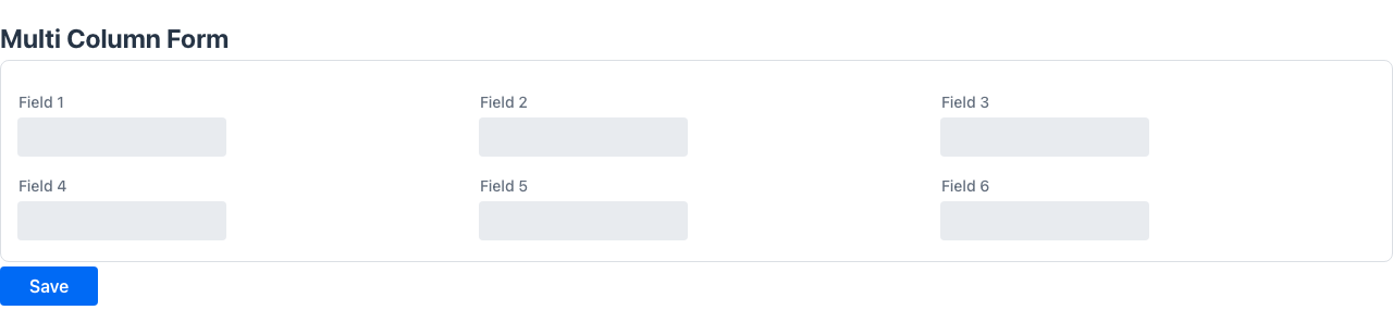
@HorizontalLayout
Section titled “@HorizontalLayout”Renders the page content in a horizontal row.
public @interface HorizontalLayout { String theme() default ""; String style() default "";}Attributes
Section titled “Attributes”| Attribute | Type | Default | Description |
|---|---|---|---|
theme | String | "" | Theme variant |
style | String | "" | Inline CSS |
Example
Section titled “Example”@UI("/summary")@HorizontalLayout(style = "gap: 1rem;")public class SummaryPage { Component salesChart; Component revenueChart;}@VerticalLayout
Section titled “@VerticalLayout”Renders the page content in a vertical column.
public @interface VerticalLayout { String theme() default ""; String style() default "";}Attributes
Section titled “Attributes”| Attribute | Type | Default | Description |
|---|---|---|---|
theme | String | "" | Theme variant |
style | String | "" | Inline CSS |
Example
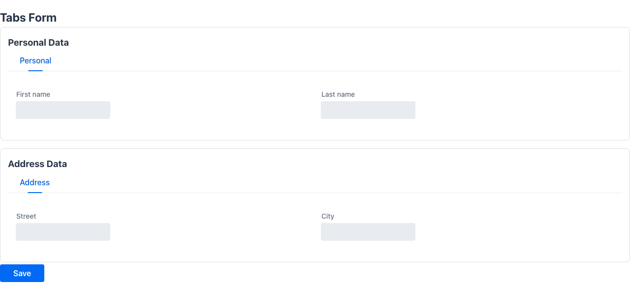
Section titled “Example”@UI("/profile")@VerticalLayoutpublic class ProfilePage { Component avatar; String bio;}Places on the class to wrap all fields in a tabbed container. Individual fields are assigned to tabs via @Tab.
public @interface Tabs { String theme() default ""; String direction() default ""; String style() default "";}Attributes
Section titled “Attributes”| Attribute | Type | Default | Description |
|---|---|---|---|
theme | String | "" | Visual theme variant |
direction | String | "" | Tab strip direction — "horizontal" or "vertical" |
style | String | "" | Inline CSS for the tab container |
Assigns the annotated field or method to a named tab. Requires @Tabs on the enclosing class.
Target: FIELD, METHOD
@Retention(RetentionPolicy.RUNTIME)@Target({ElementType.FIELD, ElementType.METHOD})public @interface Tab { String value() default ""; int order() default 0;}Attributes
Section titled “Attributes”| Attribute | Type | Default | Description |
|---|---|---|---|
value | String | "" | Tab label |
order | int | 0 | Display order among tabs |
Example
Section titled “Example”@UI("/account")@Tabspublic class AccountPage { @Tab("Profile") String firstName; String lastName;
@Tab("Security") String password; boolean mfaEnabled;
@Tab("Preferences") String language; String timezone;}Each @Tab annotation starts a new tab. Fields without @Tab fall into a default tab.
@Accordion
Section titled “@Accordion”Places on the class to render all fields inside a collapsible accordion. Individual panels are configured with @AccordionPanel.
public @interface Accordion { String style() default ""; int opened() default 0;}Attributes
Section titled “Attributes”| Attribute | Type | Default | Description |
|---|---|---|---|
style | String | "" | Inline CSS for the accordion container |
opened | int | 0 | Zero-based index of the initially expanded panel |
@AccordionPanel
Section titled “@AccordionPanel”Assigns the annotated field to a named accordion panel. Requires @Accordion on the enclosing class.
public @interface AccordionPanel { String theme() default ""; String style() default ""; String summary() default ""; boolean disabled() default false;}Attributes
Section titled “Attributes”| Attribute | Type | Default | Description |
|---|---|---|---|
summary | String | "" | Panel header text shown in collapsed state |
theme | String | "" | Visual theme variant |
style | String | "" | Inline CSS for this panel |
disabled | boolean | false | Whether this panel is non-interactive |
Example
Section titled “Example”@UI("/settings")@Accordion(opened = 0)public class SettingsPage { @AccordionPanel(summary = "General") String language; String timezone;
@AccordionPanel(summary = "Notifications") boolean emailNotifications; boolean smsNotifications;}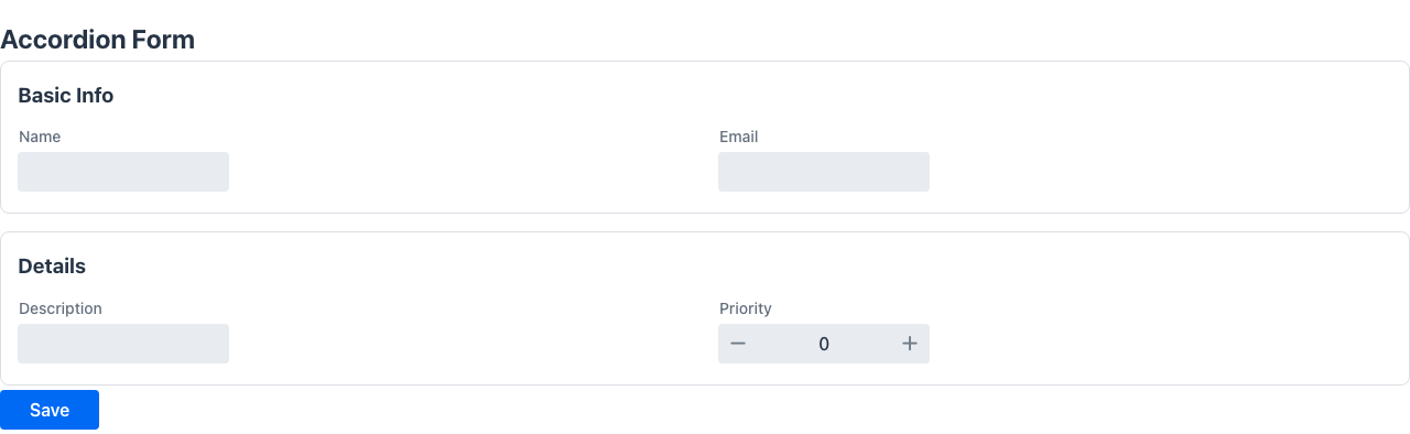
@SplitLayout
Section titled “@SplitLayout”Renders the page as a two-panel layout with a resizable divider. The first field becomes the primary panel and the second becomes the secondary panel.
public @interface SplitLayout { String theme() default ""; String style() default "";}Attributes
Section titled “Attributes”| Attribute | Type | Default | Description |
|---|---|---|---|
theme | String | "" | Theme variant |
style | String | "" | Inline CSS |
Example
Section titled “Example”@UI("/orders")@SplitLayoutpublic class OrdersPage { Component orderList; Component orderDetail;}@MasterDetail
Section titled “@MasterDetail”Target: FIELD
Renders the annotated field as a master-detail layout. When a row in the master list is selected, the detail panel appears beside it. The minHeightWhenDetailVisible value sets the minimum height of the component while the detail panel is open.
@Retention(RetentionPolicy.RUNTIME)@Target({ElementType.FIELD})public @interface MasterDetail { String minHeightWhenDetailVisible();}Attributes
Section titled “Attributes”| Attribute | Type | Default | Description |
|---|---|---|---|
minHeightWhenDetailVisible | String | — | CSS minimum height when the detail panel is open (e.g. "400px") |
Example
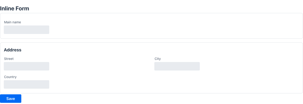
Section titled “Example”public class OrdersPage { @MasterDetail(minHeightWhenDetailVisible = "500px") List<OrderRow> orders;}@Section
Section titled “@Section”Target: FIELD, METHOD
Groups the annotated field and all following fields under a named section heading within a form. The section ends at the next @Section annotation.
@Retention(RetentionPolicy.RUNTIME)@Target({ElementType.FIELD, ElementType.METHOD})public @interface Section { String value(); int columns() default 1; String style() default ""; String zone() default "";}Attributes
Section titled “Attributes”| Attribute | Type | Default | Description |
|---|---|---|---|
value | String | — | Section heading label (required) |
columns | int | 1 | Number of columns inside this section’s field grid |
style | String | "" | Inline CSS for the section container |
zone | String | "" | Name of the layout zone this section belongs to. Only used when the class is annotated with @Zones; sections sharing a zone are stacked inside that zone’s column |
sticky | boolean | false | Pin the section card (position: sticky) so it stays in view while the rest of the page scrolls. Handy on a long @Toc page for a reference section (e.g. a list you keep glancing at); multiple sticky sections stack under the pinned header |
Example
Section titled “Example”public class CustomerForm { @Section("Personal data") String firstName; String lastName; LocalDate birthDate;
@Section(value = "Contact", columns = 2) String email; String phone; String address;}Target: TYPE
Shows a sticky index (table of contents) of the page’s @Sections in a right-hand
sidebar. Each entry lists a section title and scrolls to it when clicked; the active section is
highlighted as the user scrolls, and Ctrl+Alt+1..9 jump to the first nine sections. In docs mode
the page header is pinned and any @Section(sticky = true) sections stack under it.
It is tri-state: absent means auto — the index appears only when there are more than four
vertically-stacked sections and the form is not a @Zones / horizontal layout;
@Toc (or @Toc(true)) forces it on; @Toc(false) suppresses it.
@UI("/checkin/:id")@Tocpublic class CheckInForm { @Section("Información general de la reserva") ReservationInfo general; @Section("Check-in") CheckInData checkIn; @Section(value = "Huéspedes", sticky = true) GuestList guests; // pinned @Section("Información cliente") ClientInfo client; // …}See Sticky sections index for the full pattern.
@Inline
Section titled “@Inline”Target: FIELD
Drops the chrome (title, outlined card) that the framework would otherwise add around a nested field, so it blends into its host section/tab. Works in two flavours:
- POJO nested type — expands the type’s fields directly into the parent section, without adding a
Cardwrapper or a separate header around the content. The parent field’s@Sectionannotation provides the section title; the nested type’s class-level annotations (@PlainText,@Compact, etc.) must be applied on the nested class itself — they are not inherited from the enclosing form. - Embedded orchestrator (a
MultiViewsubclass such asAutoEditableView) — the inner view drops badges/kpis, demotes its title fromh2toh3so it nests under the host, and (for single-section forms) drops the outlined Card wrapper around its content. The parent@Sectionthat hosts an@Inlineorchestrator also drops its own title row so the embeddedh3title + toolbar buttons render as one coherent row inside the section’s card. For tabs (which have no parent title row), the embeddedh3becomes the only visible title — remove@Titlefrom the inner model class to suppress it entirely.
@Retention(RetentionPolicy.RUNTIME)@Target(ElementType.FIELD)public @interface Inline {}No attributes.
Behavior of @Toolbar and @Button on an @Inline type
Section titled “Behavior of @Toolbar and @Button on an @Inline type”Methods annotated with @Toolbar or @Button inside the nested class still work. Their placement shifts to match the inline context:
| Annotation on nested method | Rendered as |
|---|---|
@Toolbar | Button(s) in the section title row, on the same line as the section heading |
@Button | Button row below the section content |
Example
Section titled “Example”// Nested inline type — own annotations applied here@PlainText@Compactpublic class GuestsSection {
@Label("") @Stereotype(FieldStereotype.grid) List<GuestData> guests = new ArrayList<>();
@Toolbar @Label("Welcome card") Object printWelcomeCard(HttpRequest httpRequest) { return Message.success("Sent to printer"); }
@Button @Label("Wi-Fi code") Object showWifiCode(HttpRequest httpRequest) { return Message.success("Code: HOTEL-GUEST"); }}
// Parent form@UI("/checkin/:id")@Compact@Zones({ @Zone(name = "left", width = "64%"), @Zone(name = "right", width = "36%") })public class CheckInForm {
// The @Section card is the only container; GuestsSection fields expand into it @Section(value = "Guests", columns = 1, zone = "left") @Label("") @Inline GuestsSection guestList = new GuestsSection();}The “Guests” section card shows [Welcome card] on the same line as the heading and renders the [Wi-Fi code] button below the guest grid.
Use @Inline on dense, information-rich screens (e.g. @Compact + @Zones) where an extra card nesting would add too much visual weight. For nested types that need their own clearly separated card and toolbar, omit @Inline.
Embedded orchestrator example
Section titled “Embedded orchestrator example”A field whose type is a MultiView subclass (e.g. an AutoEditableView<T>) is embedded as a mediator sub-app. Annotating it with @Inline makes the embedded view collapse into the host section instead of stacking its own page chrome on top of the host card:
// Routed editable view@UI("/pf-personal")public class PersonalDataView extends AutoEditableView<PersonalDataSection> {    @Override public PersonalDataSection load(HttpRequest r)     { return store; }    @Override public void persist(PersonalDataSection e, HttpRequest r) { store = e; }}
// Host form@UI("/partial-forms")@Title("Formularios parciales")public class PartialFormDemo {
    // @Inline → section header is hidden, the embedded view title renders as h3    // alongside the Edit / Save / Cancel toolbar, no inner Card wrap.    @Section("Datos personales")    @Inline    PersonalDataView personal;
    @Section("Contacto")    ContactSection contact = new ContactSection();}
Result: the “Datos personales” card has no separate title row; instead it shows the embedded h3 “Datos personales” + the Edit button in a single row, then the form fields. The “Contacto” section keeps its regular section heading because it is not @Inline.
The marker travels via the embedded route (?_embeddedMediator=1&_inline=1), so the inline behaviour persists across view → edit → save cycles — including the toolbar buttons the embedded AutoEditableView brings.
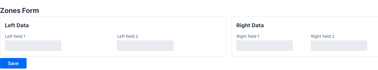
@Zones / @Zone
Section titled “@Zones / @Zone”Target (@Zones): TYPE
Declares the layout zones (side-by-side columns) of a form. When a class is annotated with @Zones, its @Sections are distributed into the declared zones by their zone value and the zones are rendered next to each other, each zone stacking its sections vertically. This is the idiomatic way to build dense, information-rich screens (e.g. a check-in or order desk) where related groups of sections sit in fixed-width columns.
A section whose zone does not match any declared zone falls back into a trailing flexible column, so nothing is ever dropped.
@Retention(RetentionPolicy.RUNTIME)@Target(ElementType.TYPE)public @interface Zones {    Zone[] value();}
public @interface Zone {    String name();    String width() default "";   // e.g. "64%", "30rem"; empty = grow to fill}
Attributes (@Zone)
Section titled “Attributes (@Zone)”| Attribute | Type | Default | Description |
|---|---|---|---|
name | String | — | Zone name, referenced by @Section(zone = …) (required) |
width | String | "" | CSS width of the zone column. Empty means the zone grows to fill the remaining space (flex: 1) |
Example
Section titled “Example”@UI("/checkin/:id")@Zones({ @Zone(name = "left", width = "64%"), @Zone(name = "right", width = "36%")})public class CheckInForm {
@Section(value = "Reservation", columns = 4, zone = "left") String localizador; // … more left-zone sections …
@Section(value = "Charges", zone = "right") List<ChargeLine> charges; // … more right-zone sections …}The left and right zones render side by side (64% / 36%); each stacks its own sections.
@Colspan
Section titled “@Colspan”Sets how many columns a field spans inside its containing form layout. A value of 2 makes the field stretch across two column slots.
@Retention(RetentionPolicy.RUNTIME)public @interface Colspan { int value();}Attributes
Section titled “Attributes”| Attribute | Type | Default | Description |
|---|---|---|---|
value | int | — | Number of grid columns to span (required) |
Example
Section titled “Example”@FormLayout(columns = 2)public class ProductForm { String name; double price;
@Colspan(2) List<ProductComponent> components; // stretches across both columns}@ColumnWidth
Section titled “@ColumnWidth”Target: FIELD
Specifies a CSS width for this field’s column in a grid or listing. Accepts any valid CSS length value.
A column with an explicit @ColumnWidth becomes a fixed-width column (flex-grow: 0); columns without one keep the default flex behaviour and share the remaining space. So in a row of columns, annotate the narrow ones (codes, flags, dates) with @ColumnWidth and leave the free-text column unannotated to let it absorb the slack.
Use the special value @ColumnWidth("auto") to make the column size to its content (header + widest cell). It never truncates and adapts to the current density — the right choice for short code/flag columns on a grid shown in both compact and non-compact screens, where a fixed 3rem might truncate a value to "A." once the extra padding of a non-compact layout eats the width.
@Retention(RetentionPolicy.RUNTIME)@Target({ElementType.FIELD})public @interface ColumnWidth { String value();}Attributes
Section titled “Attributes”| Attribute | Type | Default | Description |
|---|---|---|---|
value | String | — | CSS width string, e.g. "150px" or "20%", or "auto" to size to content (required) |
Example
Section titled “Example”record InvoiceRow( @ColumnWidth("80px") String id, String description, // no width → flex-grows to fill @ColumnWidth("120px") double total) {}@Compact
Section titled “@Compact”Target: TYPE
Renders a page/form in a condensed, high-density mode so information-rich screens fit without scrolling. It injects a Lumo density preset (smaller control sizes, spacing, tighter form-row gaps and field labels, smaller card padding, and a smaller auto-responsive column width so more @Section(columns = N) columns actually fit) into the page container, which cascades to every component inside.
It is opt-in and non-breaking: pages without @Compact are unaffected. The preset is also available directly as StyleConstants.COMPACT for use with @Style.
@Retention(RetentionPolicy.RUNTIME)@Target(ElementType.TYPE)public @interface Compact {}Example
Section titled “Example”@UI("/checkin/:id")@Compact@Zones({ @Zone(name = "left", width = "64%"), @Zone(name = "right", width = "36%") })public class CheckInForm { @Section(value = "Reservation", columns = 8, zone = "left") // … many read-only fields rendered tightly …}Pairs naturally with @Zones and @PlainText for dense, single-screen desks.
@Scroller
Section titled “@Scroller”Wraps the page content in a scrollable container.
public @interface Scroller { String direction() default ""; String style() default "";}Attributes
Section titled “Attributes”| Attribute | Type | Default | Description |
|---|---|---|---|
direction | String | "" | Scroll direction: "vertical", "horizontal", or "both" |
style | String | "" | Inline CSS for the scroller container |
Example
Section titled “Example”@UI("/feed")@Scroller(direction = "vertical")public class FeedPage { Component items;}@DetailFormCustomisation
Section titled “@DetailFormCustomisation”Target: FIELD
Customises where the detail form appears when using a master-detail or embedded CRUD. Controls the position, column count, and visual styling of the detail panel.
@Retention(RetentionPolicy.RUNTIME)@Target({ElementType.FIELD})public @interface DetailFormCustomisation { FormPosition position() default FormPosition.right; String style() default ""; String theme() default ""; int columns() default 2;}FormPosition values
Section titled “FormPosition values”| Value | Description |
|---|---|
right | Detail panel opens to the right of the master (default) |
left | Detail panel opens to the left |
top | Detail panel opens above |
bottom | Detail panel opens below |
modal | Detail opens in a centred modal dialog |
modalLeft | Detail opens in a modal anchored left |
modalRight | Detail opens in a modal anchored right |
Attributes
Section titled “Attributes”| Attribute | Type | Default | Description |
|---|---|---|---|
position | FormPosition | right | Where the detail panel appears |
columns | int | 2 | Number of form columns in the detail panel |
style | String | "" | Inline CSS for the detail panel |
theme | String | "" | Theme variant |
Example
Section titled “Example”public class Level1View { @DetailFormCustomisation(position = FormPosition.right, columns = 1) List<Level2Row> items;}@DivStyle
Section titled “@DivStyle”Target: TYPE, FIELD, PARAMETER
Applies inline CSS to the wrapper <div> of the annotated element. Useful for controlling the outer container independently of the element’s own style.
@Retention(RetentionPolicy.RUNTIME)@Target({ElementType.TYPE, ElementType.FIELD, ElementType.PARAMETER})public @interface DivStyle { String value();}Attributes
Section titled “Attributes”| Attribute | Type | Default | Description |
|---|---|---|---|
value | String | — | Inline CSS string applied to the wrapping div (required) |
Example
Section titled “Example”@DivStyle("padding: 1rem; background: #f5f5f5;")public class InfoBox { String message;}Real-world example
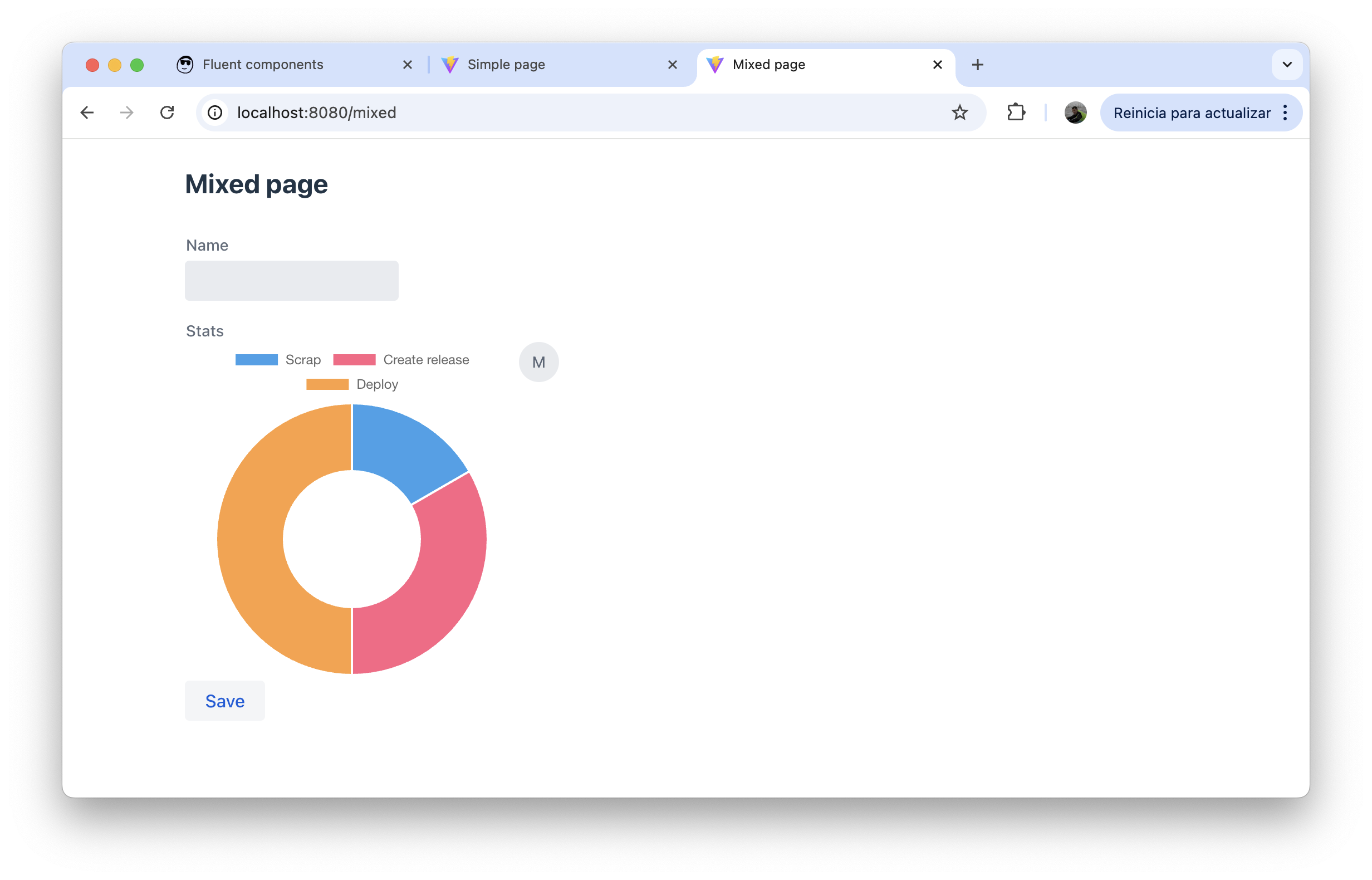
Section titled “Real-world example”MixedPage from the admin-panel demo combines @FormLayout, @Style, and a mix of data fields and fluent components on a single page:
@UI("/mixed")@Style(StyleConstants.CONTAINER)@FormLayout(columns = 1)public class MixedPage {
    String name;
    Component stats = new HorizontalLayout(            Chart.builder()                    .chartType(ChartType.doughnut)                    .chartData(ChartData.builder()                            .labels(List.of("Scrap", "Create release", "Deploy"))                            .datasets(List.of(ChartDataset.builder()                                    .label("label 1")                                    .data(List.of(1d, 2d, 3d))                                    .build()))                            .build())                    .chartOptions(ChartOptions.builder()                            .maintainAspectRatio(false)                            .build())                    .build(),            new Avatar("Mateu")    );
    @Button    void save() {}}
The single-column @FormLayout stacks the name text field on top of the stats component row, with the save button rendered inline below both.