

Field Type Annotations
These annotations control how individual fields are rendered and what input widget is used in edit mode.
@Stereotype
Section titled “@Stereotype”Target: FIELD
Sets the input widget type for a field. Mateu infers a default stereotype from the Java type (e.g. String → text input, boolean → checkbox), but @Stereotype overrides that inference.
@Target(ElementType.FIELD)@Retention(RetentionPolicy.RUNTIME)public @interface Stereotype { FieldStereotype value();}Attributes
Section titled “Attributes”| Attribute | Type | Description |
|---|---|---|
value | FieldStereotype | The widget stereotype to apply |
FieldStereotype enum
Section titled “FieldStereotype enum”| Value | Description |
|---|---|
regular | Default text input |
radio | Radio button group |
checkbox | Checkbox input |
textarea | Multi-line text area |
toggle | Toggle switch |
combobox | Combo box (typed input with dropdown) |
select | Dropdown select |
email | Email input |
password | Password input (masked) |
richText | Rich text / WYSIWYG editor |
listBox | List box (scrollable options) |
html | Raw HTML display |
markdown | Markdown editor / renderer |
image | Image display (<img> from a URL / data-URI value) |
uploadableImage | Image preview + upload (replace) + delete actions — see @UploadableImage |
signature | Drawing canvas that stores the accepted strokes as a PNG data URI — see @Signature |
camera | Device camera with live preview; the shot lands as a JPEG data URI — see @PhotoCapture |
treeSelect | A select whose dropdown unfolds a TREE of options — see @TreeSelect |
icon | Icon picker |
link | Hyperlink |
money | Currency amount |
grid | Embedded data grid |
color | Color picker |
choice | Choice selector |
popover | Popover trigger |
slider | Range slider |
button | Button |
stars | Star rating |
Example
Section titled “Example”From the Products demo:
@Stereotype(FieldStereotype.textarea)@HiddenInListString description;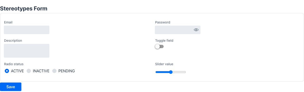
@UseRadioButtons
Section titled “@UseRadioButtons”No attributes. Shorthand for @Stereotype(FieldStereotype.radio). Renders an enum or options field as a radio button group instead of a dropdown.
public @interface UseRadioButtons {}Example
Section titled “Example”public class OrderForm { @UseRadioButtons DeliveryMethod delivery;}@UploadableImage
Section titled “@UploadableImage”Target: FIELD
No attributes. Shorthand for @Stereotype(FieldStereotype.uploadableImage). Renders a String
field as an uploadable image: the image preview combined with an Upload (or Replace)
action and a Delete action.
public @interface UploadableImage {}The picked file is read client-side into a data URI (base64) and stored as the field value, so the image travels in the string itself — no upload endpoint is required. The value may also be a plain image URL. Delete clears the value; pressing your form’s action round-trips the value (the data URI or URL) to the backend like any other string.
Example
Section titled “Example”@UI("/profile")public class Profile {
String name;
@UploadableImage @Label("Avatar") String avatar; // null/empty → "upload" placeholder; a data-URI/URL → preview + replace + delete
@Toolbar Object save() { return Message.success("Saved"); }}In read-only mode the field shows just the image (same as @Stereotype(FieldStereotype.image)).
@Signature
Section titled “@Signature”Target: FIELD
Renders a String field as a signature capture: a drawing canvas (mouse or touch) with
Clear and Accept. Accepting stores the strokes as a PNG data URI in the field value — the
same self-contained contract as @UploadableImage, no upload endpoint involved. An existing value
shows as the signature image with Sign again / Delete actions, and the read-only rendering
shows the image.
@Signature@Label("Firma del huésped")String signature;@PhotoCapture
Section titled “@PhotoCapture”Target: FIELD
Renders a String field as a photo capture: opens the device camera (getUserMedia) with a
live preview and a shutter; the shot is stored as a JPEG data URI in the field value. When the
camera is unavailable (no device, permission denied, insecure context) the widget offers a file
input with capture, which on phones opens the native camera. Same self-contained round-trip as
@UploadableImage.
@PhotoCapture@Label("Foto del documento")String documentPhoto;@SliderMin
Section titled “@SliderMin”Target: FIELD
Sets the minimum value for a slider field. Used together with @Stereotype(FieldStereotype.slider) and @SliderMax.
@Target(ElementType.FIELD)@Retention(RetentionPolicy.RUNTIME)public @interface SliderMin { int value();}Attributes
Section titled “Attributes”| Attribute | Type | Description |
|---|---|---|
value | int | Minimum value of the slider range |
@SliderMax
Section titled “@SliderMax”Target: FIELD
Sets the maximum value for a slider field. Used together with @Stereotype(FieldStereotype.slider) and @SliderMin.
@Target(ElementType.FIELD)@Retention(RetentionPolicy.RUNTIME)public @interface SliderMax { int value();}Attributes
Section titled “Attributes”| Attribute | Type | Description |
|---|---|---|
value | int | Maximum value of the slider range |
Slider example
Section titled “Slider example”@Stereotype(FieldStereotype.slider)@SliderMin(0)@SliderMax(100)int progress;File fields
Section titled “File fields”A field of type io.mateu.uidl.data.File[] is automatically rendered as an upload widget — no annotation needed. Mateu infers dataType = file from the field type.
import io.mateu.uidl.data.File;
public class ContractForm {
    File[] documents;   // → upload widget, stores { id, name } per file
    @Button    Object save() {        for (File f : documents) {            persist(f.id(), f.name());        }        return Message.success("Saved");    }}
The upload widget POSTs each file to the fixed path POST /upload. Your application must expose that endpoint; it must return the file identifier as plain text. See File Upload for the full guide including Spring Boot, Micronaut, and Quarkus examples.
@Searchable
Section titled “@Searchable”Target: FIELD
Marks a field so the UI renders a “Search” button next to it. Clicking the button opens a modal containing the class referenced by selector() — typically a Listing that also implements Selector. When the user picks a row the modal closes and the field is populated with the selected id; the label() supplier provides the human-readable display text.
Use @Searchable instead of @Lookup when the selection screen needs filters, sortable columns, row actions, or even CRUD capabilities — anything more complex than a simple dropdown.
@Retention(RetentionPolicy.RUNTIME)@Target(ElementType.FIELD)public @interface Searchable { Class<? extends Selector> selector() default Selector.class; Class<? extends LabelSupplier> label() default LabelSupplier.class; boolean bubble() default false; boolean editableCode() default false; boolean showCode() default false;}Attributes
Section titled “Attributes”| Attribute | Type | Default | Description |
|---|---|---|---|
selector | Class<? extends Selector> | Selector.class | Screen opened in the modal. Must implement Selector<IdType>. Typically also implements Listing. |
label | Class<? extends LabelSupplier> | LabelSupplier.class | Resolves the display text for a stored id. |
bubble | boolean | false | Propagates the selection event to the parent component. |
editableCode | boolean | false | Allows the user to type the code/id directly in the field. |
showCode | boolean | false | Shows the raw id alongside the resolved label. |
Implementing the Selector
Section titled “Implementing the Selector”The selector class must:
- Implement
Selector<IdType>—selected()is called when the user clicks a row and must return aSelectedItemcontaining theidand alabel. - Optionally implement
LookupLabelSupplier— resolves a stored id back to its display text (reused inlabel()). - Typically implement
Listing<Row>(plusSearchable, andFilterable<Filters>for a filter bar) to get a full filterable, pageable table inside the modal.
@Trigger(type = TriggerType.OnLoad, actionId = "search")@Style("min-width: 40rem;")public class HotelSelector implements Listing<Row>, Searchable,        Selector<String>, LookupLabelSupplier {
    String _fieldId;
    @Override    public String fieldId() { return _fieldId; }
    @Override    public Selector withFieldId(String fieldId) {        _fieldId = fieldId;        return this;    }
    @Override    public ListingData<Row> search(SearchRequest request, HttpRequest httpRequest) {        return ListingData.of(            rows.stream()                .filter(r -> r.name().contains(request.searchText()))                .toList()        );    }
    @Override    public SelectedItem<String> selected(HttpRequest httpRequest) {        Row row = httpRequest.getClickedRow(rowClass());        return new SelectedItem<>(row.id(), row.name());    }
    @Override    public String label(String fieldName, Object id, HttpRequest httpRequest) {        return rows.stream()            .filter(r -> r.id().equals(id))            .findFirst().orElseThrow().name();    }}
Example
Section titled “Example”public class BookingForm {
@Searchable(selector = HotelSelector.class, label = HotelSelector.class) @NotEmpty String hotelId;
@Button Object save() { return Message.success("Saved " + hotelId); }}@Searchable vs @Lookup
Section titled “@Searchable vs @Lookup”@Lookup | @Searchable | |
|---|---|---|
| UI widget | Incremental-search dropdown (inline) | Text display + “Search” button → modal |
| Selector class | LookupOptionsSupplier (list of Option) | Listing + Selector (full screen) |
| Suitable for | Simple option lists, fast lookups | Complex grids with filters, actions, or CRUD |