

General overview
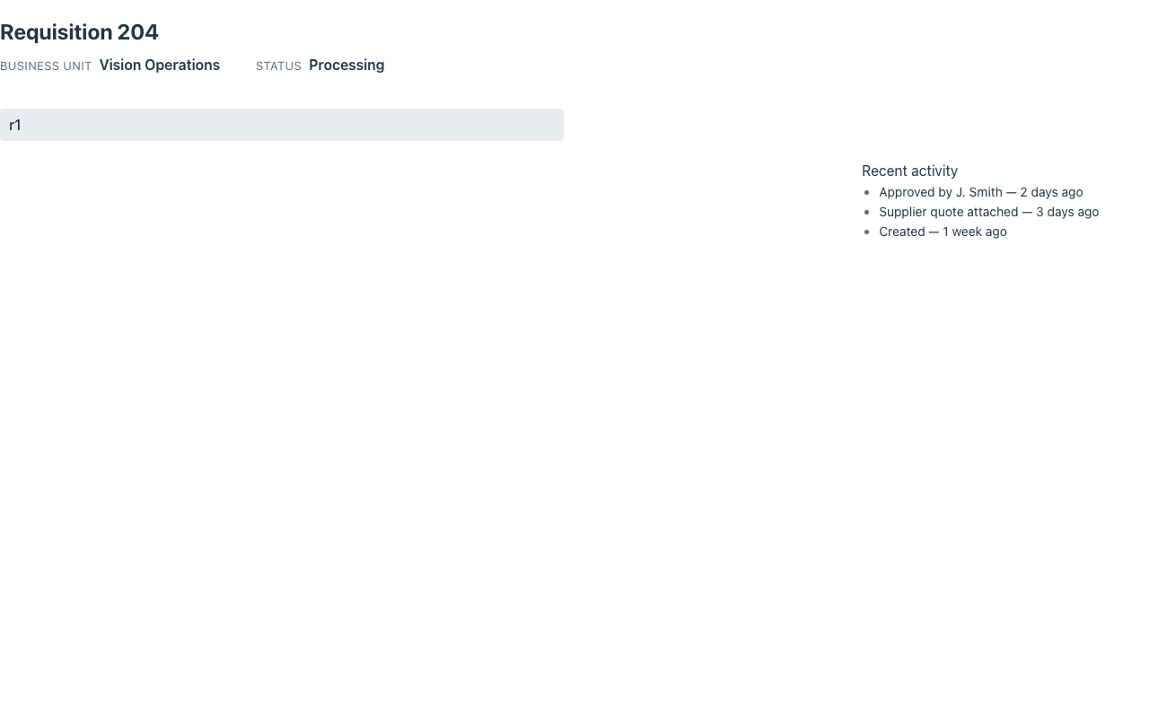
The GeneralOverview<Row> archetype renders a context switcher at the top (a select listing your records) and the selected record’s overview below, re-rendered in place when the user picks another record — no navigation.
@UI("/requisitions")@Title("Requisitions")public class RequisitionOverview extends GeneralOverview<Requisition> {
  @Autowired RequisitionRepository repo;
  @Override  protected List<Option> switcherOptions(HttpRequest rq) {    return repo.findAll().stream().map(r -> new Option(r.id(), r.title())).toList();  }
  @Override  protected Requisition load(String id, HttpRequest rq) { return repo.findById(id); }
  @Override  protected Component overview(Requisition r, HttpRequest rq) {    return VerticalLayout.builder().content(List.of(        EntityHeader.builder()          // the metadata strip: title + badges + facts + metric            .title(r.title())            .facts(List.of(Fact.builder().label("Business Unit").value(r.unit()).build()))            .metricLabel("Amount").metricValue(r.amount())            .build(),        Card.builder().title(new Text("Details")).build()   // … the property cards    )).build();  }}
The first record is selected by default. emptyOverview() customizes what shows when nothing is selected, and recordLabel() labels the switcher (unlabelled by default). Pair the header with Cards, StatusLists or property rows for the record body — or an embedded routed island when the detail needs its own actions.
The info slot
Section titled “The info slot”The Redwood general overview is main + info: the overview, and a contextual side panel with
secondary, read-only context — related contacts, recent activity, notes. Override info(row, rq):
@Overrideprotected Component info(Requisition r, HttpRequest rq) {  return Card.builder().content(activityOf(r)).build();}
@Overrideprotected GeneralOverviewDisplay display() {   // optional  return GeneralOverviewDisplay.defaults().toBuilder().promoteInfoSlot(Toggle.on).build();}
On wide pages the panel sits beside the overview (infoWidth(), default 20rem); below 48rem the
two stack. promoteInfoSlot (the Redwood display option of the same name, default off) puts
the info panel ABOVE the overview when they stack. display().info() = off drops the panel.
Composed on the one responsive grid (a ResponsiveGrid template "main info"), so every renderer
draws it.
A switcher in the header of any page
Section titled “A switcher in the header of any page”This archetype’s switcher is a field in the page body. For a record or context switcher in the
page header — on any page, not just this one, with type-ahead search and the
object/context distinction — implement RecordSwitcherSupplier; see
Page templates › record switcher.
Coverage
Section titled “Coverage”| Java | .NET | Python | Vaadin | Redwood | React Native | IntelliJ | |
|---|---|---|---|---|---|---|---|
| Switcher + overview | ✅ | ✅ | ✅ | ✅ | ✅ | ✅ | ✅ |
info slot | ✅ | ✅ | ✅ | ✅ | ✅ | ✅ | ✅ |
promoteInfoSlot | ✅ | ✅ | ✅ | ✅ | 🟡 ¹ | ✅ | ✅ |
¹ Redwood places the info panel in its column; when the layout stacks it keeps the main-first order.
Redwood parameter and slot reference
Section titled “Redwood parameter and slot reference”What the Redwood general-overview-page template exposes, and what Mateu gives you for it. The
canonical page-header elements shared by every template — title, avatar, status badge, @KPI
facts, @Timestamp, peer navigation — are documented once in
Page templates; this table covers what is specific to this one.
Legend: ✅ supported · 🟡 partial · — not supported · ⚪ deliberately out of scope
| Redwood prop / slot | Mateu | |
|---|---|---|
selectContext / selectObject {data, itemText, secondaryText, avatar, icon} | switcherOptions(HttpRequest) returning Options | ✅ |
selectContextValue / selectContextItem (controlled selection) | the public record field, set by the switcher | ✅ |
dataSwitcherType: context | object | the header switcher (RecordSwitcherSupplier, RecordSwitcher.type); this archetype’s body switcher has no type | 🟡 |
displayOptions.switcherSearch (type-ahead inside the switcher) | the header switcher’s RecordSwitcher.searchable | 🟡 |
displayOptions.promoteInfoSlot | GeneralOverviewDisplay.promoteInfoSlot | ✅ |
displayOptions.contextualInfoLabel / contextualInfoSticky | @KPI facts render, but neither toggle exists | 🟡 |
displayOptions.density: standard | compact | @Compact, set on the view rather than as a template option | 🟡 |
previousItem / nextItem + spPreviousItem / spNextItem | PeerNavigationSupplier → PeerNav | ✅ |
Slot main | overview(Row, HttpRequest) | ✅ |
Slot info (contextual side panel) | info(Row, HttpRequest) + infoWidth() | ✅ |
Slot search | the app-level smart search bar / ⌘K palette, not a page slot | 🟡 |
Slot announcement (aria-live) | UICommand.announce(text) from any action | ✅ |
| Switcher change event | switchRecord — re-renders in place, no navigation | ✅ |
Mateu adds two things the Redwood template has no equivalent for: emptyOverview() (what shows
before anything is selected) and load(String id, HttpRequest) as an explicit data port, so the
switcher never carries the record payload.
demo-admin-panel/.../generaloverview/RequisitionOverview.java (/general-overview-demo). Tests: GeneralOverviewSyncTest.