

Page types
Every page of a Mateu app belongs to one of six page types. The type is a business decision
(what is the user doing on this screen?), not a layout decision, and it is the first thing to
settle for each screen. The names follow the families of the Oracle Redwood page templates, the
clearest public taxonomy for business UIs, and every page carries its type on the wire as
pageType.
| Type | The user is… | Typical templates | Default width |
|---|---|---|---|
| Collection | finding things in a set: searching, listing, opening, editing | CRUD, smart search, to-do list, calendar, collection detail, data management | from the content |
| Detail | looking at one thing in depth | item overview, general overview, foldout, Gantt page | from the content |
| Form | completing one task: some fields, one action | create & edit, advanced create & edit, task-centric page | fixed |
| Process | moving through steps toward a result | wizard (bar, steps, rail), guided import | fixed |
| Dashboard | monitoring numbers to decide what needs attention | dashboard | from the content |
| Landing | arriving: orientation and ways in | welcome, hero search | fixed |
To pick a type, ask at most three questions, in order:
- Many records or one? Many → collection. One → detail.
- Is the user changing something? In one shot → form. Across steps → process.
- Neither? Watching numbers → dashboard. It’s the front door → landing.
Then pick the template within the type with the decision guide, Choosing a page template, and see every template with its demo route in Page templates.
How a page gets its type
Section titled “How a page gets its type”A page’s type is resolved in this order:
- Declared. In Java
@PageTemplate(PageType.DASHBOARD), in C#[PageTemplate(PageType.Dashboard)], in Python@page_template(PageType.DASHBOARD). In YAML, a definition declares it with thepageType:key (for examplepageType: dashboard), using the same six names as the wire. - From the archetype. Each archetype belongs to one type (the tables below say which).
- From the shape. A
Listingor CRUD is a collection; a view withMetricCardfields is a dashboard; a view made only ofButtonand component fields that@AutoPagecomposes as a welcome page is a landing; anything else is a form.
Inference goes one step further for the two shapes Mateu can derive entirely: with
@AutoPage, a class of
MetricCard fields is composed as a dashboard, and a class of Button fields and panels as a
welcome page. For other shapes Mateu only advises: a plain form that looks like a known template
(a selectable list next to a detail pane, for instance) logs a one-time hint naming the archetype.
Below the type, @AutoLayout infers sections, tabs and widgets.
What the type changes:
- the page’s default width (below);
- the
data-page-typeattribute on the rendered page, a hook for stylesheets; - a shared vocabulary for docs, conformance tests and the IDE page templates.
Page width
Section titled “Page width”Width is the first parameter of every page template:
| Width | What it does | Good for |
|---|---|---|
| Fixed | caps the content column at 1408 px and centres it | text and forms, which get harder to read when too wide |
| Full width | fluid, keeping 24 px side gutters | dense grids and tables |
| Edge to edge | no side margins | canvases: Gantt, planning board, foldout, map |
Resolution order: a declaration (@PageWidth(FULL_WIDTH), C# [PageWidth(PageWidthStyle.FullWidth)],
Python @page_width(PageWidth.FULL_WIDTH), or the PageWidthSupplier hook) wins. Otherwise
form, process and landing pages are fixed, and collection, detail and dashboard pages are
inferred from their content: full-bleed canvases (Gantt, planning board, kanban, BPMN, map) → edge
to edge, a dense or inline-editable CRUD → full width, anything else → fixed. Three archetypes
declare theirs: Foldout and GanttPage are edge to edge, DataManagement is full width.
In YAML, the IDE’s New › Mateu › Page… wizard writes the chosen width into the root layout’s
style (see IDE tooling).
Collection
Section titled “Collection”For: finding, comparing and acting on records in a set.
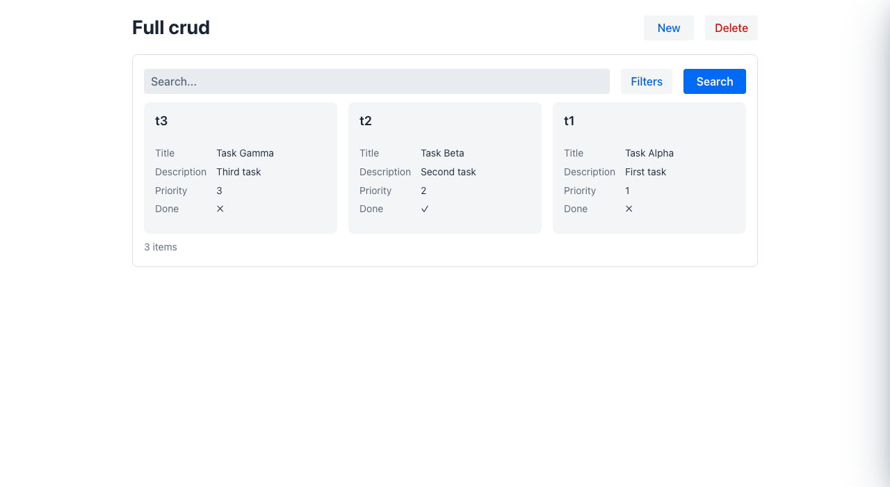
Anatomy: page header with the primary action (New), the smart search bar (free text + typed filter chips + saved views), the results (table, list, cards, tree or master-detail), pagination, and selection-driven bulk actions. A row opens the record, or edits it in a drawer.
Components you meet here: Listing, GridColumn, the filter bar, Badge/status columns,
EmptyState, TaskQueue, Calendar, Kanban.
| Template | Archetype or piece | Detail |
|---|---|---|
| Create & edit (CRUD) | AutoCrud<T> / Crud<…> | Create and edit |
| Listing with capabilities | Listing<Row> + Searchable, Filterable, Navigable, Editable, Creatable, Deletable | Capability listings |
| Smart search page | SmartSearchPage<Filters, Row> | Smart search |
| To-do list | TodoList<Row> | To-do list |
| Calendar | CalendarPage | Calendar |
| Collection detail | CollectionDetail<Row> | Collection detail |
| Data management (grid ⇄ Gantt) | DataManagement | Data management |
| Split view, tree | @SplitCrud, GridLayout.tree | Split view, Tree CRUD |
Listing behaviours worth knowing: filters and listing, bulk actions, saved views, totals and grouping, column chooser, inline editing, guided import.
# specs/ui/orders.yaml: rows from a named source; a row opens the recordtype: Listingtitle: Orderssearchable: truerowsSource: ref: ordersrowRoute: orders/${row.id}toolbar: - {type: Button, label: New, actionId: new, buttonStyle: primary}filters: - {type: FormField, id: status, label: Status, dataType: string, stereotype: select, options: [{value: open, label: Open}, {value: closed, label: Closed}]}columns: - {type: GridColumn, id: customerName, label: Customer, sortable: true} - {type: GridColumn, id: total, label: Total, dataType: money, align: end} - {type: GridColumn, id: status, label: Status, dataType: status}@UI("/products")public class Products extends AutoCrud<Product> { @Override public CrudStore<Product> store() { return productStore; // your CrudStore<Product> }}C#: class Products : Crud<Product>. Python: class Products(Crud[Product]).
Detail
Section titled “Detail”For: understanding one record in depth, and moving to its peers.
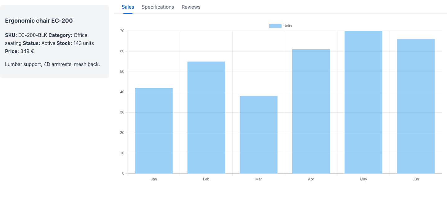
Anatomy: a rich page header (title, status badges, KPIs, timestamp, peer navigation or a record switcher), then the record’s information grouped into panels: a sticky key-info panel and tabs, property cards, lateral fold-out panels, or a canvas with a docked detail.
Components you meet here: EntityHeader, Card with property-list sections,
TabLayout, FoldoutLayout, ContentLayout (main + aside), Timeline, Gantt.
| Template | Archetype or piece | Detail |
|---|---|---|
| Item overview | ItemOverview | Item overview |
| General overview | GeneralOverview<Row> | General overview |
| Foldout | Foldout | Foldout |
| Gantt page | GanttPage | Gantt |
| Master-detail, editable view | MasterDetailView, EditableView / AutoEditableView | Editable view, master-detail |
| Waterfall detail | composition: EntityHeader + full-width cards | Waterfall detail |
| Detail without leaving the page | a read-only Drawer | Drawer |
# Key information on the left, the rest of the record in tabs on the righttype: HorizontalLayoutcontent: - type: Card style: "flex: 0 0 22rem; position: sticky; top: 0;" title: {type: Text, text: Ergonomic chair EC-200} content: type: FormLayout content: - {type: FormField, id: sku, label: SKU, dataType: string, readOnly: true, propertyRow: true} - {type: FormField, id: price, label: Price, dataType: money, readOnly: true, propertyRow: true} - type: TabLayout tabs: - {type: Tab, label: Details, active: true, content: {type: Text, text: Details go here}} - {type: Tab, label: History, content: {type: Text, text: History goes here}}@UI("/product/:id")@Title("Ergonomic chair EC-200")public class ProductOverview extends ItemOverview {
Markdown keyInfo = new Markdown("**SKU:** EC-200-BLK · **Price:** 349 €", null, null);
@Panel(title = "Specifications") Markdown specs = new Markdown("| Property | Value | …", null, null);
@Panel(title = "Reviews") Markdown reviews = new Markdown("⭐⭐⭐⭐⭐ …", null, null);}The first component field without @Panel is the sticky key-info panel; each @Panel field is a
tab.
For: completing one task: enter or change some fields and run one action.
Anatomy: page header (title, perhaps a timestamp and KPIs), the fields grouped into sections,
validation messages at the field, and the closing actions in the footer (Cancel, Save). Long
forms add a sticky section index (@Toc) or a contextual side panel (@Aside).
Components you meet here: Form, FormLayout, FormField with its
stereotypes, FormSection, Notice, Button.
| Template | Archetype or piece | Detail |
|---|---|---|
| Create & edit | a plain @UI class, or the forms of an AutoCrud | Create and edit |
| Advanced create & edit | sections + @Toc or @Aside, header extras | Advanced create & edit |
| Task-centric page | one task, one primary action | Task-centric page |
| Partial forms | folded or optional groups | Partial forms |
type: Formtitle: New customercontent: - type: FormLayout content: - {type: FormField, id: name, label: Name, dataType: string, required: true} - {type: FormField, id: email, label: Email, dataType: string, stereotype: email} - {type: FormField, id: notes, label: Notes, dataType: string, stereotype: textarea, colspan: 2}buttons: - {type: Button, label: Cancel, actionId: cancel, buttonStyle: secondary} - {type: Button, label: Save, actionId: save, buttonStyle: primary}Bind it to a route with a view model that handles save, or give it an actions: entry with a
restAction for a page with no backend.
@UI("/feedback")@AutoLayoutpublic class Feedback {
  @NotEmpty String subject;  @Stereotype(FieldStereotype.textarea) String details;
  @Button  Message send() {    return new Message("Thanks!");  }}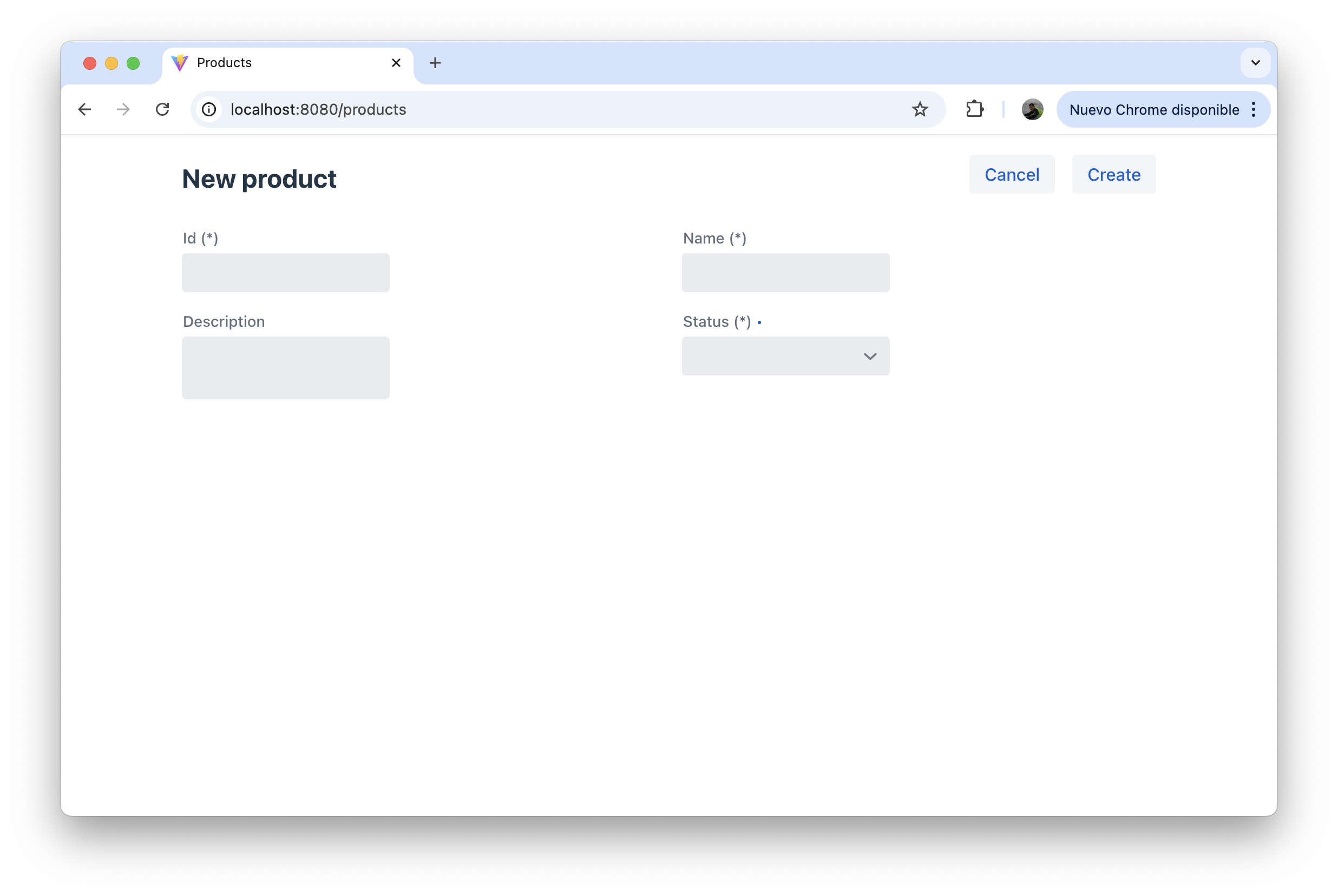
Process
Section titled “Process”For: reaching a result through ordered steps: onboarding, check-in, an import, an end-of-day run.
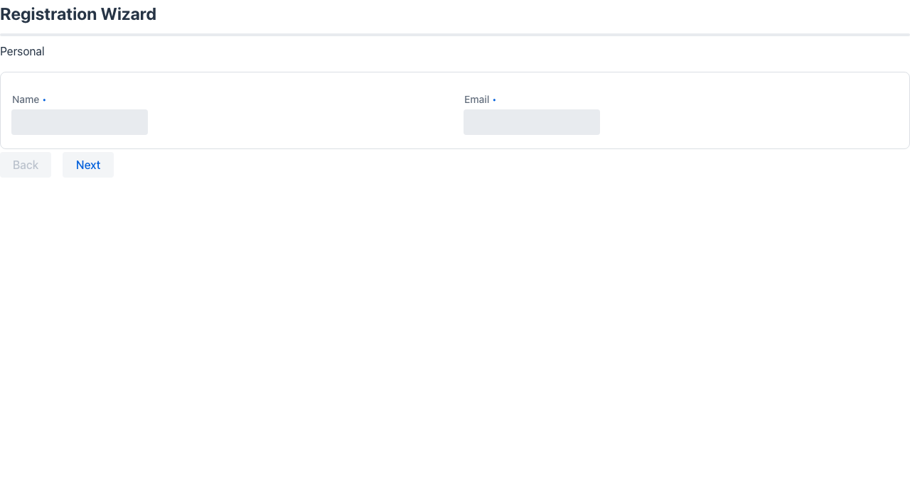
Anatomy: the step’s form, a progress indicator (a bar, numbered steps, or a sticky side rail
with a current | total counter), Back / Next, the completion action on the last input step,
and a read-only result step.
Components you meet here: ProgressBar, ProgressSteps, Form, Notice, and for long
jobs the long-running job progress.
| Template | Archetype or piece | Detail |
|---|---|---|
| Step-by-step / guided process | Wizard + @WizardProgress(STEPS | RAIL) | Wizard |
| Guided import | ImportWizard<Row> | Guided import |
| A process inside a drawer | Drawer + an embedded wizard | Guided process drawer |
# One definition per step (signup/1, signup/2…), each routed; Next navigates to the next steptype: Formtitle: Sign upcontent: - {type: Text, text: "Step 1 of 3 — Your details", size: s} - {type: ProgressBar, value: 0.33} - type: FormLayout content: - {type: FormField, id: fullName, label: Full name, dataType: string, required: true} - {type: FormField, id: email, label: Email, dataType: string, stereotype: email, required: true}buttons: - {type: Button, label: Next, actionId: next, buttonStyle: primary}actions: - id: next steps: - {type: Navigate, route: signup/2}@UI("/onboarding")@WizardProgress(WizardProgressStyle.STEPS)public class Onboarding extends Wizard {
AccountTypeStep accountType = new AccountTypeStep(); // each step: a class implementing WizardStep CompanyStep company = new CompanyStep(); OnboardingResult result; // the last step: read-only result
@WizardCompletionAction Object finish() { accounts.create(accountType, company); return null; }}The Wizard archetype handles navigation, progress, cross-step state and branching
(stepApplies).
Dashboard
Section titled “Dashboard”For: seeing at a glance what needs attention, and drilling in.
Anatomy: a band of KPI cards (each optionally clickable), then a responsive grid of titled tiles (charts, short lists, notes). No form, no footer.
Components you meet here: Scoreboard, MetricCard, DashboardLayout, DashboardPanel,
Chart, TrendChart, Stat, Meter, Funnel, Heatmap.
| Template | Archetype or piece | Detail |
|---|---|---|
| Dashboard | Dashboard, or a class of MetricCard fields with @AutoPage | Dashboard |
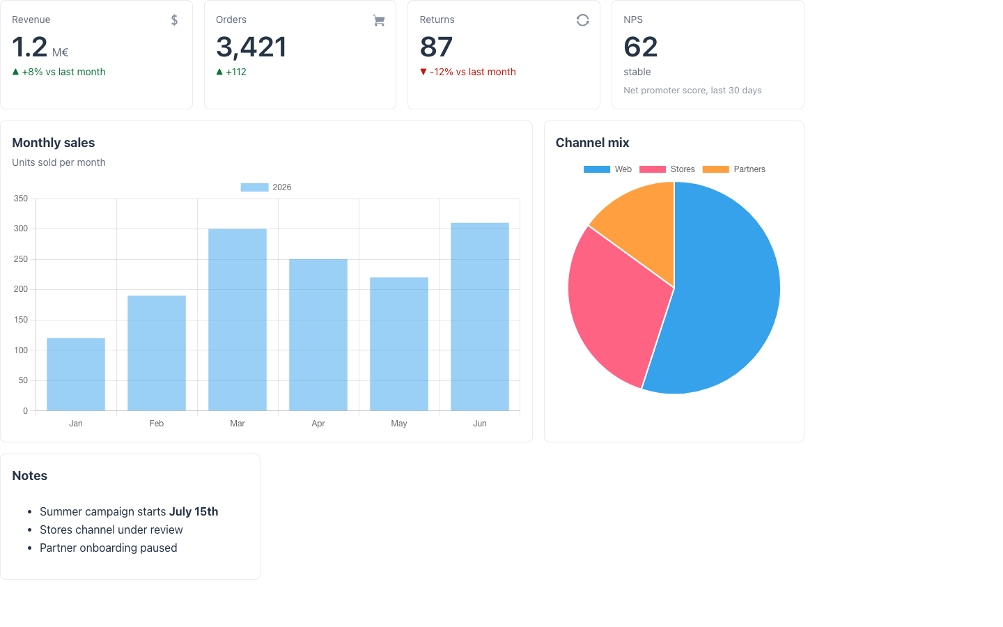
type: VerticalLayoutcontent: - {type: Text, text: Sales, container: h2} - type: Scoreboard metrics: - {type: MetricCard, title: Revenue, value: "1.2M", unit: EUR, trend: up, trendLabel: +8% vs last month} - {type: MetricCard, title: Orders, value: "3,480", trend: up, trendLabel: +3%} - type: DashboardLayout columns: 2 items: - {type: DashboardPanel, title: Sales by region, content: {type: Text, text: Put a Chart here}} - {type: DashboardPanel, title: Latest orders, content: {type: Text, text: Put a Listing here}}@UI("/dashboard")@Title("Sales dashboard")public class SalesDashboard extends Dashboard {
MetricCard revenue = MetricCard.builder() .title("Revenue").value("1.2").unit("M€") .trend(MetricTrend.up).trendLabel("+8% vs last month").build();
@Panel(title = "Notes") Markdown notes = new Markdown("- Summer campaign starts **July 15th**", null, null);}Consecutive MetricCard fields form the KPI band; @Panel fields become tiles.
Landing
Section titled “Landing”For: the front door of an app or a workflow: orientation and a few ways in.
Anatomy: a hero (title, subtitle, optional image or tone) with calls to action, then highlight tiles; or a hero hosting a search with results as cards.
Components you meet here: HeroSection, Button, DashboardLayout, FeatureGrid,
CalloutCard, Listing as cards.
| Template | Archetype or piece | Detail |
|---|---|---|
| Welcome | Welcome, or @WelcomeBanner on any page | Welcome page |
| Hero search | HeroSearch<Filters, Row> | Hero search |
type: VerticalLayoutcontent: - type: HeroSection title: Front desk subtitle: Everything you need, one click away. centered: true content: - {type: Button, label: Start check-in, actionId: startCheckin, buttonStyle: primary} - type: DashboardLayout columns: 3 items: - {type: DashboardPanel, title: Arrivals, content: {type: Text, text: Today's arrivals.}} - {type: DashboardPanel, title: Departures, content: {type: Text, text: Today's departures.}}@UI("/welcome")public class FrontDesk extends Welcome {
Button start = Button.builder() .label("Start check-in").actionId("startCheckin") .buttonStyle(ButtonStyle.primary).build();
@Panel(title = "Arrivals") Markdown arrivals = new Markdown("Today's arrivals.", null, null);
@Override protected String heroTitle() { return "Front desk"; }
@Action Object startCheckin() { return URI.create("/checkin"); }}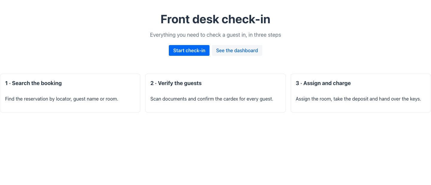
When no template fits
Section titled “When no template fits”The templates are a starting point, not a cage. Every archetype is a composition of ordinary
components, so the same pieces compose freely in a page of your own (ContentLayout,
EntityHeader, HeroSection, TaskQueue, Card…), and a page you compose still declares its
type with @PageTemplate or pageType:. When even composition is not enough, see
Extending the UI.
See also
Section titled “See also”- Choosing a page template: the decision guide.
- Page templates: every template, its demo route, its Redwood status, and the shared header grammar.
- The Mateu Way: the six starting points in code, and the ladder of control.
- Layout inference: what Mateu decides below the type.