

Layout inference
Status: ✅ Implemented
Intent
Section titled “Intent”Let the developer declare only the information — which fields exist, which are required, how they are grouped — and let Mateu decide how to present it: fold the optional fields away, turn a long read-only page into tabs, render a small enum as radio buttons. The class stays a plain data declaration; the UX pattern is inferred.
Problem
Section titled “Problem”Choosing the right presentation for a form is repetitive design work: a long editable form should not bury its required fields under twenty optional ones; a heavy read-only record reads better with random access than as an endless scroll; a three-value enum deserves radio buttons, not a dropdown hiding its options. Developers either hand-tune every screen with layout annotations or ship the default flat form and let usability suffer.
Solution
Section titled “Solution”Annotate the class with @AutoLayout:
@UI("/customers/new")@AutoLayoutpublic class NewCustomerForm {
    public enum Segment { RETAIL, BUSINESS, ENTERPRISE }
    @NotNull String name;    @NotEmpty String email;    @NotNull String phone;    @NotNull Segment segment = Segment.RETAIL;
    @Stereotype(FieldStereotype.textarea) String deliveryNotes;    @Stereotype(FieldStereotype.textarea) String billingNotes;    @Stereotype(FieldStereotype.textarea) String internalNotes;    @Stereotype(FieldStereotype.textarea) String marketingPreferences;    String website;    String vatNumber;}
Nothing in this class says “accordion”, “tabs” or “radio” — yet the rendered form keeps the four required fields visible, collapses the six optional ones into a More options panel, and renders segment as radio buttons.
Inference is deterministic: every decision is based on the declared structure — number of sections, estimated visual weight of the fields, required vs optional — never on runtime data. The same class always renders the same way.
Determinism is not the same as stability under model evolution, though: the rules are threshold-based, so adding or removing a field can flip the inferred layout when the class crosses a threshold (that is the point of inference — the presentation follows the information). To make that visible instead of surprising, Mateu logs a one-time warning when a class under @AutoLayout sits within 2 weight units (or one section) of a threshold:
WARN @AutoLayout stability: com.acme.NewCustomerForm is close to the 'fold-optionals'threshold: weight 15 is within 2 units of the threshold (16) — adding or removing afield may flip the inferred layout. Pin the layout with explicit annotations(@Section, @Tab, @FoldedLayout…) if it must not change as the model evolves.If a screen’s layout must not change as the model evolves, pin it with explicit annotations — explicit always wins, so inference steps aside.
The weight unit
Section titled “The weight unit”Rules are measured in standard field-row units (1 = one regular input), so thresholds hold across very different field mixes: a textarea, rich-text, HTML, markdown or image field counts as 4, a grid or nested component as 6, radio/checkbox as 2, and anything else as 1.
Rule 1 — fold optionals into “More options”
Section titled “Rule 1 — fold optionals into “More options””On an editable form where you declared no grouping at all (no sections, no tabs) and the estimated weight exceeds one screen (> 16 units), the required fields stay visible and the optional fields are collapsed into a More options accordion panel. The rule needs at least one required and at least four optional fields to be worth applying, and it never fires when the form contains tabs, @Inline subforms or embedded components — their layout is not Mateu’s to rearrange.
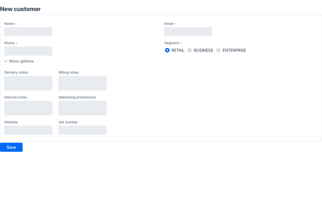
Folding regroups, never drops: every field still reaches the browser and round-trips normally.
Rule 2 — read-only sections become adaptable tabs
Section titled “Rule 2 — read-only sections become adaptable tabs”A long read-only view (the render context is read-only, or the class is @ReadOnly) with many substantial sections — at least 5 sections totalling ≥ 30 weight units — reads better with random access than as a long vertical stack, so the sections are presented as tabs, one per section:
@UI("/customers/360")@AutoLayout@ReadOnlypublic class Customer360 {
    @Section("Profile")  @Stereotype(FieldStereotype.textarea) String summary = ...;    @Stereotype(FieldStereotype.textarea) String address = ...;
    @Section("Billing")  @Stereotype(FieldStereotype.textarea) String billingTerms = ...;    // ... Shipping, Activity, Notes ...}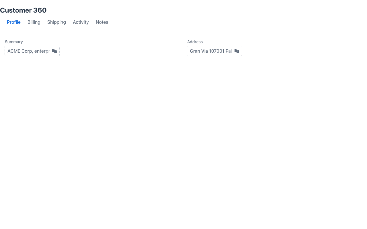
The rule applies to read-only views only: on an editable form, hiding groups behind tabs could hide an invalid required field from the user, so editable sections always stay stacked.
Rule 3 — small enums as radio buttons
Section titled “Rule 3 — small enums as radio buttons”An enum field with up to 4 constants renders as radio buttons instead of a dropdown: every option is exposed at a glance for the cost of one extra row. Beyond 4 constants the dropdown stays, as it is denser.
To force radio buttons regardless of the enum size — with or without @AutoLayout — annotate the field with @UseRadioButtons (equivalent to @Stereotype(FieldStereotype.radio), but self-documenting).
Page-level inference: @AutoPage
Section titled “Page-level inference: @AutoPage”The same idea, one altitude up: @AutoLayout infers the presentation of a form; @AutoPage
infers the page archetype from the declared information.
Page inference is on by default: a plain view whose shape spells an archetype composes it
automatically — you don’t need to annotate anything. The template is the default inferred output;
you keep declaring data and override when you want to. @AutoPage(false) opts a class out (keeping
the plain-form rendering), and a global switch disables it everywhere. The explicit @AutoPage
below is therefore optional — it’s shown for clarity.
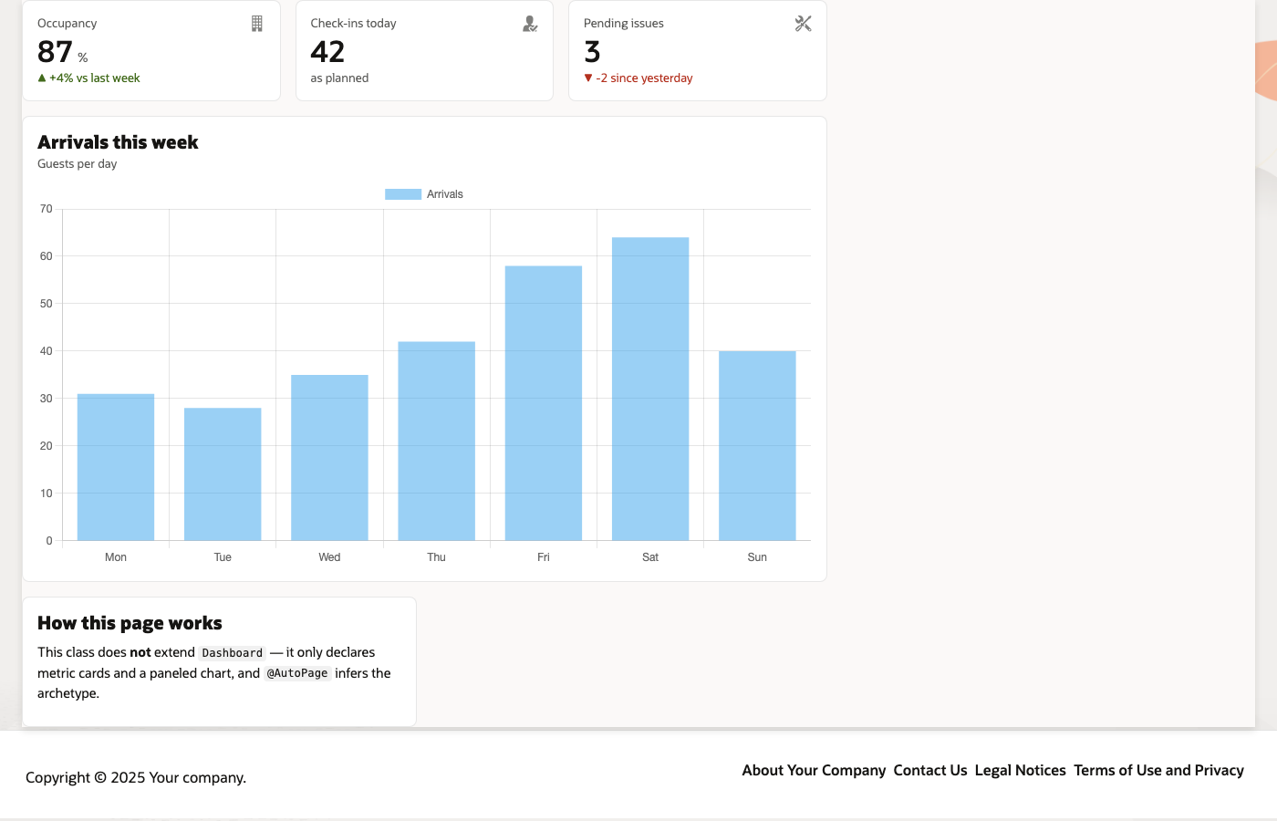
@UI("/ops")public class Ops {
  MetricCard revenue   = MetricCard.builder().title("Revenue").value("1.2").unit("M€").build();  MetricCard occupancy = MetricCard.builder().title("Occupancy").value("87%").build();
  @Panel(title = "Monthly sales")  Text sales = ...;}
Nothing in this class extends Dashboard — yet it renders as one: the consecutive MetricCard
fields group into the KPI scoreboard band, the @Panel field becomes a titled tile on the grid,
and the page is typed dashboard on the wire. Actions keep routing to your class.
Demo: /auto-dashboard-demo in demo-admin-panel (InferredOpsDashboard) — compare with
/dashboard-demo (SalesDashboard), which declares the same intent by subclassing.
The same applies to landings: a class declaring only Button fields and @Panel tiles — no
data fields — composes the Welcome archetype: buttons become hero calls-to-action (the hero
title comes from @Title) and panels become highlight tiles. A single data field keeps the class
a form: a page made only of calls-to-action is a landing; a form that happens to have a button is
not.
Rules are deliberately few and only cover archetypes that are fully derivable from the
declared fields (today: the dashboard and welcome rules). Shapes that resemble an archetype but would need
information you didn’t declare — like CollectionDetail’s id/title functions — are not composed;
instead Mateu logs a one-time hint naming the archetype so you can adopt it explicitly.
Explicit always wins: archetype subclasses, listing backends and fluent component trees are never
rewritten, @AutoPage(false) opts a class out (and -Dmateu.page.inference.disabled=true — the
Mateu.PageInference.Disabled switch in C#, the same convention in Python — turns it off globally),
and extending the archetype remains the way to take fine control (e.g. columns()).
@Aside — a content-page from a plain form
Section titled “@Aside — a content-page from a plain form”The minimal way to get the Redwood content-page grammar without composing anything: on an ordinary
form, mark one component-holder field @Aside. That field is pulled out of the form body and placed
in the contextual aside; the rest of the form becomes the main region of a ContentLayout
(the aside sits beside main on wide viewports and stacks under it when narrow; position/width/
sticky come from the annotation). You keep declaring data as usual and just point at the one
supporting panel that belongs to the side.
@UI("/profile")public class Profile {  String name;  String email;
  @Aside(width = "20rem")  Markdown help = new Markdown("Need help? Contact support.");}
@AutoPage and @Aside have full backend parity: [AutoPage]/[Aside] in C# and
@auto_page/Aside() in Python apply the same rules and emit the same wire.
Guarding against flips in CI
Section titled “Guarding against flips in CI”Inference means a model change can legitimately flip a page’s template. To make that a reviewed decision instead of a surprise, pin your screens’ fingerprints in a golden test:
assertThat(PageFingerprint.of(Ops.class)) .isEqualTo("pageType=dashboard composes=dashboard");PageFingerprint.of(...) captures the page-level decisions (pageType + composed archetype);
when a change flips one, the test fails with a readable diff. The runtime
threshold-proximity warning covers the form-level rules the same way.
Staying in control
Section titled “Staying in control”Inference only fills the gaps you left open — it never overrides a decision you made:
- Explicit annotations always win.
@Section,@Tab,@Zones,@FoldedLayout,@Toc,@Stereotype,@UseRadioButtons… are respected as declared; inference works around them or steps aside. - The tabs rule has explicit opt-outs: a
@Section(sticky = true)section or a class-level@Tocmeans you chose the pinned/scroll layout, so sections are never turned into tabs;@Zonesand@FoldedLayoutlayouts are likewise untouched. - Per-class opt-out:
@AutoLayout(false)disables inference for one class when it is enabled globally. - Global opt-in: set the
mateu.layout.inferencesystem property totrueto enable inference for every class without annotating each one — then use@AutoLayout(false)on the exceptions. - Composable:
@AutoLayouttargetsANNOTATION_TYPEtoo, so it can be bundled into your own semantic annotations (e.g. a company-wide@StandardForm).
Renderer adaptation: groupRelationship and adaptable
Section titled “Renderer adaptation: groupRelationship and adaptable”Inference does not just pick a widget — it tells the renderer what the grouping means, so each renderer (web, desktop, mobile) can adapt it to its medium. The tab layout on the wire carries two semantic hints:
groupRelationship— the semantic relation between the groups:alternative(the user looks at one group at a time — what tabs express),sequential(steps), orsimultaneous(side by side). Developer-declared tabs and inferred section-tabs both emitalternative.adaptable—truewhen the class is under@AutoLayout: the developer delegated the presentation, so a renderer may degrade the tabs to an accordion on a narrow viewport without losing the disclosure semantics. Tabs declared on a class without@AutoLayoutstill carry theirgroupRelationship, but are markedadaptable: false— the developer asked for tabs, so tabs they get.
The limits of inference
Section titled “The limits of inference”Inference has a ceiling, and it is not an implementation gap that a future version will close — it is a limit on what your model contains. Knowing where it sits saves you waiting for something that cannot arrive.
Mateu infers presentation from shape. It can do that because shape and presentation are tightly
correlated: six short optional fields are a foldable group; a class of MetricCard fields is a
dashboard.
Page family, though, comes from a different place. The Redwood decision model that the six families come from starts at the user’s goal:
user goal → category → data density → template → fixed anatomyMateu starts at the data model. That distance is the ceiling. A list of records could be a table, a calendar, a kanban, a planning board or a triage queue — the same shape, five different user goals. No amount of inference separates them, because the information is not in the model.
So Mateu only composes the families that are fully derivable from what you declared
(MetricCard fields → Dashboard; a page of Button calls-to-action → Welcome). For everything else
it can at most hint — the advisor logs “this looks like a CollectionDetail” — and you pick,
which is exactly what The Mateu Way asks you to do first.
That is not a limitation to work around. It is the one decision the framework needs from you, and it takes one annotation.
- The decision table lives in
LayoutInference(core,componentmapper), and it is the reference implementation: the C# and Python backends port the exact same rules and thresholds, so the wire JSON is identical whichever server emits it. - The thresholds are constants of that class:
RADIO_MAX_OPTIONS = 4,FOLD_WEIGHT_THRESHOLD = 16,FOLD_MIN_OPTIONAL = 4,TABS_MIN_SECTIONS = 5,TABS_WEIGHT_THRESHOLD = 30. - Behaviour is asserted end to end in
LayoutInferenceSyncTest(core), including that classes without@AutoLayoutkeep the exact previous rendering.
When to use it
Section titled “When to use it”Put @AutoLayout on forms and record views whose layout you have no strong opinion about — quickly-built back-office screens, generated CRUD models, prototypes — and keep hand-tuned layouts (@Zones, @Toc, sticky sections, explicit tabs) for the screens you designed deliberately. Since explicit annotations always win, it is safe to enable globally with mateu.layout.inference and refine individual screens later.