

Drawer
Status: ✅ Implemented
Intent
Section titled “Intent”Let an action open another form — an editor, a picker, a detail — in a panel that slides in from the side, without leaving the page underneath. On close, notify the host page so it can refresh itself or receive the result.
Problem
Section titled “Problem”Centered modal dialogs hide the page context and feel heavyweight for quick side tasks. Navigating away to a second page loses the user’s place entirely. Dense operational screens (check-in desks, back offices) need “edit this bit” interactions that keep the main record visible.
Return a Drawer from any action method. Its content is any component — typically a form:
@Toolbar@Label("Editar en drawer")Drawer editContact() { return Drawer.builder() .headerTitle("Editar contacto") .position(DrawerPosition.end) // end (default) or start .width("28rem") .content(new ContactEditDrawerForm()) .build();}The drawer slides in over a backdrop and closes on the header ✕, on Esc, on a backdrop click, or when an action run from inside it returns a close command. modeless(true) drops the backdrop so the page stays interactive.
Closing with a result
Section titled “Closing with a result”UICommand.closeModal(...) has three forms:
UICommand.closeModal() // just close the topmost overlayUICommand.closeModal("contact-saved") // close + emit an eventUICommand.closeModal("contact-saved", payload) // close + emit an event carrying the resultThe emitted event goes through the standard component-communication bus, so the host page reacts with @SubscribeTo — the payload arrives as the action’s parameters:
@UI("/drawer-demo")@SubscribeTo(event = "contact-saved", action = "load", source = SubscriptionSource.DOCUMENT)public class DrawerDemo {
  @PlainText String nombre = ContactHolder.nombre;
  @Action  Object load() {    nombre = ContactHolder.nombre;    return new State(this);      // refresh the page in place  }}
Inside the drawer, the save handler persists and closes in one return:
@Overridepublic Object handleAction(String actionId, HttpRequest httpRequest) { if ("save-contact".equals(actionId)) { var edited = httpRequest.getComponentState(ContactData.class); ContactHolder.nombre = edited.nombre; return List.of( Message.success("Contacto guardado"), UICommand.closeModal("contact-saved", Map.of("nombre", edited.nombre))); } return null;}The same closeModal(eventName, payload) contract works for Dialog too — it closes whichever overlay is topmost. Overlays stack: a drawer can open another drawer (or a dialog), and each close unwinds only the topmost one.
demo-admin-panel/.../drawer/DrawerDemo.java (/drawer-demo): a contact card whose toolbar action opens the editor in a right-hand drawer; saving closes it, toasts, and refreshes the card in place.
- Closing via ✕, Esc or the backdrop emits no event — that’s the “dismissed without saving” path, and the host is intentionally not disturbed.
- Position
start/endmaps to the left/right edge. Width accepts any CSS length; the panel caps at 92vw. - Styling is design-system neutral (Lumo CSS variables with fallbacks), so it renders on every web renderer.
General Drawer — read-only detail (subtitle, sizes, maximize, peer navigation)
Section titled “General Drawer — read-only detail (subtitle, sizes, maximize, peer navigation)”The same Drawer doubles as the Redwood General Drawer: extra read-only info about an object
without leaving the page. Four header extras enrich it:
return Drawer.builder() .headerTitle("Ada Lovelace") .subtitle("Employee #100") .size(DrawerSize.l) // s=464 · m=648 · l=968 · xl=90vw (width overrides) .maximizable(true) // a ⤢ button bumps the drawer one size up (client-side) .peerNav(new PeerNav("Prev", "/staff/1", "Next", "/staff/3")) // ‹ › arrows in the header .content(readOnlyDetails) .build();sizepicks a standard width; an explicitwidthstill overrides it.maximizableshows a maximize button that steps the drawer up the size ladder (s→m→l→xl) entirely in the frontend — no server round-trip.peerNavputs the previous/next-object arrows (the samePeerNavused by page headers) in the drawer header; anullroute disables that side.subtitlerenders under the title.
Ported to .NET (DrawerSize, Drawer { Subtitle, Size, Maximizable, PeerNav }) and Python
(DrawerSize, Drawer(subtitle=…, size=…, maximizable=…, peer_nav=…)).
Bottom Drawer (DrawerPosition.bottom + collapsible)
Section titled “Bottom Drawer (DrawerPosition.bottom + collapsible)”Set position(DrawerPosition.bottom) to dock the drawer at the bottom edge, full width — the
Redwood Bottom Drawer. It slides up instead of in, and its height defaults to half the
viewport (--mateu-drawer-height, capped at 90vh). Add collapsible(true) for the
expand/collapse behavior: a ▾/▴ handle in the header shrinks the drawer to just its header strip
and expands it back — entirely client-side, no round-trip.
return Drawer.builder() .headerTitle("Detalles del pedido") .position(DrawerPosition.bottom) .collapsible(true) .content(orderLines) .build();Ported to .NET (DrawerPosition.Bottom, Drawer { Collapsible }) and Python
(DrawerPosition.bottom, Drawer(collapsible=…)).
Guided Process Drawer (a wizard in a drawer, EmbeddedView)
Section titled “Guided Process Drawer (a wizard in a drawer, EmbeddedView)”The Guided Process Drawer pattern runs a short multi-step process inside a drawer — a subflow
or a batch action (≤5 steps; a longer process uses the full-page wizard). Return a
Drawer whose content is a wizard wrapped in EmbeddedView:
@ToolbarDrawer requestAccess() { return Drawer.builder() .headerTitle("Request access") .size(DrawerSize.m) .content(new EmbeddedView(new RequestAccessWizard())) // the wizard, embedded .build();}EmbeddedView(view) embeds a routed model view (a Wizard, or any @UI view or routes.yaml route) as an
independent server-side component: it renders inside the drawer but routes its own actions
back to itself, so the wizard advances step by step inside the drawer instead of bubbling its
Continue/Back to the host. Its state is the view’s fields, serialised exactly as a page’s are — no
getters needed. Demo: /guided-process-drawer-demo.
A ModelViewComponent renders its view as part of the component around it. In a drawer or a
dialog that would be the page behind — the form’s fields would come up empty and its buttons run on
the host — so as the content of an overlay a ModelViewComponent wrapping a view is embedded
the same way, automatically. Outside overlays it keeps rendering inline.
The drawer header shows a step pager (2 | 3) driven live by the embedded wizard’s progress —
no extra wiring, it appears whenever the embedded wizard uses @WizardProgress(STEPS) or RAIL. As
a subflow surface the Guided Process Drawer is meant for short processes (≤ 5 steps); embedding a
longer wizard still works but logs a warning suggesting a full-page wizard
instead.
Batch action (one step per item)
Section titled “Batch action (one step per item)”The same shape drives a batch action — walk the user through a set of selected items, one review step per item, inside the drawer. Reuse a single step type across several step fields (one field = one step) so N items read as N screens without N step classes:
@WizardProgress(WizardProgressStyle.STEPS)public class BatchApprovalWizard extends Wizard {    public static class ReviewStep implements WizardStep {        @PlainText @Label("Requester") public String requester;        @PlainText @Label("System") public String system;        @Label("Decision") public Decision decision = Decision.APPROVE;
        public ReviewStep() {}   // the state round trip rebuilds steps with it
        public ReviewStep(String requester, String system) {            this.requester = requester;            this.system = system;        }    }    public ReviewStep first  = new ReviewStep("Ada",  "VPN");    public ReviewStep second = new ReviewStep("Bob",  "CRM");    public ReviewStep third  = new ReviewStep("Cleo", "Wiki");    public DoneStep done;
    // completion action on the WIZARD class — its button shows on the penultimate step    @WizardCompletionAction @Label("Apply decisions") void apply() { done = new DoneStep(); }}
The header pager tracks the batch (1 | 3 → 3 | 3). Because a Mateu wizard declares its steps as
fields, the batch size is fixed at authoring time; a batch whose size is only known at runtime is
the limit of this pattern — use a full-page Guided Process for a longer or dynamic flow. Demo:
/batch-approval-demo.
CRUD editing in a drawer (editInDrawer())
Section titled “CRUD editing in a drawer (editInDrawer())”For the “Create and Edit - Drawer” pattern (Oracle Redwood’s RDS template), you don’t need to build the drawer yourself: override editInDrawer() on any AutoCrud subclass and the crud’s New button and row clicks open the create/edit form in a drawer sliding over the listing instead of navigating to the /new — /{id}/edit routes:
@UI("/contacts")public class ContactsCrud extends AutoCrud<Contact> {  @Override  public CrudStore<Contact> store() {    return new ContactStore(); // your CrudStore<Contact>  }
  @Override  public boolean editInDrawer() {    return true;  }  // optional: @Override public String editDrawerWidth() { return "42rem"; }}
The listing never unmounts (scroll, filters and page survive); Save persists, closes the drawer and re-runs the listing’s search in place (the closing drawer emits a saved event the listing subscribes to); Cancel/✕/Esc just close it. In this mode there is no separate read-only view page — a row click goes straight to the edit drawer (on read-only cruds row clicks keep navigating to the view).
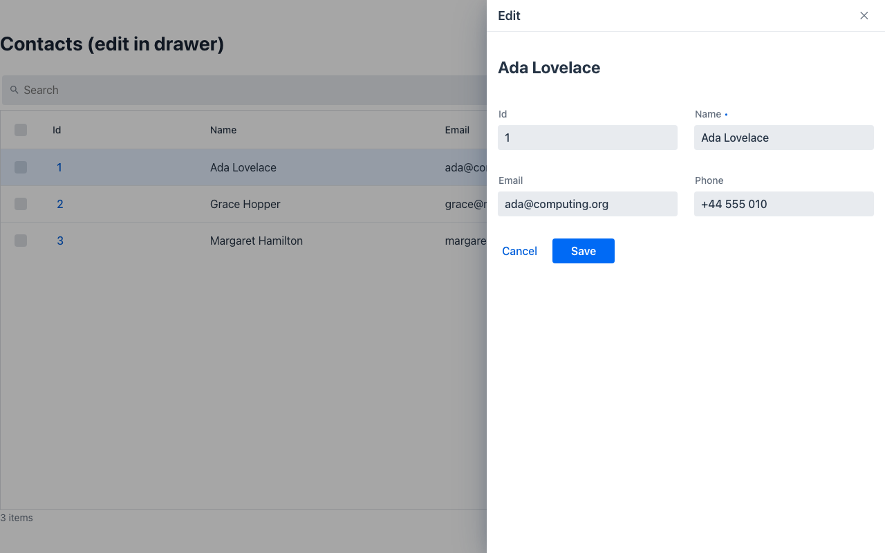
Demo: demo-admin-panel/.../drawercrud/ContactsDrawerCrud.java (/drawer-crud-demo). Tests: EditInDrawerSyncTest.
Save and next, and the error banner
Section titled “Save and next, and the error banner”Two more pieces of the Redwood create-edit drawer, switched through the crud’s display()
(CrudDisplay, the tri-state Toggle grammar — on · off · disabled):
@Overridepublic CrudDisplay display() { return CrudDisplay.defaults().toBuilder() .saveAndNext(Toggle.on) // default off .create(canCreate ? Toggle.on : Toggle.disabled) .delete(Toggle.off) .build();}- Save and next — editing a series row by row: the drawer gets a Save and next button; it
saves, and the SAME drawer moves on to the next row of the listing (the server re-sends it with
the same id, which refreshes the open drawer in place) while the listing refreshes behind it. On
the last row it closes like a plain save. The next row comes from
nextIdAfter(currentId, rq)— by default the row after it in an unfiltered search; override it to follow the user’s filters. Label:saveAndNextLabel(). - Error banner (
errorBanner, defaulton) — when the save throws, the drawer stays open with the exception’s message as a danger banner above the form and the values the user typed, and the message is announced to screen readers.offbrings back the plain error toast. create/delete— the New and Delete buttons;disabledshows them inert (and the server refuses them), on top of the capability gates (canCreate,@NotCreatable…), which still decide whether the affordance exists at all.
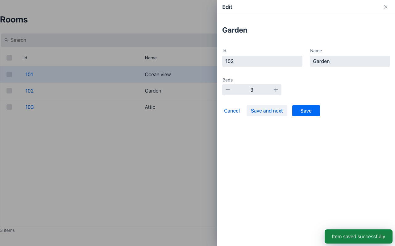
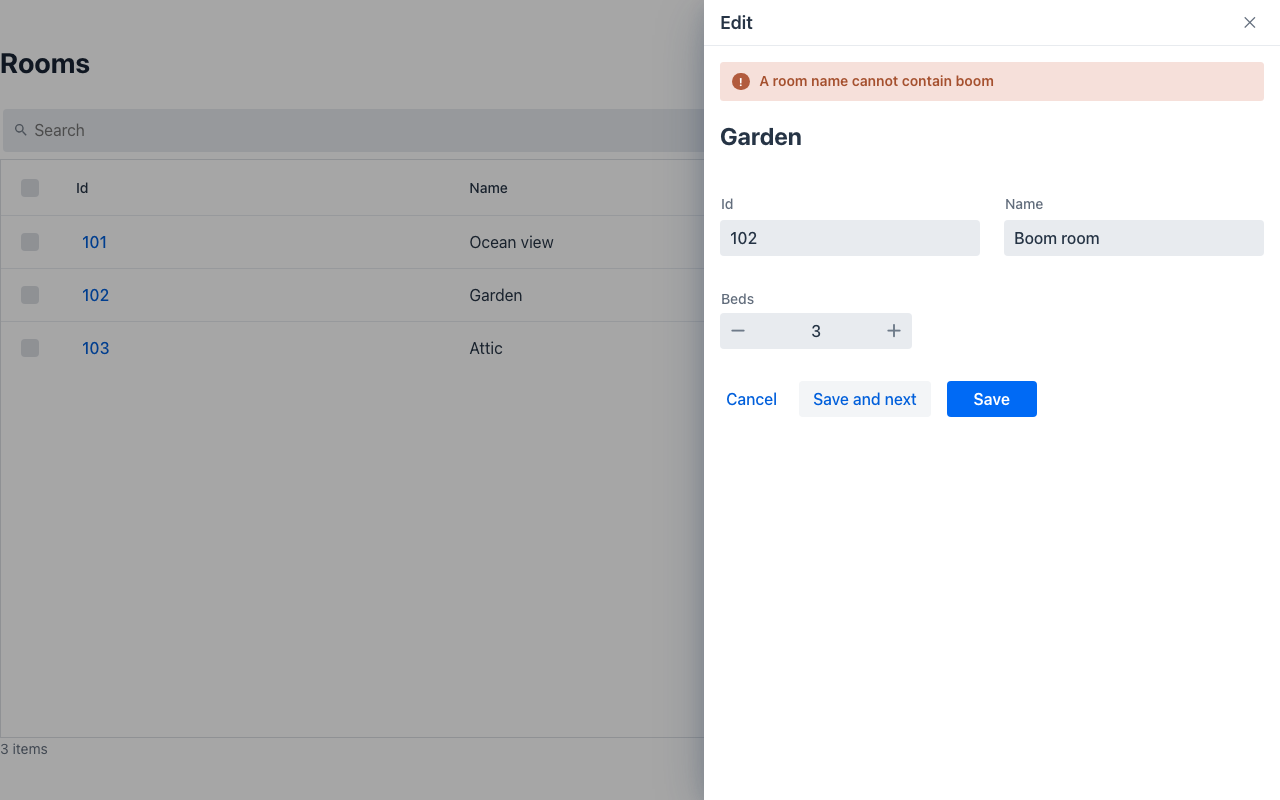
Tests: CrudDisplaySyncTest.
Coverage
Section titled “Coverage”| Java | .NET | Python | Vaadin | Redwood | React Native | IntelliJ | |
|---|---|---|---|---|---|---|---|
| Drawer (sizes, maximize, peer nav, bottom, collapsible) | ✅ | ✅ | ✅ | ✅ | ✅ | ✅ | ✅ |
editInDrawer() | ✅ | ✅ | ✅ | ✅ | ✅ | ✅ | ✅ |
| Save and next | ✅ | ✅ | ✅ | ✅ | ✅ | ✅ | ✅ |
| Error banner on a failed save | ✅ | ✅ | ✅ | ✅ | ✅ | ✅ | ✅ |
CrudDisplay create / delete toggles | ✅ | ✅ ¹ | ✅ | ✅ | ✅ | ✅ | ✅ |
What makes save-and-next and the error banner work on a renderer is one rule: a Drawer re-sent
with the id of an OPEN drawer refreshes it in place (its initialData becomes the form’s values)
instead of stacking a second one. ¹ In .NET the toggles apply to Crud<T>; capability listings
(IListing) do not have them yet.
Redwood parameter and slot reference
Section titled “Redwood parameter and slot reference”Redwood ships five drawer templates; one Drawer component covers them all in Mateu, so this
table is grouped by template. The canonical page-header elements shared by every page template are
documented once in Page templates.
Legend: ✅ supported · 🟡 partial · — not supported · ⚪ deliberately out of scope
general-drawer-template
Section titled “general-drawer-template”| Redwood prop / slot | Mateu | |
|---|---|---|
drawerTitle / drawerSubtitle | headerTitle / subtitle | ✅ |
drawerSize: sm | md | lg | xl | DrawerSize.s | m | l | xl (464 / 648 / 968 / 90vw); an explicit width overrides | ✅ |
drawerState: auto | closed | maximized | maximizable steps the drawer up the size ladder client-side | 🟡 |
displayOptions.maximize | maximizable | ✅ |
nextItem / previousItem + spPrevious / spNext | peerNav → PeerNav in the drawer header | ✅ |
Slots header + default | header / content (plus footer, a Mateu addition) | ✅ |
closeAction + spClose | ✕, Esc and the backdrop close it and emit no event by design (the “dismissed without saving” path) | 🟡 |
displayOptions.header: auto | tabsOnly | — | — |
displayOptions.goToParent + spGoToParent | — | — |
| — | layout (dock and push the content instead of overlaying) and modeless are Mateu additions | ✅ |
create-edit-drawer-template
Section titled “create-edit-drawer-template”| Redwood prop / slot | Mateu | |
|---|---|---|
| Create/edit form in the drawer | editInDrawer() on any AutoCrud; the listing never unmounts | ✅ |
primaryActionType: auto | create | derived from whether the row exists | ✅ |
unsavedChanges + spUnsavedChangesDiscard / Cancel | the framework’s dirty guard covers it | ✅ |
spPrimaryActionAndClose | Save persists, closes the drawer and re-runs the listing’s search | ✅ |
spPrimaryActionAndNext (“save and next” when editing a series over a listing) | CrudDisplay.saveAndNext + nextIdAfter(id, rq) | ✅ |
displayErrorMessageBanner + errorMessage (inline error banner on a failed save) | CrudDisplay.errorBanner (default on): the drawer is re-sent with a danger banner and the typed values | ✅ |
bottom-drawer-template
Section titled “bottom-drawer-template”| Redwood prop / slot | Mateu | |
|---|---|---|
| Bottom docking | DrawerPosition.bottom | ✅ |
drawerState: … | minimized + displayOptions.drawerMode: fixed | closable | collapsible | 🟡 |
displayOptions {title, maximize} | headerTitle, maximizable | ✅ |
discoverability: on | off (peeks a tab so users find it) | — | — |
spBeforeBottomDrawerStateChange (cancelable) | — | — |
guided-process-drawer-template
Section titled “guided-process-drawer-template”| Redwood prop / slot | Mateu | |
|---|---|---|
| A wizard inside a drawer | EmbeddedView + Wizard — see Guided Process Drawer; Redwood draws it as a generic wizard (step train), not with this template | 🟡 |
processTitle, steps[], currentStep, drawerSize | from the embedded Wizard and the host Drawer | ✅ |
introductionPanel {secondaryText, indexDisplay} | — | — |
spSkip, spBeforeStepNavigate | from the embedded Wizard: stepSkippable(step) and beforeStepNavigate(from, to, rq) — see Wizard | ✅ |
displayErrorMessageBanner | — | — |
configuration-drawer-template
Section titled “configuration-drawer-template”The fifth drawer (a settings drawer: drawerTitle/Subtitle, primaryAction, header + default
slots) has no dedicated Mateu piece, but its whole surface is a subset of the general drawer — build
it with Drawer directly. ✅