

Page templates
Enterprise design systems (Oracle Redwood’s RDS toolkit is the canonical example) don’t stop at components — they standardize full-page templates: the record overview, the collection with a detail pane, the guided process, the create-and-edit drawer. Mateu covers these templates from the UI model: you extend an archetype or set a flag, and the page comes out with the template’s anatomy on every renderer that paints its components (see the Redwood column).
This page is the map. Each row names the template (RDS naming), the Mateu piece that builds it, and where to see it running. The normal way to build a UI starts here: list the screens your app needs, decide the page type and the template for each one, then declare the data — choosing the template is your call per screen (Mateu only composes it for you in two fully-derivable cases; see Choosing a page template, the decision guide).
| Template | Mateu piece | Demo route | Guide | Redwood |
|---|---|---|---|---|
| Smart Filter and Search | Every CRUD/Listing — the smart search bar with typed filters, chips and saved views is the default listing UX | /products | Filters & listing | ✅ |
| Smart Search page | SmartSearchPage<Filters, Row> archetype — a standalone, search-first page: intro line + smart search bar with typed facets + results; starts empty | /smart-search-demo | Smart search | ✅ |
| To-do list | TodoList<Row> archetype — pending work as counted buckets of actionable cards; clicking a task acts on it | /todo-list-demo | To-do list | ✅ |
| Create and Edit — Simple | AutoCrud<T> — routed /new and /{id}/edit forms with validation, optimistic locking and dirty guard | /products | Create and edit | ✅ |
| Create and Edit — Advanced | a sectioned transactional form with a canonical header (save/cancel, @Timestamp, @KPI facts, peer-nav) and either @Toc (section index) or @Aside (detail slot) | — | Advanced create & edit | 🟡 no @Toc index |
| Create and Edit — Drawer | editInDrawer() on the crud — the form slides over the listing, which never unmounts | /drawer-crud-demo | Drawer | ✅ |
| Waterfall detail | Composition — a VerticalLayout of EntityHeader + full-width Card/property-list panels telling the record top-to-bottom | — | Waterfall detail | ✅ |
| Step-by-step | Wizard + @WizardProgress(STEPS) — the classic numbered-step stepper with done/current/upcoming states | /branching-wizard | Wizard | ✅ oj-train |
| Collection Detail | CollectionDetail<Row> archetype — searchable card list + in-place detail pane | /collection-detail-demo | Collection detail | ✅ |
| General Overview | GeneralOverview<Row> archetype — record context switcher + EntityHeader metadata strip over property cards | /general-overview-demo | General overview | ✅ card contents render as atoms (a Grid is an oj-table) |
| Guided Process | Wizard + @WizardProgress(RAIL) — step form with the sticky lateral rail (current | total counter over the vertical step list) | /branching-wizard | Wizard | ✅ |
| Item Overview | ItemOverview archetype — sticky key-info panel + tabbed detail | /product-overview | Item overview | ✅ key panel and tabs render their components (Markdown, charts, lists…) |
| Foldout Layout | Foldout archetype — fixed overview + lateral fold-out panels | /foldout-demo | Foldout | ✅ oj-sp-foldout-layout |
| Dashboard | Dashboard archetype — KPI scoreboard band + responsive tile grid | /dashboard-demo | Dashboard | ✅ KPI band + oj-chart tiles |
| Welcome Page | Welcome archetype — hero with CTAs + highlight tiles | /welcome-demo | Welcome page | ✅ |
| Empty States | EmptyState component — used by every listing and archetype automatically | /empty-skeleton-demo | Empty states & skeletons | ✅ (Skeleton —) |
| Data Management (grid ⇄ Gantt) | DataManagement archetype — the same data as a grid and a Gantt with a toolbar switcher (full-width). Dense editable grids use @InlineEditing + @Compact | /data-management-demo | Data management | ✅ grid as oj-table, Gantt as oj-gantt |
| Gantt page | GanttPage archetype — edge-to-edge Gantt canvas + docked detail; clicking a bar opens the task in a drawer | /gantt-page-demo | Gantt | ✅ oj-gantt; a bar click opens the task drawer |
| Calendar | CalendarPage archetype — the full page: calendar toolbar (‹/Today/›, optional + Create) over the calendar, per-month event fetching, event click actions, month/week/day/list views, per-date labels and clickable dates | /calendar-demo | Calendar | ✅ |
Three notes on how to read the table:
-
Templates are backend-side. An archetype composes existing wire components, so it renders wherever those components render — on Vaadin and the native renderers (React Native, IntelliJ) without renderer work. Redwood is the exception to watch: it paints a curated set of components with Oracle’s own, and shows a visible Unsupported component placeholder for the ones it has no view for — the last column says what each template looks like there, and the Redwood component coverage table (checked in CI) says why. Styling follows each design system’s tokens.
-
Page width is a template parameter.
@PageWidth(FIXED | FULL_WIDTH | EDGE_TO_EDGE)(or thePageWidthSupplierhook —Foldoutdeclares edge-to-edge) decides how the content column is sized: capped and centered, fluid with side margins, or touching the viewport edges. When neither is set, the renderer infers it from the content (full-bleed canvases → edge-to-edge, dense datagrids → full width, anything else → fixed). On the Vaadin shell all three modes render: fixed caps the content column at 1408 px centered, full width is fluid, and edge to edge drops the shell gutters for the content while the page header keeps its own side padding (so the title never touches the viewport edge). -
A leading
EntityHeaderbecomes the page header. When a page’s content starts with anEntityHeader(the guest/record banner), the renderer hoists it into the canonical page header: its title becomes the page title with the badges beside it, its subtitle the page subtitle, and its facts + metric render as a row of label/value pairs under the title — the banner is not repeated in the body. This is the Redwood record-header anatomy without any extra annotation: compose theEntityHeaderas the first component and the header comes out integrated. Applies to top-level pages only; embedded islands keep their banner inline. -
Secondary header actions collapse into a ”…” menu. Toolbar buttons marked primary stay visible in the page header; when a page declares two or more secondary actions they collapse into an overflow menu (the Redwood header grammar), keeping the header to one primary action plus ”…”. A single secondary action stays inline.
-
The page type is inferred from the ModelView. Every page carries a coarse
pageTypeon the wire —landing(Welcome, HeroSearch),collection(listings, search pages, CRUDs, to-do lists, calendars, collection detail),detail(overviews, foldout, master-detail),form(plain reflected forms),process(wizards),dashboard(archetype, or any ModelView withMetricCardfields). Archetypes declare theirs through the mapping; declare it explicitly with@PageTemplate(PageType.X)— or, on a YAML page, with a top-levelpageType: landingkey (YAML pages); declared, either wins over inference. The type anchors the width default (form/process/landing are always capped; collection/detail/dashboard defer to the content inference) and is stamped asdata-page-typeon the rendered page host as a stylesheet hook. -
Peer navigation. A detail/overview page can implement
PeerNavigationSupplierto add the previous/next-object arrows to the header (the Redwood “next/previous object” element): return aPeerNav(prevLabel, prevRoute, nextLabel, nextRoute)for the current record — anullroute disables that side. Ported to .NET (IPeerNavigationSupplier) and Python (PeerNavigationSupplier). Demo:/peer-nav-demo.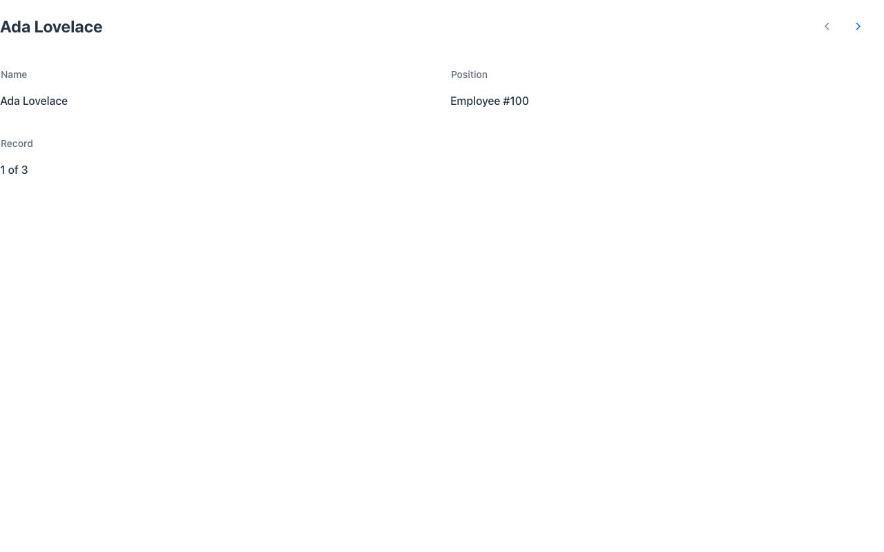
-
Header overline and title placeholder. Two small text elements of the Redwood canonical header.
@Overline("Requisitions")puts a quiet line above the title — a category, a parent context, a step marker.@TitlePlaceholder("New booking…")supplies what the header shows while the title is still empty (the create-mode affordance); it is a placeholder, not a default, so it disappears the moment a title exists. Both follow the house rule for page metadata: implementOverlineSupplier/TitlePlaceholderSupplierwhen the text depends on runtime state, and the supplier wins over the annotation. They travel on the wire asPageDto.overline/PageDto.titlePlaceholder. -
Header timestamp. Mark a field with
@Timestamp("Last updated")to show a “last updated” line in the header (the Redwood timestamp element); the field’s value renders as text and the field is dropped from the form body. Header key/value facts come from@KPIfields the same way. Ported to .NET ([Timestamp]) and Python (Timestamp()). -
On Redwood these elements use the
oj-sppage header’s own: the peer arrows are its previous/next item actions, the first header badge is its status badge (more badges follow the subtitle), and a timestamp whose value is a date (2026-10-12T10:42, label empty or “Last updated”) is its timestamp element, which writes its own translated “Last updated …”; any other timestamp text ends the subtitle line. The header has no overline or placeholder element, so the renderer draws the overline above the title and dims the placeholder title. Demo:demo-vb/header-extras(Java) and/yaml-header(the same page in YAML). -
Backend parity. Everything on this page also works on the .NET and Python backends — see the parity matrix for the per-feature detail.
-
Composition beats templates. When no template fits, the same pieces compose freely:
HeroSection,EntityHeader,TaskQueue,Card, property-list sections, zones and the fluentFormFieldare the vocabulary the archetypes themselves are written in. -
Uniform content-page slot grammar. The templates with a main + contextual aside shape (
ItemOverview— key-info panel + tabs;CollectionDetail— searchable list + detail pane) compose a singleResponsiveGridtemplate: named areas (gridTemplateAreas, e.g."keyinfo tabs"), the content dropped into them asSlottedchildren,stickyAreasfor a pinned region andstackBelowfor the width under which the areas stack — instead of each reinventing a bespoke layout. The aside sits beside the main region on wide viewports and stacks under it when narrow. It is a wire component likeFoldoutLayout, so you can also compose it directly in a custom view; ported to .NET and Python. (The olderContentLayoutwithmain/aside/footerregions is deprecated: no archetype produces it any more.) -
@Aside— content-page from a plain form. The minimal way to get the content-page grammar without composing anything: on an ordinary reflected form, mark one component-holder field@Aside(.NET[Aside], PythonAside()). That field is pulled out of the form body and placed in the aside area; the rest of the form becomes the main area of the same kind of grid template (position/width/stickycome from the annotation). You keep declaring data as usual and just point at the one supporting panel that belongs to the side.
The header in YAML
Section titled “The header in YAML”Every header element on this page — overline, title placeholder, timestamp, badges, KPIs, peer
navigation, the record switcher, banners and page FABs — is authorable on a YAML page’s
type: Form too, with the same wire fields. See
YAML pages › Page header.
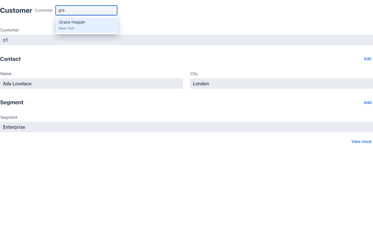
Record and context switcher
Section titled “Record and context switcher”The Redwood header’s selectObject / selectContext element, available on any page with a
header — not only inside GeneralOverview. Implement RecordSwitcherSupplier (the sibling of
PeerNavigationSupplier: peer navigation steps to the previous/next record, the switcher jumps to
any of them):
@UI("/customer")public class CustomerPage implements RecordSwitcherSupplier {  public String customer = "c1";
  @Override  public RecordSwitcher switcher(HttpRequest rq) {    return RecordSwitcher.builder()        .options(customers.stream().map(c -> new Option(c.id(), c.name(), c.city())).toList())        .value(customer)        .type(SwitcherType.object)      // or context: what the page is evaluated in        .label("Customer")        .searchable(true)               // type-ahead over label + description        .build();  }
  @Override  public Object switchTo(String value, HttpRequest rq) {    customer = value;                   // point the page at the new record…    return this;                        // …and re-render in place (or return a URI to navigate)  }}
It travels as PageDto.switcher; a pick runs the page’s _switchRecord action with the value in
_record, which calls switchTo. Vaadin draws a native select (a filtering combobox when
searchable) beside the title; Redwood uses the oj-sp header’s own data switcher (with
switcherSearch); React Native a pill opening a bottom sheet; IntelliJ a combo box with speed
search.
Announcements
Section titled “Announcements”The Redwood announcement slot — what a screen-reader user should hear when nothing on screen
takes focus — is a command any action can return: UICommand.announce("3 rows imported"), or
UICommand.announceAssertive(text) for errors (it interrupts). Nothing is drawn; each renderer
pushes the text through its live region (web), AccessibilityInfo (React Native) or the IDE’s
announcer (IntelliJ). The CRUD edit drawer already announces a failed save.
Display options: one tri-state grammar
Section titled “Display options: one tri-state grammar”Redwood switches a template’s built-in affordances through displayOptions, each on, off or
disabled. Mateu’s equivalent is the shared Toggle enum (on · off · disabled = shown but
inert — the state permissions need) grouped in one display record per archetype, returned by an
overridable display():
| Archetype | Record | Toggles |
|---|---|---|
Wizard | WizardDisplay | saveDraft, saveAndClose, skip |
Crud / AutoCrud | CrudDisplay | create, delete, saveAndNext, errorBanner |
GeneralOverview | GeneralOverviewDisplay | info, promoteInfoSlot |
Toggles are consumed on the server while composing — a disabled affordance travels as a disabled
button and is refused if forced, an off one does not travel — so no renderer needs to know about
them. The existing gates (canCreate, @NotDeletable…) still decide whether an affordance exists;
the display record decides how it shows. Only the archetypes with affordances worth switching have
a record: inventing toggles for the others would be surface without behaviour.
Section affordances
Section titled “Section affordances”The Redwood section template’s edit / add / view-more actions, on any @Section:
@Section(value = "Guests", addAction = "addGuest", editAction = "editGuests")public String leadGuest;
@Section(value = "Payments", viewMoreAction = "allPayments")public String lastPayment;
Each attribute names an action method of the form: Add and Edit render as small tertiary buttons on the section’s title row, View more as a link under its content. They are ordinary buttons composed on the server, so every renderer draws them.
Coverage of the header and cross-template pieces
Section titled “Coverage of the header and cross-template pieces”| Java | .NET | Python | Vaadin | Redwood | React Native | IntelliJ | |
|---|---|---|---|---|---|---|---|
| Record / context switcher | ✅ | ✅ | ✅ | ✅ | ✅ | ✅ | ✅ |
| Announcements | ✅ | ✅ | ✅ | ✅ | ✅ | ✅ | ✅ |
Display records (Toggle) | ✅ | ✅ | ✅ | ✅ | ✅ | ✅ | ✅ |
| Section affordances | ✅ | ✅ | ✅ | ✅ | ✅ | ✅ | ✅ |
| Peer navigation, overline, title placeholder, timestamp | ✅ | ✅ | ✅ | ✅ | ✅ | ✅ | ✅ |