

Item overview
Status: ✅ Implemented
Intent
Section titled “Intent”Keep the key information about the item the user is working on — name, status, stock, price — always visible in a left-hand panel, while the rest of the page (charts, specifications, history) is organised in tabs.
Problem
Section titled “Problem”On tabbed detail pages the identifying information lives in the first tab, so as soon as the user switches to “Reviews” they lose sight of what item they are looking at. Repeating the header in every tab wastes space and drifts out of sync.
Solution
Section titled “Solution”Extend ItemOverview. The first component field is the key-info panel (left, sticky — it stays put while the right side scrolls); each component field annotated with @Panel becomes a tab.
@UI("/product/:id")@Title("Ergonomic chair EC-200")public class ProductOverview extends ItemOverview {
    Markdown keyInfo = new Markdown("""        ### Ergonomic chair EC-200        **SKU:** EC-200-BLK · **Stock:** 143 · **Price:** 349 €        """, null, null);
    @Panel(title = "Sales")    Chart sales = Chart.builder().chartType(ChartType.bar) /* … */ .build();
    @Panel(title = "Specifications")    Markdown specs = new Markdown("| Property | Value | …", null, null);
    @Panel(title = "Reviews")    Markdown reviews = new Markdown("⭐⭐⭐⭐⭐ …", null, null);}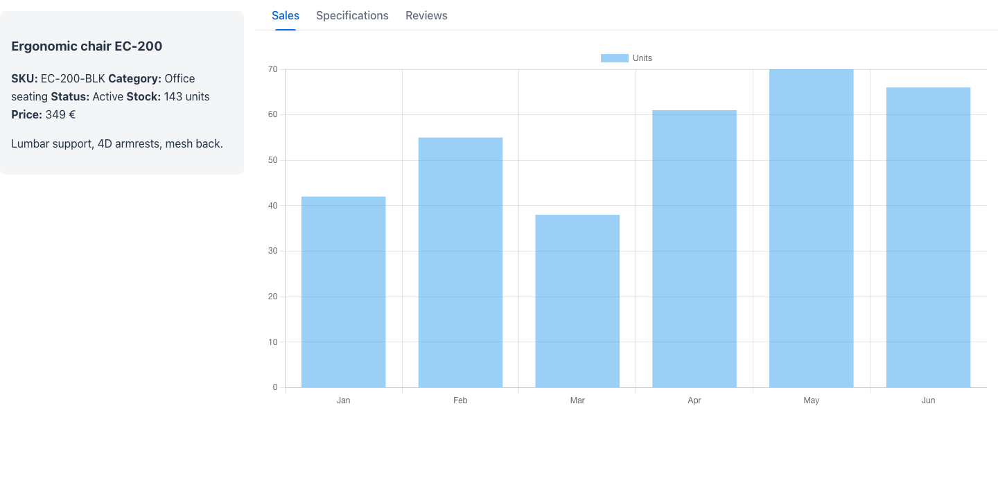
Override panelWidth() (default 22rem) to size the key-info panel.
Redwood parameter and slot reference
Section titled “Redwood parameter and slot reference”What the Redwood item-overview-page template and its item-overview key-info pattern expose, and
what Mateu gives you for them. The canonical page-header elements shared by every template are
documented once in Page templates.
Legend: ✅ supported · 🟡 partial · — not supported · ⚪ deliberately out of scope
Page (item-overview-page)
Section titled “Page (item-overview-page)”| Redwood prop / slot | Mateu | |
|---|---|---|
Slot overview (key info) | the first component field, sticky; width via panelWidth() (default 22rem) | ✅ |
Slot main | component fields annotated @Panel, rendered as tabs | ✅ |
overviewExpanded + spOverviewCollapse | — the key-info panel is always expanded | — |
nextItem / previousItem + getPreviousNextItems | PeerNavigationSupplier → PeerNav | ✅ |
Key-info pattern (item-overview)
Section titled “Key-info pattern (item-overview)”| Redwood prop / slot | Mateu | |
|---|---|---|
itemTitle / itemSubtitle | compose them in the key-info panel — typically an EntityHeader, which the renderer hoists into the page header | ✅ |
photo {src} | EntityHeader image / any component in the panel | ✅ |
badge {text, style: strong | subtle, position: leading | trailing} | @BadgeInHeader / EntityHeader badges; no position control | 🟡 |
isFavorite + spExpand | — | — |
displayOptions {edit, share, favorite} | — no built-in affordance bar; declare your own buttons | — |
Slots body / footer | the panel is a single component tree; compose a VerticalLayout | 🟡 |
spEdit / spShare | your own @Action methods behind declared buttons | 🟡 |
When to use it
Section titled “When to use it”Use item overview for read-mostly detail pages where identity context matters across categories. If the user must edit the item, prefer AutoEditableView; if the categories must be visible simultaneously rather than tabbed, use the Foldout pattern; for a long single-flow page with an index, use @Toc + sticky sections.