

Grids
Grids display collections of data.
Example
Section titled “Example”@UI("")public class Users {
List<User> users = userService.findAll();
}Mateu renders a table automatically.
Key idea
Section titled “Key idea”Collections = tables.
Column widths
Section titled “Column widths”Annotate a column field with @ColumnWidth to pin it to a fixed width. Columns with an explicit width no longer flex-grow, so the unannotated columns share the remaining space — annotate the narrow columns (codes, flags, dates) and leave the free-text column unannotated.
record GuestRow( @ColumnWidth("9rem") String lastName, @ColumnWidth("4rem") String paxType, String observations // no width → fills the rest) {}Use @ColumnWidth("auto") to make a column size to its content (header + widest cell) instead
of a fixed width. It never truncates and adapts to the current density, so it’s the right choice for
short code/flag columns on a grid that is shown both in compact and non-compact screens (a fixed
3rem can truncate to "A." once the extra padding of a non-compact layout eats the width).
record GuestRow( @ColumnWidth("9rem") String lastName, @ColumnWidth("auto") String paxType, // as wide as "Pax" / "AD" needs @ColumnWidth("auto") String mealPlan, String observations // no width → fills the rest) {}Row selection (@OnRowSelected)
Section titled “Row selection (@OnRowSelected)”Annotate a grid field with @OnRowSelected("method") to run a method when the user selects a row.
The selected row is auto-injected (typed as the row class), and it works on read-only grids — the
natural way to build a master/detail screen.
@Stereotype(FieldStereotype.grid)@OnRowSelected("onGuestSelected")List<GuestData> guests;
Object onGuestSelected(GuestData guest, HttpRequest httpRequest) {    return UICommand.dispatchEvent("pax-selected", guest.getCardex());}
Add a shortcut base to select rows by position from the keyboard — the base combo plus a digit
selects that row (ctrl+shift+1 → first row … up to the ninth; top-row digits or numeric keypad):
@OnRowSelected(value = "onGuestSelected", shortcut = "ctrl+shift")List<GuestData> guests;Inline editing (@InlineEditing)
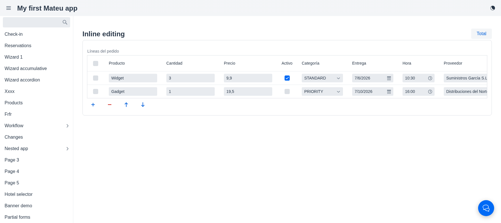
Section titled “Inline editing (@InlineEditing)”By default, editing a row of an editable list opens a separate detail form. Annotate the list
field with @InlineEditing to edit the rows directly in the grid cells instead — no detail form,
no per-row “Edit” button. See the Editable table pattern for when to
reach for it.
@InlineEditing@Stereotype(FieldStereotype.grid)List<OrderLine> lines;Each column becomes an editable input based on its field’s real Java type:
| Type | Editor |
|---|---|
String | text field |
int / Integer / long | integer field |
double / BigDecimal / @Stereotype(money) | number field |
boolean | checkbox |
enum | combo box (the enum constants) |
LocalDate | date picker |
LocalTime | time picker |
LocalDateTime | date-time picker |
@Lookup (reference) | combo box with remote search-as-you-type (the lookup’s LookupOptionsSupplier); stores the id, shows the label |
A field marked @ReadOnly stays display-only. Edits travel back in the normal component state, so
they are persisted when the enclosing form’s next action runs (a save/submit, or any developer
action that reads the list) — there is no per-cell save.
Choosing the layout (gridLayout())
Section titled “Choosing the layout (gridLayout())”A declarative listing (a Listing<Row> class) can force how its rows are laid out by overriding gridLayout(). By default the renderer picks a layout from the column weights (GridLayout.auto), which for a wide, many-column row can fall back to masterDetail. Return GridLayout.table (or list, cards) to force it:
@UI("/arrivals")public class Arrivals implements Listing<ArrivalRow>, Searchable, Filterable<ArrivalFilters> {
    @Override    public GridLayout gridLayout() {        return GridLayout.table;   // always a classic table    }
    @Override    public ListingData<ArrivalRow> search(SearchRequest request, HttpRequest httpRequest) { ... }}
A row class that drives a list/master-detail layout should mark its identifier column with @Priority(value = 1, identifier = true) so each row has a visible label.
URL-based pagination and sorting
Section titled “URL-based pagination and sorting”CRUD and listing pages sync their pagination, sort, and filter state to the browser URL. This means:
- Sharing or bookmarking a URL preserves the exact page, sort order, and active filters.
- Navigating back in the browser restores the previous listing state.
- Deep-linking directly to
?page=2&sort=name:ascopens the listing at that page and sort.
The URL parameters are read automatically on component load; no extra code is needed in search().
/customers?page=2&sort=lastName:asc/orders?page=0&sort=createdAt:desc&status=PENDINGQuery parameters that match filter field names in the Filters class are applied to the filter form as well.