

Foldout
Status: ✅ Implemented
Intent
Section titled “Intent”Show everything about one business object on a single screen: a fixed overview panel with the record’s key information, plus two or more lateral panels — payments, history, notes… — that the user folds in and out as needed.
Problem
Section titled “Problem”Object pages with many categories of associated information usually hide them behind tabs, so the user can only see one category at a time and loses the record context while switching. Long vertical pages bury the categories below the fold instead.
Solution
Section titled “Solution”Extend Foldout. The first component field is the overview (always visible, left); each component field annotated with @Panel becomes a fold-out panel. Closed panels render as a narrow strip with the rotated title; clicking a strip folds the panel out, and several panels can be open side by side (the row scrolls horizontally when it overflows).
@UI("/booking/:id")@Title("Booking 2026-08117")public class BookingFoldout extends Foldout {
    Markdown overview = new Markdown("""        ### Booking 2026-08117        **Guest:** Jane Smith        **Dates:** 12–19 Aug 2026        """, null, null);
    @Panel(title = "Payments", subtitle = "Charges and refunds")    Markdown payments = new Markdown("...", null, null);
    @Panel(title = "Occupancy")    Chart occupancy = Chart.builder().chartType(ChartType.line) /* … */ .build();
    @Panel(title = "Notes", open = false)   // starts folded    Markdown notes = new Markdown("...", null, null);}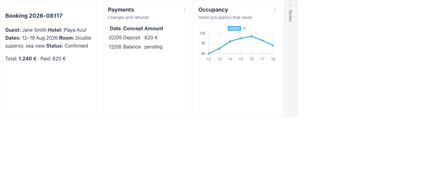
@Panel attributes on foldout pages: title (defaults to the field label), subtitle, icon, and open (initial state, default true).
Fluent variant
Section titled “Fluent variant”Build a FoldoutLayout directly from ComponentTreeSupplier when panels are data-dependent:
@Overridepublic Component component(HttpRequest request) { return FoldoutLayout.builder() .overview(overviewCard()) .panels(List.of( FoldoutPanel.builder().title("Payments").width("40rem").content(paymentsGrid()).build(), FoldoutPanel.builder().title("Notes").open(false).content(notes()).build())) .build();}FoldoutPanel.width is an optional CSS length for the expanded panel — unset panels keep the renderer’s default section width (--mateu-foldout-panel-flex / --mateu-foldout-section-width, 22rem). Use it to size panels to their content: a wide checklist or grid next to a narrow property list.
Two Vaadin-carousel behaviours worth knowing:
- The scroll affordances (the round left/right buttons at the bottom corners) only appear when the sections genuinely overflow the viewport — a few residual pixels (a scrollbar’s width, rounding) don’t summon them, and the carousel re-measures as slotted content settles or the window resizes.
- The last fold never renders narrower than the overview column: a skinny accessory panel (say a 14rem profile strip) widens to match the first fold, so the page reads as balanced columns instead of trailing off into a sliver.
Redwood parameter and slot reference
Section titled “Redwood parameter and slot reference”What the Redwood foldout-layout and foldout-panel components expose, and what Mateu gives you
for them. The canonical page-header elements shared by every template are documented once in
Page templates.
Legend: ✅ supported · 🟡 partial · — not supported · ⚪ deliberately out of scope
Layout (foldout-layout)
Section titled “Layout (foldout-layout)”| Redwood prop / slot | Mateu | |
|---|---|---|
orientation: horizontal | vertical | orientation() → FoldoutOrientation.horizontal | vertical | ✅ |
nextStep / previousStep + spPrevious / spNext | navigationHeader() → FoldoutNavigation.previousActionId / nextActionId | ✅ |
displayOptions.goToParent + spGoToParent | FoldoutNavigation.parentLabel / parentActionId | ✅ |
Slot overview | the first component field (always visible) | ✅ |
| Slot default (the panels) | component fields annotated @Panel, or FoldoutLayout.panels | ✅ |
Slot drilldown | — | — |
Slot search | the app-level smart search bar / ⌘K palette, not a page slot | 🟡 |
selectedPanel (controlled selection) | @Panel(open = …) / FoldoutPanel.open set the initial state; the open panel is not a controlled prop afterwards | 🟡 |
animate | the renderer animates folding; not configurable | 🟡 |
displayOptions.bidirectionalNavigation | — | — |
displayOptions.background: default | transparent | — (style/cssClasses escape hatch) | — |
displayOptions.inFlowBack + spInFlowBack | — | — |
Panel (foldout-panel)
Section titled “Panel (foldout-panel)”| Redwood prop / slot | Mateu | |
|---|---|---|
panelTitle | @Panel(title) / FoldoutPanel.title (defaults to the field label) | ✅ |
| — | subtitle, icon, width are Mateu additions with no Redwood equivalent | ✅ |
| Slot default | @Panel field value / FoldoutPanel.content | ✅ |
Slot summary (what shows on the collapsed strip) | — the strip only shows the rotated title | — |
Slot recommendation | — | — |
Slot noData | — compose an EmptyState as the panel content | 🟡 |
secondaryActions + spAction {actionId} | — panel-level actions must live inside the panel content | — |
When to use it
Section titled “When to use it”Use a foldout for record workspaces where the user works one object at a time and hops between its associated categories — reservations, contracts, patient records. Prefer @Tabs when categories are mutually exclusive and context loss is acceptable, or MasterDetailView when the “categories” are really alternative detail parts of a master form.