

Feature grid
Status: ✅ Implemented
Intent
Section titled “Intent”Show a set of features, benefits or capabilities as a scannable grid of icon + title + description cards — the classic “features” band of a landing or product page.
Solution
Section titled “Solution”Use the FeatureGrid component: a list of Features (icon, title, description) and an optional columns count (0 = auto-fit to the viewport). A feature with an actionId becomes clickable.
@Section("Features")Component features = FeatureGrid.builder() .columns(3) .features(List.of( Feature.builder().icon("⚡").title("Zero frontend") .description("Annotate Java, get a full web UI.").build(), Feature.builder().icon("🧩").title("Full-stack components") .description("Dashboards, kanban, calendars, charts.").build(), Feature.builder().icon("🤖").title("AI chat") .description("Drop-in assistant that can operate your app.") .actionId("openAi").build())) .build();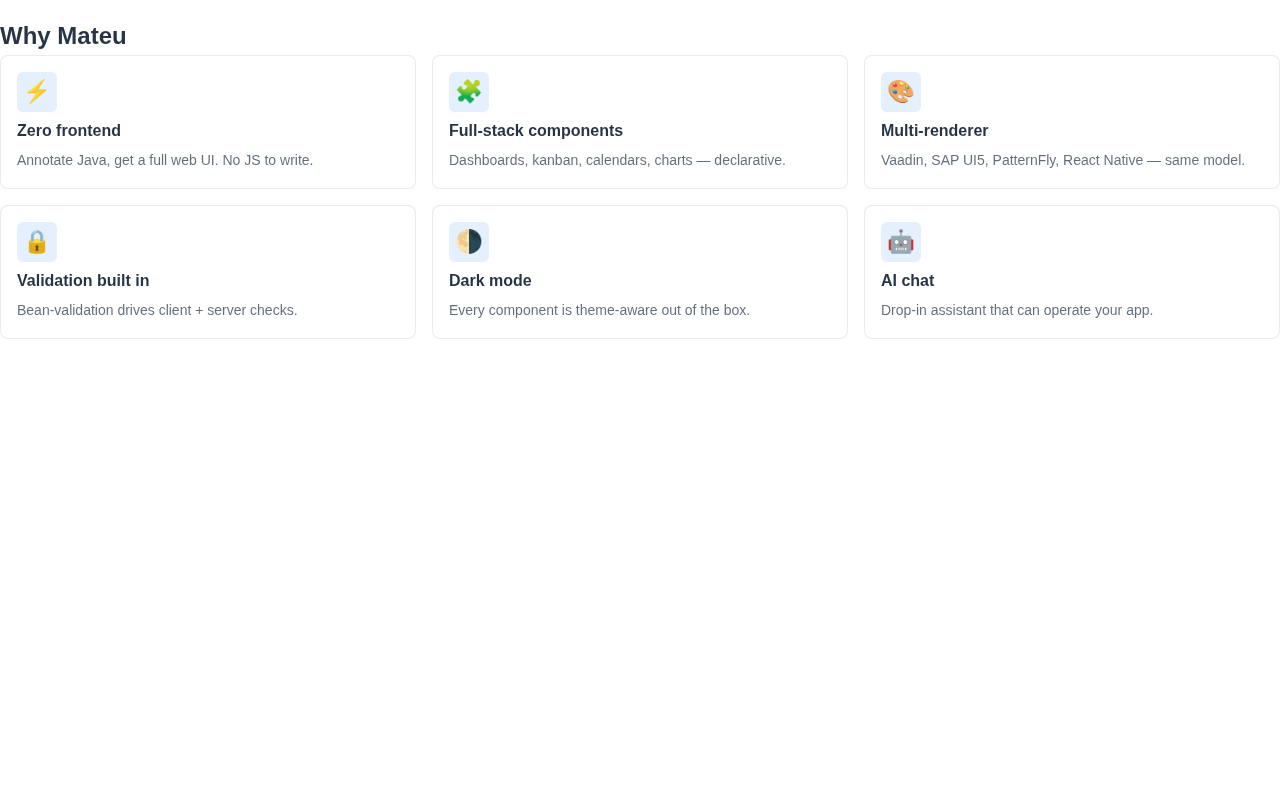
The renderer is dependency-free (CSS grid), reflows to fewer columns on narrow viewports, themes through the standard CSS variables and works in dark mode. On mobile (React Native) and the IntelliJ plugin the cards stack vertically.
When to use it
Section titled “When to use it”Use a FeatureGrid for marketing/overview feature bands. For KPIs use Stat/MetricCard; for a comparison table use PricingTable. Demo: /features-demo.