

Structure of an app
Every Mateu app has the same nested structure. Knowing it tells you where any piece of UI lives, which declaration controls it, and why it looks consistent on every renderer.
flowchart TD Mount["Mount (type: UI · @UI)"] --> Shell["App shell (type: AppShell · @App)"] Shell --> AH["App header"] Shell --> Nav["Navigation (menu)"] Shell --> CA["Content area"] Shell --> AF["App-level floating buttons<br/>AI chat · command center · app FABs"] CA --> Page["Page"] Page --> PH["Page header"] Page --> PB["Banners"] Page --> Body["Body"] Page --> PF["Footer buttons"] Page --> FAB["Page FABs"] Page -.-> OV["Overlays: dialog · drawer · popover · toast"]The anatomy, labelled
Section titled “The anatomy, labelled”This is the canonical arrangement on a wide web viewport with the menu on top. Other variants move the navigation (see shell variants), and the native renderers adapt it to their platform (a drawer on a phone, tool windows in IntelliJ), but the parts are the same.
┌──────────────────────────────────────────────────────────────────────────────────────┐│ [1] Logo · Title [2] Products Orders ▾ Reports [3] Hotel ▾ Actions ▾ 🔔 ☾ │ ← app header├──────────────────────────────────────────────────────────────────────────────────────┤│ [4] Home › Orders ││ [5] SALES [9] ‹ › [10] Edit Export … ││ [6] Order SO-1042 [7] Open Priority │ ← page header│ Placed by ACME Corp · Last updated 2 min ago [8] Total 1,240 € Lines 12 │├──────────────────────────────────────────────────────────────────────────────────────┤│ [11] ⚠ Payment pending: the customer has not paid the deposit yet. ✕ │ ← banners├──────────────────────────────────────────────────────────────────────────────────────┤│ [12] ┌ Customer ───────────────┐ ┌ Shipping ────────────────┐ ││ │ Name ACME Corp │ │ Address … │ │ ← body│ └─────────────────────────┘ └──────────────────────────┘ ││ ┌ Lines ───────────────────────────────────────────────┐ ││ │ Product Qty Price │ ││ └──────────────────────────────────────────────────────┘ │├──────────────────────────────────────────────────────────────────────────────────────┤│ [13] Cancel Save │ ← footer buttons│ [14] (+) (✦) │ ← FABs└──────────────────────────────────────────────────────────────────────────────────────┘ [15] overlays open above all of this: dialog · drawer · popover · toast| # | Part | What it is | Declared with |
|---|---|---|---|
| 1 | App identity | Title, subtitle, logo, favicon | title: / logo: on type: AppShell · @Title, @Logo, @FavIcon on the @UI class |
| 2 | Navigation | The menu, drawn by the shell variant | menu: · @Menu fields, MenuSupplier |
| 3 | Header widgets | Context pickers, header actions, notification bell, theme toggle, live values | see the app header |
| 4 | Breadcrumbs | Where the page sits | BreadcrumbsSupplier · breadcrumbs |
| 5 | Overline | A quiet line above the title | @Overline / OverlineSupplier |
| 6 | Title | The page title (and a placeholder while it is empty) | title: · @Title / TitleSupplier, @TitlePlaceholder |
| 7 | Badges | Status chips beside the title | @BadgeInHeader fields / BadgeSupplier |
| 8 | Subtitle, timestamp, KPIs | Context under the title; key/value facts | subtitle: · @Subtitle, @Timestamp, @KPI fields |
| 9 | Peer navigation, record switcher | Previous / next record; jump to any record | PeerNavigationSupplier, RecordSwitcherSupplier |
| 10 | Toolbar | The page’s actions; secondary ones collapse into ”…” | toolbar: · @Toolbar methods, ToolbarSupplier |
| 11 | Banners | Messages above the body: info, success, warning, danger | @Banner / BannerSupplier, or returned by an action |
| 12 | Body | The components of the page: sections, zones, tabs, listings… | content: · the view model’s fields, or a component tree |
| 13 | Footer buttons | The page’s closing actions | buttons: · @Button methods, ButtonsSupplier |
| 14 | FABs | Floating action buttons, per page or for the whole app | @Fab methods |
| 15 | Overlays | Dialogs, drawers, popovers, toasts | returned by actions; see overlays |
The page-header parts 5–9 and the banners are page metadata, declared in code today; a YAML
Form or Listing has title, subtitle, toolbar, header, buttons and footer. The
header grammar itself (one primary action, secondary actions in ”…”, a leading EntityHeader
hoisted into the header) is described in page templates.
The mount
Section titled “The mount”A mount is an app served at a base path (/, /back-office). It names its home page and the
route files that make it up. Several mounts can live in one project, or be
federated into one console. A mount has no visual presence of its own:
what you see is its shell. See mounts and routes.
The app shell and its variants
Section titled “The app shell and its variants”The app shell is the chrome around every page of a mount: identity, header, navigation and the content area. It is not a page: its content area shows the current route’s page.
The variant decides how navigation is drawn:
| Variant | What it looks like | Good for |
|---|---|---|
MENU_ON_TOP | a horizontal bar; groups open as dropdowns | a standard back office with two levels |
HAMBURGER_MENU | a button opening the whole menu in a drawer | many top-level entries; small screens |
HAMBURGER_SECTIONS | the hamburger holds the sections, a band under the header holds the current section’s entries | large suites organised in sections |
MENU_ON_LEFT | a persistent, collapsible sidebar | keeping the whole tree visible while working |
RAIL | a compact icon rail on the left | frequent switching between a few areas |
TABS | a tab bar | a few peer sections with no hierarchy |
TILES | flat top-level entries; an entry with children opens a hub of tiles | deep menus |
AUTO (the default) | chosen from the menu’s shape, see below | not deciding |
How AUTO picks, in order:
- the menu federates a
RemoteMenu→MENU_ON_TOP; - a group contains another group (three levels or more) →
TILES; - the menu has groups and more than seven top-level entries →
HAMBURGER_MENU; - the menu has groups →
MENU_ON_TOP; - the menu has no groups at all, however long →
TABS.
An explicit variant always wins. (MEDIATOR is internal: the chrome-less shell a CRUD
uses inside the content area.)
Two shell flags change the chrome itself:
- Command center (
commandCenter: true·@App(commandCenter = true)): a floating button that opens a full-screen palette unifying navigation, entity search, recent screens and the AI hand-off. See command center. - Chromeless (
chromeless: true·@App(chromeless = true)): drops the navigation chrome entirely; the command center becomes the way around. Implies the command center.
The content area can also be split in two panes (@App(layout = AppLayout.SPLIT)), and the
accentColor/accentStrip attributes brand the shell (see
accent colour and strip).
# specs/ui/app.yaml, bound to the mount root ("") in routes.yamltype: AppShelltitle: Cataloguevariant: AUTOthemeToggle: truecommandCenter: truemenu: - {type: RouteLink, label: Products, route: products} - type: Menu label: Reports submenu: - {type: RouteLink, label: Sales, route: reports/sales}@UI("")@Title("Catalogue")@App(value = AppVariant.AUTO, themeToggle = true, commandCenter = true)public class Catalogue { @Menu Products products; @Menu Reports reports; // a class holding @Menu fields becomes a group}C#: [App(...)] with [MenuItem] methods. Python: @app(...) with @menu_item.
More: App shell and menus (the concept),
App shell as data (every YAML key),
@App (every attribute) and
navigation patterns (each variant in detail).
The app header
Section titled “The app header”The right side of the app header hosts app-wide widgets. Each one appears only when the app declares it:
| Widget | What it does | Declared with | Pattern page |
|---|---|---|---|
| Context pickers | Fix a value for every screen: active hotel, company, fiscal year | @AppContext field on the app class | App context |
| Header actions | Buttons and dropdowns next to the pickers | AppActionsSupplier | App context › header actions |
| Notification bell | Inbox with unread count and mark-as-read | NotificationsSupplier | Notification inbox |
| Global search | ⌘K palette searching the menu and your data | GlobalSearchSupplier | Global search |
| Theme toggle | Light / dark | themeToggle | @App |
| Live header values | Values pushed from the server (a counter, a clock) | headerValues: · HeaderValuesSupplier | Live header values |
| Widgets | Any component (a version tag, a status badge) | widgets: | App shell as data |
| Open on mobile | A QR code that opens the current screen in the Mateu app | mobileQr | Open on mobile |
App-wide behaviours that are not widgets: app shortcuts and quick launch
(@AppShortcut, shortcuts:), access keys (accessKeys),
the idle-session warning and the
embedded AI chat (@AI, a floating button at the bottom right).
Navigation and menus
Section titled “Navigation and menus”A menu is a list of entries. Every leaf either routes somewhere or runs something:
| Entry | What a click does |
|---|---|
RouteLink | navigates to a route of the mount (or a full URL) |
RuleLink | runs an action instead of navigating |
Menu | a group of entries, nestable |
RemoteMenu | the menu of another Mateu service, fetched at runtime |
Two presentations change how a group opens:
- Card menus (
@Menu(display = MenuDisplay.cards), orpresentation: {display: cards}): the group opens as a panel of cards, each with a description and an image or icon. See card menus. - Remote menus: a shell composes the menus of independent services, so several teams’ UIs appear as one console. See shell and remote menus.
Entries the caller may not open are not sent at all (a RouteLink inherits its route’s access
rules). The home page is the shell’s homeRoute, else the mount’s home:, else the first navigable
entry. More: navigation and menus.
The content area
Section titled “The content area”The content area shows the page of the current route. Navigating replaces it; the shell stays. Its width follows the page, not the shell: each page is fixed (capped at 1408 px and centred), full width (fluid with side gutters) or edge to edge (no margins). See page width.
Inside a page, parts of the screen can be independent islands: an embedded view or micro-frontend with its own state and actions, which re-renders on its own. See component communication.
Page anatomy
Section titled “Page anatomy”A page has five regions. Most pages use some of them; a page type is largely a convention about which regions it fills and how.
- Header: breadcrumbs, overline, title, badges, subtitle, timestamp, KPIs, peer navigation,
record switcher and toolbar. A page can also open with a
welcome banner (
@WelcomeBanner), a hero above the content. When a page’s content starts with anEntityHeader, the renderer hoists it into this header. - Banners: page messages between the header and the body, static (
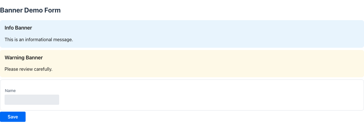
@Banner,BannerSupplier) or returned by an action (PageBanner), optionally closeable or timed. For a message inside the body, use a notice. - Body: the components. In code, fields group into
@Sectioncards, which can sit side by side in@Zones, become@Tabs, sit side by side with@FoldedLayout, get a sticky index with@Toc, or place one panel aside with@Aside. AContentLayoutgives the main + aside + footer grammar to any page. - Footer buttons: the closing actions (
@Buttonmethods,buttons:in YAML). - FABs: floating action buttons (
@Fab), scoped to the page or, on the app class, to the whole app. They stack above the AI and command-center buttons.

Two modifiers change the whole page: @Compact for dense
operational screens, and @AutoSave for screens without a save
button.
Overlays
Section titled “Overlays”An overlay opens above the page without leaving it. An action returns it, and
UICommand.closeModal() closes the topmost one (optionally emitting an event the page reacts to).
| Overlay | Use it for | Pattern page |
|---|---|---|
Dialog | a short, focused interaction that must be answered | Dialog |
ConfirmDialog | confirming a destructive action (@Action(confirmationRequired = true) builds one for you) | Confirm dialog |
Drawer (side) | editing or reading more about something without losing the page; CRUD create/edit with editInDrawer() | Drawer |
Drawer (bottom) | a docked, collapsible panel under a canvas | Bottom drawer |
Popover | details on hover or click | Hover details |
ActionPanel | a categorised “I want to…” menu of actions | Action panel |
| Toasts | messages returned by actions, including undoable ones | Undo |
Overlays trap focus and give it back when they close; see accessibility.
- Page types: what fills the content area.
- Components: the catalogue every region is built from.