

Calendar
Status: ✅ Implemented
Intent
Section titled “Intent”Show dated items — a team schedule, a content plan, bookings — on a familiar month grid, so when things happen reads at a glance and clustering is visible.
Solution
Section titled “Solution”Use the Calendar component: month is any LocalDate in the month to display (the grid is derived from it), and each CalendarEvent is placed on its date as a small chip. A chip carries an optional accent color and an optional actionId that makes it clickable (dispatches the standard action-requested event).
@Section("March 2026")Component calendar = Calendar.builder() .month(LocalDate.of(2026, 3, 1)) .events(List.of( CalendarEvent.builder().title("Sprint planning") .date(LocalDate.of(2026, 3, 2)).color("#3b82f6").build(), CalendarEvent.builder().title("Release 3.1") .date(LocalDate.of(2026, 3, 13)).color("#10b981") .actionId("openRelease").build())) .build();
The renderer is dependency-free (a Monday-first CSS grid), themes through the standard CSS variables, marks today, and works in dark mode.
Views, dates that carry information, dates that act
Section titled “Views, dates that carry information, dates that act”view—CalendarView.month(default),week(Monday to Sunday around the anchor, events with their times),day(the anchor date) orlist(the month’s agenda, grouped by date).monthstays the anchor date for every view.views— when it lists more than one view, a switcher changes the view in place (client-side, no round trip).days— aCalendarDay(date, label, tone)per date puts a short label in the date’s cell and tints it (info,success,warning,danger,neutral): the maximum availability of a hotel’s Property Calendar, a restriction, a closing.dayActionId— makes the date cells clickable; the action receives the date as_date.- Events gain
endDate(inclusive — a multi-day event appears on each of its days) andstartTime/endTime("HH:mm", shown in the week, day and list views).
Calendar.builder() .month(LocalDate.of(2026, 10, 12)) .view(CalendarView.list) .views(List.of(CalendarView.list, CalendarView.month)) .days(List.of(new CalendarDay(LocalDate.of(2026, 10, 30), "Avail 3", "danger"))) .dayActionId("openDay") .events(List.of(CalendarEvent.builder().title("Tech Summit").date(LocalDate.of(2026, 10, 15)) .endDate(LocalDate.of(2026, 10, 18)).startTime("09:00").endTime("18:00").build())) .build();Calendar page (the RDS template)
Section titled “Calendar page (the RDS template)”The CalendarPage archetype turns the component into the full Redwood Calendar page template: a calendar toolbar — previous/next chevrons, a Today button, the view switcher and an optional primary + Create button — over the calendar. Navigation re-runs events(month) for every month the displayed period touches (so events can be fetched per month), and clicking an event runs actionOn(event). Override views() to offer the week, day and list views (the chevrons then step by the view’s period), days(from, to) to put a label and a tone in each date, and daysClickable() + actionOnDay(date) to make the dates act — the shape of OPERA’s Property Calendar (demo: demo-vb-pms /home/calendar).
@UI("/calendar-demo")@Title("Housekeeping calendar")public class HousekeepingCalendar extends CalendarPage {
    @Override    protected List<CalendarEvent> events(LocalDate month, HttpRequest httpRequest) {        return myEventsOf(month);                 // your use case / repository, per month    }    @Override    protected Object actionOn(CalendarEvent event, HttpRequest httpRequest) {        return URI.create("/bookings/" + event.id());    }    @Override protected boolean showCreate() { return true; }    @Override protected Object createAction(HttpRequest httpRequest) {        return URI.create("/todo-list-demo");    }}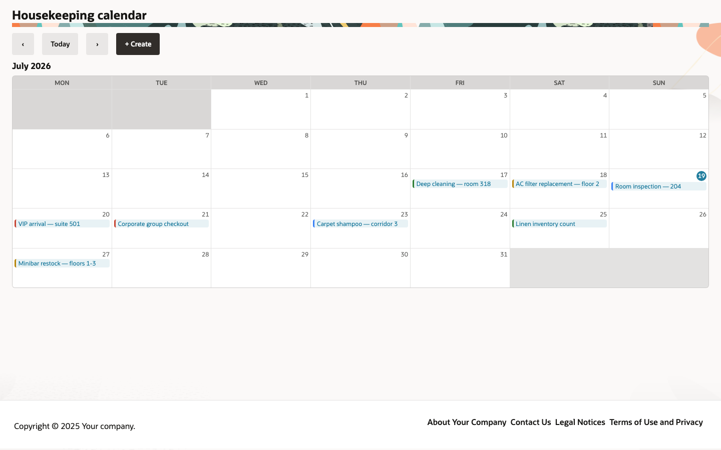
initialMonth()defaults to the current month; the displayed month is page state, so ‹ / › and Today round-trip through the backend and re-fetch.- Works on every renderer — Vaadin, Redwood (JET has no calendar component, so the grid is drawn with Redwood’s tokens; the switcher is
oj-buttonset-one), React Native and the IntelliJ plugin — and on the .NET (CalendarPage) and Python (CalendarPage) backends.
Redwood parameter and slot reference
Section titled “Redwood parameter and slot reference”What the Redwood calendar template exposes, and what Mateu gives you for it. This is the template
with the largest open surface of the set — the underlying component is a month grid. The
canonical page-header elements shared by every template are documented once in
Page templates.
Legend: ✅ supported · 🟡 partial · — not supported · ⚪ deliberately out of scope
| Redwood prop / slot | Mateu | |
|---|---|---|
calendarEvents | events(LocalDate month, HttpRequest) — fetched per displayed month, server-side | ✅ |
| Month navigation | ‹ / › / Today round-trip through the backend; initialMonth() sets the start | ✅ |
displayOptions.createEvent / createEventLabel | showCreate() + createAction(HttpRequest) | ✅ |
| Event click | actionOn(CalendarEvent, HttpRequest) — return a URI to navigate | ✅ |
selectedViewValue + displayOptions {monthView, weekView, dayView, listView} | views() (+ Calendar.view/views): month, week, day and list | ✅ |
| Date cell content / date click | days(from, to) labels and tones; daysClickable() + actionOnDay(date) | ✅ |
displayOptions.firstDayOfWeek | — the grid is Monday-first | — |
displayOptions {eventCounter, eventSortCriteria, eventDetailMode} | — | — |
calendarProviders[] + visibleCalendars[] (multi-calendar) | — one event source per page | — |
selectionMode: none | single | multiple | events are actionable, not selectable | 🟡 |
readonly | the calendar is read-only by design; pair it with a form to create or move events | ⚪ |
emptyState {primaryText} | — | — |
eventDetailActions[] | a single actionOn per event | 🟡 |
Slots eventTemplate / tooltipTemplate / eventDetailTemplate | — events render as chips with an optional accent color; the chip shape is not overridable | — |
spCalendarEventCreate / Update / DetailAction | createCalendarEvent / openCalendarEvent cover create and open; there is no update event | 🟡 |
When to use it
Section titled “When to use it”Use a Calendar to show dated events by month, week, day or as an agenda for scanning and light interaction (click an event to drill in). It is read-only by design; for scheduling/drag-to-create, pair it with a form that creates or moves events and re-renders. Demo: /calendar-demo.