

Data management
Status: ✅ Implemented (Java; .NET/Python ports planned)
Intent
Section titled “Intent”Present a data set two ways — a data grid and a Gantt timeline — on one dense, full-width page, with a toolbar switcher so the user can review it as a table or as a schedule. The Oracle Redwood Data management template.
Extend DataManagement and supply the two views:
@UI("/project-plan")@Title("Project plan")public class ProjectPlanBoard extends DataManagement {
@Override protected Component gridView(HttpRequest rq) { ... } // the dense table @Override protected Component ganttView(HttpRequest rq) { ... } // the Gantt canvas}- The page lays out full width (
PageWidthStyle.FULL_WIDTH). - A toolbar switcher (two buttons, labels via
gridLabel()/ganttLabel()) flips the active view. - The active view is kept in state (
_view,"grid"by default) and the page re-renders in place when the user switches — no navigation. - A heading (from
@Title) sits above the toolbar; overrideheading()or return blank to omit it.
gridView is any component — typically a dense table (an embedded crud/listing, a fluent Grid,
or @InlineEditing + @Compact for in-place editing); ganttView is typically a Gantt (the same
canvas the GanttPage archetype uses). Pure composition of existing components, so it renders on
Vaadin and the native renderers without renderer work — not yet on Redwood, which renders
neither a fluent Grid nor a Gantt (only the view switcher shows).
Docked panels
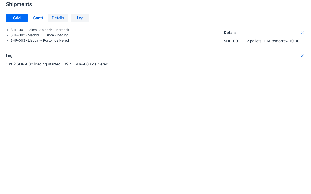
Section titled “Docked panels”The Redwood data-management page docks panels beside and under the content — a details pane next
to the grid, a messages or log strip under it. Override endPanel(rq) and/or bottomPanel(rq):
@Overrideprotected DockedPanel endPanel(HttpRequest rq) {  return DockedPanel.builder().id("details").title("Details")      .content(detailsOf(selected)).size("24rem").open(true).build();}
@Overrideprotected DockedPanel bottomPanel(HttpRequest rq) {  return DockedPanel.builder().id("log").title("Log").content(logOf(rq)).build();}
Each declared panel gets a toggle in the toolbar (and a ✕ in its own header); whether it is open is
page state, so toggling re-renders in place. The panels reflow the content — the grid or Gantt
shrinks to make room (the end panel is a fixed track beside it, stacking under it below 48rem; the
bottom panel caps its height at size, default 16rem, and scrolls) — which is the inner,
modeless variant of the Redwood slots. For an overlay panel, return a Drawer from an action.
Coverage
Section titled “Coverage”| Java | .NET | Python | Vaadin | Redwood | React Native | IntelliJ | |
|---|---|---|---|---|---|---|---|
| View switcher (grid ⇄ Gantt) | ✅ | ✅ | ✅ | ✅ | 🟡 ¹ | ✅ | ✅ |
| Docked end / bottom panels | ✅ | ✅ | ✅ | ✅ | ✅ | ✅ | ✅ |
¹ See above: Redwood does not draw the fluent grid/Gantt views yet.
Redwood parameter and slot reference
Section titled “Redwood parameter and slot reference”The real data-management-page API is considerably richer than “grid ⇄ Gantt”: it is a
transactional page with four dockable panels. Mateu covers the view switcher, the full-width
canvas and the two reflowing (inner) panels. The canonical page-header elements shared by every template
are documented once in Page templates.
Legend: ✅ supported · 🟡 partial · — not supported · ⚪ deliberately out of scope
| Redwood prop / slot | Mateu | |
|---|---|---|
| Full-width canvas | pageWidth() → PageWidthStyle.FULL_WIDTH | ✅ |
| View switcher | gridView/ganttView + gridLabel()/ganttLabel(); the active view is page state and re-renders in place | ✅ |
| Page heading | heading() (from @Title; return blank to omit) | ✅ |
Slots innerEnd / innerBottom | endPanel(rq) / bottomPanel(rq) → DockedPanel (reflow) | ✅ |
Slots outerEnd / outerBottom | — the overlay variants: return a Drawer (modeless, any DrawerPosition) from an action | 🟡 |
endOpened / bottomOpened: inner | outer | none | DockedPanel.open (initial) + the toolbar toggles; open state is page state | ✅ |
endDisplay / bottomDisplay: reflowModeless | overlayModal | Drawer.layout (reflow) vs Drawer.modeless (overlay) express both modes at component level | 🟡 |
bottomDrawerState: auto | closed | maximized | minimized + displayOptions.bottomDrawerMode/Height | DrawerPosition.bottom + collapsible + maximizable + DrawerSize | 🟡 |
Transactional header (save/cancel) | — this archetype is a viewer; use AutoCrud or an advanced create-edit form for the transaction | — |
Slot messages | toasts/alerts ride on the wire’s messages, not as a page slot | 🟡 |
Slot search | the app-level smart search bar / ⌘K palette, not a page slot | 🟡 |
Slot announcement (aria-live) | UICommand.announce(text) from any action | ✅ |
feedback + openFeedback | ⚪ the embedded survey is a Fusion Apps concern, out of scope by decision | ⚪ |
demo-admin-panel/.../datamanagement/DataManagementDemo.java (/data-management-demo): a project
plan shown as a table and as a Gantt, switchable from the toolbar.
See also
Section titled “See also”- Gantt — the Gantt component and the
GanttPagearchetype used as the timeline view. - Inline editing in listings and High-density screens — for the dense, editable grid view.