

Branding & design tokens (make it look like your brand)
The most credible criticism of a generated UI is “will it look like our brand, or like the framework?”. The honest answer has two parts: most of it is a token layer you set once, and the rest is an explicit, bounded escape hatch. This page covers both, so you can scope adoption with eyes open.
The brand is a token layer, set once
Section titled “The brand is a token layer, set once”Because the UI is declared and the look lives in the renderer, branding is CSS custom properties,
not per-screen work. Set them once and every generated screen is on-brand at once — no screen is
touched. Mateu’s production mateu-vaadin renderer themes through Lumo variables (--lumo-*), and
Mateu’s own components read those variables (with fallbacks), so a corporate theme is a set of Lumo
overrides driven by your tokens.
A worked example ships in the repo: frontend/reference-renderer/brand-theme.css
themes a demo to a fictitious brand (“Acme”) — a red #D2232A and a gold #CA9C4E. Its shape:
:root { /* 1 · brand tokens (once) */ --brand-red: #d2232a; --brand-gold: #ca9c4e; --brand-ink: #1f1a17; /* … */ /* 2 · map to Lumo → themes the production mateu-vaadin renderer */ --lumo-primary-color: var(--brand-red); --lumo-primary-text-color: #8f1418; --lumo-error-color: var(--brand-red); --lumo-border-radius-m: 10px; --lumo-font-family: var(--brand-font-body);}Run the reference renderer and flip the Theme switch to see the same wire rendered default vs. branded — the proof that brand is a layer, not a rewrite:
| Default | Brand tokens applied |
|---|---|
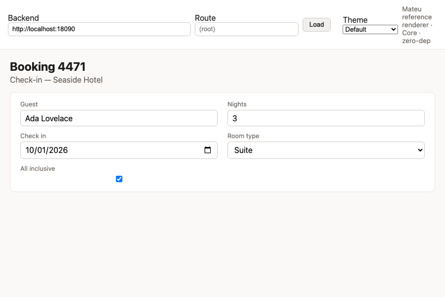 | 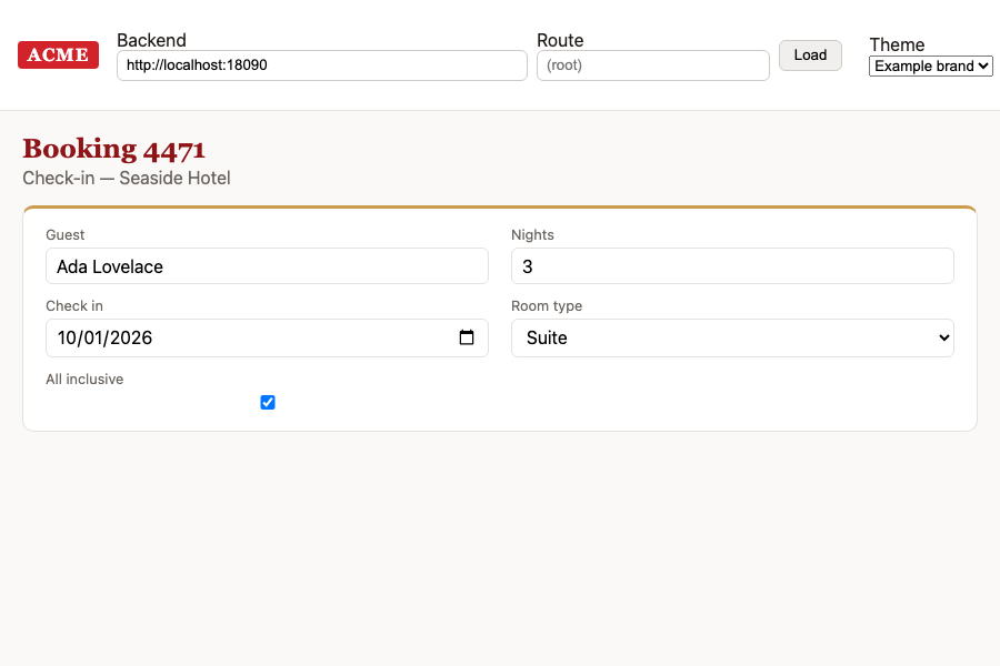 |
Nothing in the definition changed between the two — only the token layer. Proven at scale: Wefox ran on Mateu with its own corporate design system in production.
Logos & fonts (bring your own asset)
Section titled “Logos & fonts (bring your own asset)”Colour and type are tokens; the logo is your trademark — drop the official asset into the app
shell’s logo slot rather than committing it to the framework. Corporate webfonts are licensed
assets: point the --…-font-* tokens at your self-hosted font. (The example uses safe fallbacks and
a placeholder wordmark, on purpose.)
Where the token layer ends — the escape-hatch playbook
Section titled “Where the token layer ends — the escape-hatch playbook”Tokens cover visual style (colour, type, spacing, radius). They do not cover novel structure, non-catalogue widgets, or bespoke micro-interactions/animation — that is the honest ceiling of any declarative model (production server-driven UI at Airbnb/DoorDash is layout-level by design too). For those, Mateu has explicit, relegated escape hatches. Reach for the smallest one that fits:
| Need | Hatch | Cost |
|---|---|---|
| One field looks/behaves specially | custom field (stereotype + a web-component) | small; still declared |
| A one-off widget on a screen | Element (arbitrary custom element + attrs + events) | small; hand-written markup behind a Mateu node |
| Render a non-Mateu domain object as UI | ComponentAdapter | medium; you own the adapter + its round-trip |
| A whole screen must be bespoke | custom renderer for that component type in your DS | larger; you own that renderer surface |
| A pinch of client behaviour | run-js | small; last resort |
Every hatch forfeits generation for that surface (you now maintain code there) — which is exactly why they are the exception, not the entry cost. See Escaping the framework and Component adapter.
Scope guardrail (the decision rule)
Section titled “Scope guardrail (the decision rule)”State, in the adoption decision, which surfaces are in scope for Mateu — this turns a real gap into a bounded, accepted risk:
- Operational / back-office / internal tools (CRUD, forms, wizards, dashboards, check-in, folios): declarative + theme. The gap here is negligible and the velocity payoff is largest. Default yes.
- Brand-consistent customer-facing with standard components: declarative + theme + the occasional custom field.
- Design-led / marketing / booking flows with bespoke motion and pixel-perfect art direction: escape hatch or keep hand-coded. Default: out of scope for generation — use Mateu where it wins.
Decision rule in one line: consistent & operational → declarative + theme; bespoke & brand-led → escape hatch or hand-coded.
Before adopting: prove it against your brand
Section titled “Before adopting: prove it against your brand”Do this once, early, and the severity of the “design gap” stops being an opinion:
- Build your token layer (map your palette/type to
--lumo-*). - Reproduce 2–3 representative screens spanning the spectrum: one operational (expected easy) and one deliberately design-led candidate.
- Measure how much lands via the theme vs. needs an escape hatch — and write down the scope guardrail from what you find.