Display Annotations
These annotations control how field values are presented visually — as tiles, collapsible panels, navigation entries, or custom widgets.
@Avatar
Section titled “@Avatar”Target: FIELD
No attributes. Renders the field as an avatar component — either an image (when the field holds a URL) or a styled initials badge (when the field holds a name string).
@Target(ElementType.FIELD)@Retention(RetentionPolicy.RUNTIME)public @interface Avatar {}Example
Section titled “Example”public class UserCard { @Avatar String profilePhotoUrl;
String displayName;}Target: FIELD
No attributes. Renders the field as a Key Performance Indicator tile — a large numeric metric with a label, intended for dashboard pages.
@Target(ElementType.FIELD)@Retention(RetentionPolicy.RUNTIME)public @interface KPI {}Example
Section titled “Example”public class DashboardPage { @KPI int totalInvoices = 142;
@KPI String totalRevenue = "€ 48,320";
@KPI double averageOrderValue = 340.28;}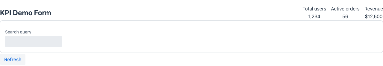
@Widget
Section titled “@Widget”Target: FIELD
No attributes. Marks a field as a custom widget. The field’s type must implement the appropriate widget interface. Mateu delegates rendering entirely to the widget.
@Target(ElementType.FIELD)@Retention(RetentionPolicy.RUNTIME)public @interface Widget {}Example
Section titled “Example”public class DashboardPage { @Widget Component salesChart;
@Widget Component revenueKpi;}@Details
Section titled “@Details”Target: FIELD
Wraps the field content in a collapsible details/summary component. The summary attribute is the header shown in the collapsed state; set opened to true to start the panel expanded.
@Target(ElementType.FIELD)@Retention(RetentionPolicy.RUNTIME)public @interface Details { String theme() default ""; String style() default ""; String summary() default ""; boolean opened() default false;}Attributes
Section titled “Attributes”| Attribute | Type | Default | Description |
|---|---|---|---|
summary | String | "" | Label shown in the collapsed header |
opened | boolean | false | Whether the panel is initially expanded |
theme | String | "" | Visual theme variant |
style | String | "" | Inline CSS applied to the details container |
Example
Section titled “Example”public class OrderForm { String orderId; String status;
@Details(summary = "Internal notes", opened = false) String internalNotes;}Target: FIELD
Renders the field as a navigation menu entry. The description attribute is a hint for AI assistants to understand the purpose of the menu item.
@Target(ElementType.FIELD)@Retention(RetentionPolicy.RUNTIME)public @interface Menu { boolean selected() default false; String description() default "";}Attributes
Section titled “Attributes”| Attribute | Type | Default | Description |
|---|---|---|---|
selected | boolean | false | Whether this menu entry is shown as active/selected |
description | String | "" | Hint text for AI assistants describing the entry’s purpose |
Example
Section titled “Example”public class SidebarPage { @Menu(selected = true, description = "Main overview dashboard") Component dashboard;
@Menu(description = "Manage customer records") Component customers;}@Button
Section titled “@Button”Target: FIELD, METHOD
No attributes. Renders a method as a clickable button, or a field as a button action. When placed on a method, Mateu calls that method on click. See also the actions reference.
public @interface Button {}Example
Section titled “Example”public class OrderForm { String orderId;
@Button void save() { // called when the button is clicked }}@State
Section titled “@State”Target: FIELD
Marks a field as part of the tracked component state. State fields can be referenced in @Rule conditions and @Trigger expressions without triggering a full server round-trip.
@Target(ElementType.FIELD)@Retention(RetentionPolicy.RUNTIME)public @interface State { String value();}Attributes
Section titled “Attributes”| Attribute | Type | Description |
|---|---|---|
value | String | State identifier used in rule and trigger expressions |
Example
Section titled “Example”public class WizardForm { @State("currentStep") int step = 1;
String firstName; String lastName;}@Status
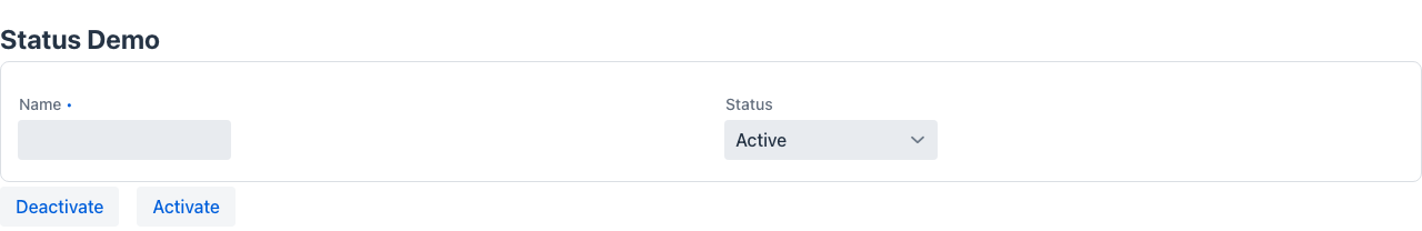
Section titled “@Status”Target: FIELD
Renders an enum or String field as a coloured status badge in listings and detail views. Requires two mandatory attributes — mappings (enum value → badge colour) and defaultStatus (fallback colour for unmapped values).
public @interface Status { StatusMapping[] mappings(); StatusType defaultStatus();}public @interface StatusMapping { String from(); // enum constant name or string value StatusType to(); // badge colour}StatusType values
Section titled “StatusType values”| Value | Colour |
|---|---|
SUCCESS | Green |
WARNING | Orange / yellow |
DANGER | Red |
INFO | Blue / informational |
NONE | Default / neutral |
Example
Section titled “Example”public enum OrderStatus { PENDING, CONFIRMED, CANCELLED, NO_SHOW }
public class OrderRow {
@Status( defaultStatus = StatusType.NONE, mappings = { @StatusMapping(from = "PENDING", to = StatusType.WARNING), @StatusMapping(from = "CONFIRMED", to = StatusType.SUCCESS), @StatusMapping(from = "CANCELLED", to = StatusType.DANGER), @StatusMapping(from = "NO_SHOW", to = StatusType.INFO) } ) OrderStatus status;}Note: Both
mappingsanddefaultStatusare mandatory —@Statusalone does not compile. Thefromstring must match the enum constant name exactly (case-sensitive).
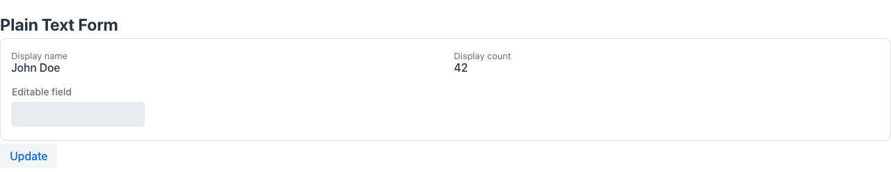
@PlainText
Section titled “@PlainText”Target: FIELD, METHOD
No attributes. Renders the field’s value as plain, read-only text instead of an input control — denser and unmistakably display-only. Typically combined with @ReadOnly on information-heavy screens. Booleans render as a check / dash icon.
It is opt-in and orthogonal: it does not change the default rendering of any field that is not annotated, so existing forms are unaffected.
@Retention(RetentionPolicy.RUNTIME)@Target({ElementType.FIELD, ElementType.METHOD})public @interface PlainText {}Example
Section titled “Example”public class CheckInForm { @ReadOnly @PlainText String hotel; @ReadOnly @PlainText LocalDate arrival; @ReadOnly @PlainText boolean guaranteed; // shown as ✓ / —}Pairs well with @Compact and @Zones for dense, single-screen layouts.
@Multiline
Section titled “@Multiline”Target: TYPE, FIELD
Allows a @PlainText field to wrap its text content instead of truncating it with an ellipsis. Has no effect on fields that are not plain-text.
@Retention(RetentionPolicy.RUNTIME)@Target({ElementType.TYPE, ElementType.FIELD})public @interface Multiline {}Example
Section titled “Example”public class IncidentForm { @ReadOnly @PlainText @Multiline String notes; // wraps across multiple lines instead of truncating}@BadgeInHeader
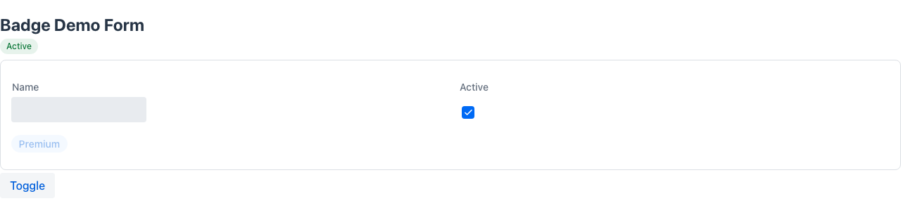
Section titled “@BadgeInHeader”Target: FIELD
Marks a field as a status chip rendered in the page header strip (not in the form body). The field is automatically excluded from the form layout.
- Boolean field: the badge is shown when the value is
true; the text comes fromlabel(falls back to the field’s derived label if empty). - String field: the field value is used as badge text;
nullor blank hides the badge.
For programmatic control implement BadgeSupplier (see metadata suppliers).
@Retention(RetentionPolicy.RUNTIME)@Target(ElementType.FIELD)public @interface BadgeInHeader { String label() default ""; String color() default "normal"; boolean primary() default false; boolean small() default true; boolean pill() default true;}Attributes
Section titled “Attributes”| Attribute | Type | Default | Description |
|---|---|---|---|
label | String | "" | Badge text override (boolean fields: text shown when true) |
color | String | "normal" | Vaadin Lumo badge theme: normal, success, error, warning, contrast |
primary | boolean | false | Uses the primary colour fill |
small | boolean | true | Renders a smaller badge |
pill | boolean | true | Rounds the badge into a pill shape |
Example
Section titled “Example”@UI("/checkin/:id")public class CheckInForm {
// Boolean: shown as "VIP" badge (success/green) when true @BadgeInHeader(label = "VIP", color = "success") boolean vip;
// String: displays the value directly; hidden when null or blank @BadgeInHeader(color = "warning") String pendingWarning; // e.g. "OVERBOOKING", "NO CREDIT CARD"
// rest of form fields…}Boolean badges — FieldStereotype.badge
Section titled “Boolean badges — FieldStereotype.badge”Annotating a boolean with @Stereotype(FieldStereotype.badge) renders it as a coloured chip whose text is the field label — lit (green) when true, muted when false. Useful for flag rows where many on/off indicators must be scannable at a glance.
@ReadOnly @Stereotype(FieldStereotype.badge) @Label("Guaranteed") boolean guaranteed;@ReadOnly @Stereotype(FieldStereotype.badge) @Label("VIP") boolean vip;@Stereotype vs @Representation
Section titled “@Stereotype vs @Representation”These two annotations are closely related but govern different rendering contexts:
| Annotation | Controls |
|---|---|
@Stereotype | The input widget used in edit mode |
@Representation | How the value is displayed in read-only / list view |
Both can be combined on the same field to independently control each context.
// Edit mode: textarea input; read-only mode: rendered as Markdown@Stereotype(FieldStereotype.textarea)@Representation(FieldStereotype.markdown)String description;See field-types for the complete FieldStereotype enum reference.