

Dashboard
Status: ✅ Implemented
Intent
Section titled “Intent”Give users a landing page that summarises the status of their business at a glance: a band of KPIs on top and a grid of titled panels (charts, lists, notes) below, each one an entry point to more detail.
Problem
Section titled “Problem”Operational users open the app dozens of times a day just to answer “is everything OK?”. Forcing them through listings and detail screens to reconstruct that answer wastes time; hand-building a dashboard with raw layouts means re-inventing metric tiles, grid placement and responsive behaviour on every project.
Solution
Section titled “Solution”Extend Dashboard and declare fields holding components. Mateu lays them out as a dashboard grid:
- Consecutive
MetricCardfields are grouped into a scoreboard band (full-width strip of KPI tiles). - Component fields annotated with
@Panelbecome titled tiles on a responsive grid (titledefaults to the field label;colSpan/rowSpancontrol the footprint). - Any other component field is placed on the grid as-is.
@UI("/dashboard")@Title("Sales dashboard")public class SalesDashboard extends Dashboard {
    MetricCard revenue = MetricCard.builder()            .title("Revenue").value("1.2").unit("M€")            .trend(MetricTrend.up).trendLabel("+8% vs last month")            .icon("vaadin:dollar")            .build();
    MetricCard orders = MetricCard.builder()            .title("Orders").value("3,421")            .trend(MetricTrend.up).trendLabel("+112")            .build();
    @Panel(title = "Monthly sales", subtitle = "Units sold per month", colSpan = 2)    Chart sales = Chart.builder()            .chartType(ChartType.bar)            .chartData(ChartData.builder()                    .labels(List.of("Jan", "Feb", "Mar"))                    .datasets(List.of(ChartDataset.builder()                            .label("2026").data(List.of(120d, 190d, 300d)).build()))                    .build())            .build();
    @Panel(title = "Notes")    Markdown notes = new Markdown("- Summer campaign starts **July 15th**", null, null);}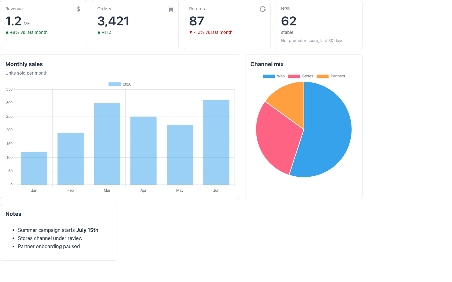
Populate the fields in the constructor or field initializers — query your use cases or repositories there, exactly like any other Mateu view-model. Override columns() to fix the number of grid columns; the default (0) lets the renderer pick a responsive auto-fit count.
Drill-in
Section titled “Drill-in”Give a MetricCard an actionId to make it clickable; the action is dispatched to the page like a button press, so you can navigate to the backing listing:
MetricCard pending = MetricCard.builder()        .title("Pending approvals").value("14")        .actionId("openPending")        .build();
@ActionObject openPending() {    return URI.create("/approvals");}
Fluent variant
Section titled “Fluent variant”Everything is also available as fluent components for ComponentTreeSupplier pages: build a DashboardLayout with Scoreboard, DashboardPanel and MetricCard items directly when the layout is data-dependent.
@Overridepublic Component component(HttpRequest request) { return DashboardLayout.builder() .items(List.of( Scoreboard.builder().metrics(kpis()).build(), DashboardPanel.builder().title("Monthly sales").colSpan(2) .content(salesChart()).build())) .build();}Redwood parameter and slot reference
Section titled “Redwood parameter and slot reference”What the Redwood dashboard-landing-page template (plus dashboard-grid, dashboard-panel and
scoreboard) exposes, and what Mateu gives you for it. The canonical page-header elements shared by
every template are documented once in Page templates.
Legend: ✅ supported · 🟡 partial · — not supported · ⚪ deliberately out of scope
| Redwood prop / slot | Mateu | |
|---|---|---|
Slot kpi | consecutive MetricCard fields, grouped into the scoreboard band | ✅ |
scoreboard.data | the MetricCard fields themselves (or Scoreboard in the fluent variant) | ✅ |
scoreboard.selection / selectionMode: none | single | MetricCard.actionId makes a tile actionable, but a tile cannot hold selected state | 🟡 |
scoreboard.maxKpis | — every declared metric renders | — |
dashboard-panel {panelTitle, panelSubtitle} | @Panel(title, subtitle) / DashboardPanel | ✅ |
dashboard-grid placement | @Panel(colSpan, rowSpan); columns() fixes the column count (0 = responsive auto-fit) | ✅ |
displayOptions.scoreboardSticky | — the band scrolls with the page | — |
displayOptions.density: standard | compact | @Compact, set on the view rather than as a template option | 🟡 |
selectContext / selectObject + displayOptions.switcherSearch | — the record switcher is only available inside GeneralOverview, not as a header element here | — |
editLayoutMode, contentLibraryData, editLayoutOptions {share, properties, contentLibraryFilters} | ⚪ end-user-editable dashboards (drag tiles, content library) are a Fusion Apps concern, out of scope by decision | ⚪ |
spRestoreDefaults, spShare | ⚪ part of the same edit-layout feature | ⚪ |
When to use it
Section titled “When to use it”Use a dashboard as the home route of operational backoffices: the scoreboard answers “is everything OK?” and the panels give one-click access to whatever is not. Prefer AutoCrud listings with @KPI headers when the overview is about a single collection rather than the whole business.