Listing layout
Every listing in Mateu renders in one of four layouts. The framework picks one automatically based on the columns you define and the available screen width. You can also force a specific layout when the automatic choice is not right for your use case.
The four layouts
Section titled “The four layouts”| Layout | When it appears | Best for |
|---|---|---|
| table | All columns fit comfortably | Dense data with many comparable fields |
| list | Columns fit in two lines (title + secondary info) | Navigation-heavy UIs on medium screens |
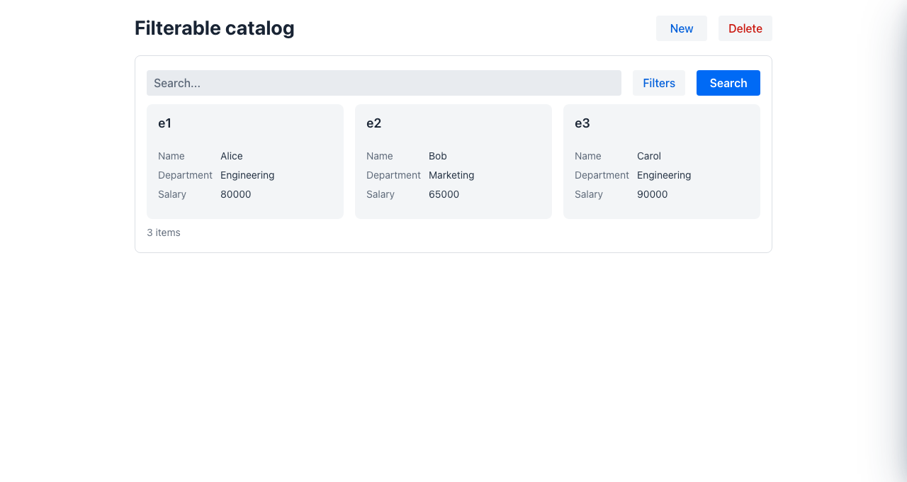
| cards | Image/rich content present, or many columns without a clear primary one | Product catalogues, media galleries |
| masterDetail | Too many or too wide columns to summarise | Complex entities that need side-by-side browsing |
How auto-selection works
Section titled “How auto-selection works”The framework assigns a weight to every column (roughly, how many pixels wide it needs to be), then compares the total column weight to the available container width. 1 unit ≈ 76 px.
Default weights by type
Section titled “Default weights by type”| Column type / stereotype | Weight (units) |
|---|---|
bool, icon | 1.0 |
status, integer | 1.5 |
combobox, select, number, date, money | 2.0 |
link, dateTime, dateRange | 2.5 |
plain String | 3.0 |
image | 4.0 |
html, richText, markdown, textarea | 5.0 |
Decision tree
Section titled “Decision tree”density ratio = totalColumnWeight / (containerWidthPx / 76)
ratio ≤ 1.0 → tableratio > 1.6 OR columns > 10 → masterDetailotherwise: compact columns exist AND their weight ≤ 8 → list has image or html stereotype → cards no compact columns AND 4–8 columns → cards fallback → masterDetailCompact columns are columns marked as the identifier (@Priority(identifier = true)) or with a priority value ≤ 2 (@Priority(1), @Priority(2)). They are the fields shown in the condensed views (list row title, master-detail panel header).
Influencing auto-selection via annotations
Section titled “Influencing auto-selection via annotations”Mark the primary column
Section titled “Mark the primary column”public record ProductRow(
@Priority(value = 1, identifier = true) String name,
String category, BigDecimal price, ProductStatus status) {}identifier = true pins this column as the row title in list and master-detail layouts. Columns with priority ≤ 2 are included in the compact summary line.
Override column weight
Section titled “Override column weight”public record ProductRow(
@Weight(5.0) // treat as very wide — pushes density ratio up String description,
@ColumnWidth("60px") // narrow fixed column — weight derived from px boolean active
) {}@Weight takes precedence over the type-based default. @ColumnWidth also feeds into the weight calculation when @Weight is absent.
Forcing a specific layout
Section titled “Forcing a specific layout”Via the fluent Listing builder
Section titled “Via the fluent Listing builder”return Listing.builder() .gridLayout(GridLayout.cards) // ... .build();Available values: auto (default), table, list, cards, masterDetail.
Via listingType (shorthand for cards)
Section titled “Via listingType (shorthand for cards)”return Listing.builder() .listingType(ListingType.card) // ... .build();listingType(ListingType.card) is equivalent to gridLayout(GridLayout.cards). It exists as a semantic alias for CRUDs whose primary presentation is always cards regardless of screen width.
Fixing the content height (cards and table)
Section titled “Fixing the content height (cards and table)”By default the listing expands to fill the container, which scrolls the whole page. Set contentHeight to constrain the card or table area to a fixed height with its own internal scrollbar:
return Listing.builder() .gridLayout(GridLayout.cards) .contentHeight("400px") .build();Practical guide: which layout will I get?
Section titled “Practical guide: which layout will I get?”| Situation | Expected layout |
|---|---|
| 3 short columns (name, status, date) on desktop | table |
6 columns total, 1 marked identifier, compact weight ≤ 8 | list |
Any column with image or html stereotype | cards |
| More than 10 columns | masterDetail |
| Density ratio > 1.6 after adding many wide columns | masterDetail |
gridLayout(GridLayout.cards) set explicitly | always cards |
- Customizing CRUD and listings — restrict capabilities, hide fields, add toolbar buttons
- Listing row actions — per-row
ColumnActionandColumnActionGroup