

Comparison card
Status: ✅ Implemented
Intent
Section titled “Intent”Put two values next to each other and make the difference between them read at a glance — this month vs last, actual vs target, two plans, a before/after. The delta between them is the headline, colored by whether it went the right way.
Solution
Section titled “Solution”Use the ComparisonCard component: an optional title, a leftLabel/leftValue and rightLabel/rightValue, and a delta with a trend ("up" / "down" / "flat"). The delta renders as a chip between the two sides — green for up, red for down, grey for flat — with an ▲/▼ marker.
@Section("Revenue")Component revenue = ComparisonCard.builder() .title("Revenue") .leftLabel("Last month") .leftValue("€38k") .rightLabel("This month") .rightValue("€48k") .delta("+26%") .trend("up") .build();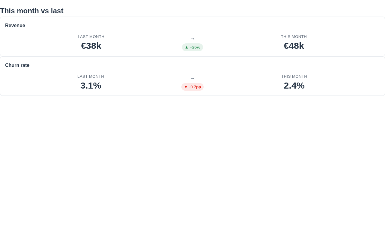
The values are plain strings, so format them however you like (currency, percentages, counts). trend drives the color only — pick the direction that means “good/bad” for your metric (e.g. a falling churn rate is a down trend). The renderer is dependency-free, themes through the standard CSS variables and works in dark mode.
When to use it
Section titled “When to use it”Use a ComparisonCard for exactly two values whose difference is the point. For a single KPI with a trend badge use Stat or MetricCard; for many metrics at once use a Scoreboard or Dashboard; for tiered plans use PricingTable. Demo: /comparison-demo.