High-density screens
Status: ✅ Implemented — @Compact
Intent
Section titled “Intent”Pack the maximum amount of relevant information on a single screen so operational users can work without scrolling or switching context.
Problem
Section titled “Problem”Standard-density forms are designed for casual or occasional users: generous spacing, large controls, generous whitespace. That trade-off reverses for high-frequency operational screens — hotel check-in, call-centre detail views, trading dashboards, warehouse picking stations — where experienced users know the layout and pay the cost of scrolling or multiple tabs in every single action they take.
Solution
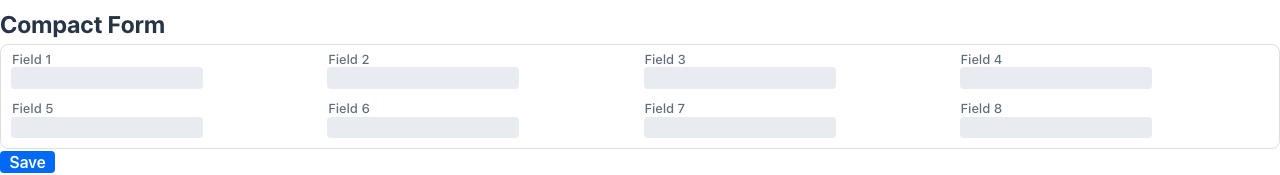
Section titled “Solution”Annotate the page class with @Compact.
@UI("/checkin/:id")@Compact@Style(StyleConstants.FULL_WIDTH_WITH_PADDING)@Zones({ @Zone(name = "left", width = "64%"), @Zone(name = "right", width = "36%")})public class CheckInForm { ... }@Compact injects a Lumo CSS custom-property block onto the page container. Because Vaadin’s design tokens cascade through shadow DOM, every component inside is automatically condensed:
- Form layout inter-row gap reduced from ~
1emto0.2rem - Control heights compressed (
--lumo-size-*reduced by ~25 %) - Spacing tokens reduced proportionally
- Field labels rendered at
xsfont size with tighter line height - Form-layout minimum column width reduced to
7em(allows more columns at the same viewport width) - Grid/table rows rendered with Vaadin’s built-in
compactrow theme
Font size is intentionally left at the normal Lumo value so body text stays legible.
Combining with other patterns
Section titled “Combining with other patterns”@Compact pairs naturally with:
| Technique | Why |
|---|---|
@Zones | Two or three columns side by side maximise the use of horizontal space |
@Style(StyleConstants.FULL_WIDTH_WITH_PADDING) | Extend the form to the full viewport width instead of the default 900px cap |
@Tab | Group secondary information into tabs so the primary data stays visible |
@PlainText on read-only fields | Eliminates input chrome (border, background) for display-only values |
@ReadOnly | Locks the form when the user is inspecting, not editing |
Structure example
Section titled “Structure example”┌────────────────────────────────────────────────────────────┐│ Localizador Hotel Agencia Estancia Régimen Saldo │ ← header strip├──────────────────────────────┬─────────────────────────────┤│ Información general col×8 │ Importes (grid) ││ Waiting TarifaRef Tipo … │ │├──────────────────────────────┤ Información habitación ││ Check-in col×6 │ Nº hab Beds Estado … ││ Nº hab Tipo Upgrade … │ │├──────────────────────────────┤ Historial cliente ││ Huéspedes (grid) │ RiuClass Último hotel … │├──────────────────────────────┤ ││ Información cliente col×8 │ Folios / Anticipos ││ [Info Cardex] [Empresa] … │ Crédito Tarjeta Saldo … │└──────────────────────────────┴─────────────────────────────┘Partial compact
Section titled “Partial compact”If only part of a page needs high density (e.g. a single section with a dense grid inside a normal-density page) apply StyleConstants.COMPACT directly via @Style on that field or element rather than the whole class:
@Style(StyleConstants.COMPACT)List<LineItem> lines;Principles served
Section titled “Principles served”- Minimize navigation — all relevant data visible in one screen, no scrolling or tab-switching
- Workflow over screens — the screen is shaped around the operational task, not the data model
- Keyboard-first — high-density users rely on tab order and keyboard shortcuts;
@Compactdoes not affect focus or tab stops