

Hero search
Status: ✅ Implemented
Intent
Section titled “Intent”Give users whose task starts with a search — find a hotel, a product, a candidate — a focused landing page: a big hero header, a prominent search box with filter facets, and results as cards.
Problem
Section titled “Problem”Dropping users on a dense listing when their task is “search for X” buries the search box in toolbar chrome. Building a custom search landing by hand means rewiring search, facets, pagination and result rendering that Mateu’s listing machinery already provides.
Solution
Section titled “Solution”Extend HeroSearch<Filters, Row> and implement search(SearchRequest, HttpRequest) exactly like any listing (the archetype already declares Searchable and Filterable<Filters> for you). It renders a centered hero (title + subtitle, optional background image) followed by the standard searchable listing, with results as card tiles by default.
@UI("/hotel-search")@Title("Hotel search")public class HotelSearch extends HeroSearch<HotelFilters, Hotel> {
    public record HotelFilters(String zone, Integer minStars) {}    public record Hotel(String name, String zone, int stars, String price) {}
    @Override protected String heroTitle() { return "Find your hotel"; }    @Override protected String heroSubtitle() { return "Search by name or zone…"; }
    @Override    public ListingData<Hotel> search(SearchRequest request, HttpRequest httpRequest) {        // query your use case / repository with        // request.searchText() + filters(request) + request.pageable()        return ListingData.<Hotel>builder().page(/* … */).build();    }}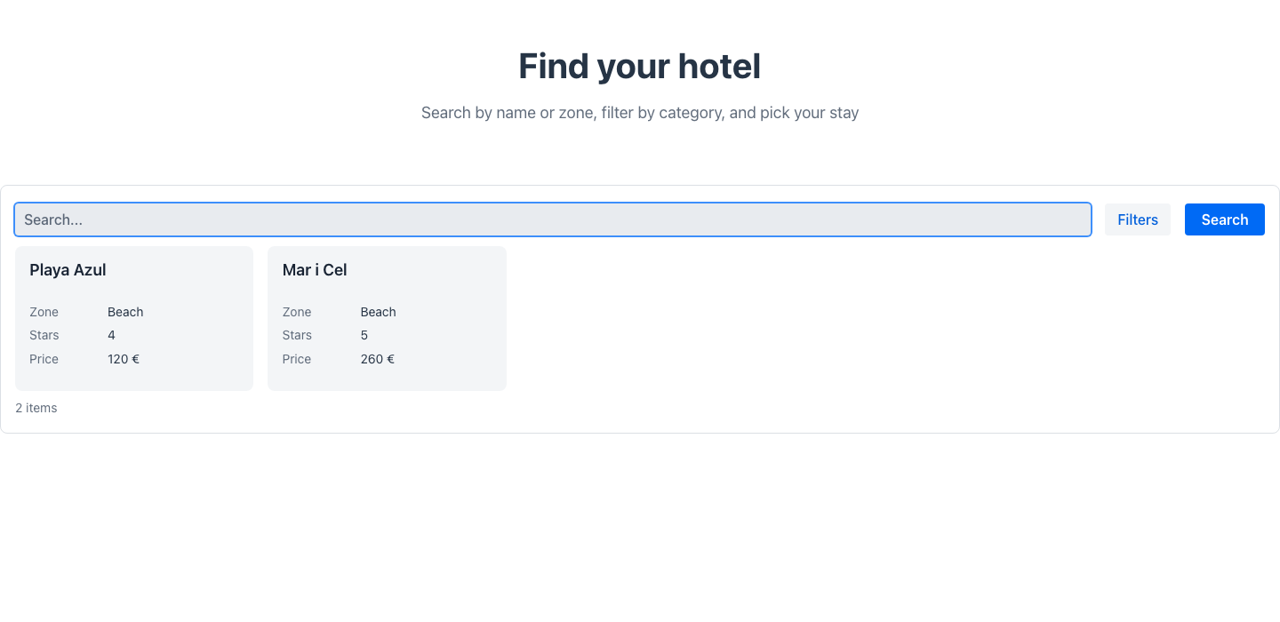
- The
Filtersrecord fields become the facets of the search box (the standard smart search bar: they live in its Filter by panel and show as removable chips when applied). - Results render as cards by default — override
gridLayout()to returnGridLayout.tableor any other layout. - The listing starts empty (distraction-free) and searches on enter. Add
@Trigger(type = TriggerType.OnLoad, actionId = "search")on the class to preload results. - Override
heroImage()to set a background image for the hero (a dark overlay keeps the text readable).
Fluent variant
Section titled “Fluent variant”HeroSection is a regular component: compose it with a fluent Listing (or anything else) from ComponentTreeSupplier:
HeroSection.builder() .title("Find your hotel").subtitle("…") .image("/images/hero.jpg").centered(true) .build()Redwood parameter and slot reference
Section titled “Redwood parameter and slot reference”What the Redwood hero-search-page template exposes, and what Mateu gives you for it. The canonical
page-header elements shared by every template are documented once in
Page templates.
Legend: ✅ supported · 🟡 partial · — not supported · ⚪ deliberately out of scope
| Redwood prop / slot | Mateu | |
|---|---|---|
pageTitle | heroTitle() | ✅ |
description | heroSubtitle() | ✅ |
| Hero background | heroImage() (dark overlay keeps the text readable) — a Mateu addition, the Redwood hero has no image prop | ✅ |
collectionView: on | off | the listing always renders; it just starts empty until the user searches | 🟡 |
selection | row clicks dispatch the listing’s own actions | 🟡 |
avatar | PageDto.avatar/icon on the canonical header | ✅ |
suggestions[] (suggestion chips under the search box) + spSuggestionAction | — | — |
descriptionHotspot {label, data} + spDescriptionHotspotAction (clickable text inside the description) | — the subtitle is plain text | — |
| Slot default (results) | the listing; cards by default, gridLayout() to change it | ✅ |
Slot searchTemplate | the standard smart search bar, with the Filters fields as facets | ✅ |
Slot detailTemplate | — pair it with collection detail when you need an in-place detail pane | — |
Slot announcement (aria-live) | live regions are installed client-side for a11y, but the backend cannot declare announcement content | 🟡 |
When to use it
Section titled “When to use it”Use hero search when searching is the task and the page is an entry point (public catalogs, pickers, knowledge bases). Prefer a plain AutoCrud/Listing when the user works the collection (bulk edits, exports, dense scanning).