

Trend chart
Status: ✅ Implemented
Intent
Section titled “Intent”Show a single metric’s shape over time — revenue, signups, latency — as a clean line or area chart, without pulling in a full charting library.
TrendChart is the middle ground between the Stat sparkline (tiny, inline) and the full Chart component (Chart.js, multi-series, interactive): a dependency-free, single-series line/area chart.
Solution
Section titled “Solution”Use the TrendChart component: a list of values, optional x-axis labels, a color and an area flag. The renderer draws an SVG line (area-filled when area is true), marks the min and max points and shows per-point tooltips.
@Section("Monthly revenue (k€)")Component trend = TrendChart.builder() .title("Revenue 2026") .values(List.of(32.0, 35.0, 33.0, 41.0, 44.0, 48.0, 52.0, 49.0, 58.0, 63.0, 61.0, 72.0)) .labels(List.of("Jan","Feb","Mar","Apr","May","Jun","Jul","Aug","Sep","Oct","Nov","Dec")) .color("#1a73e8") .area(true) .build();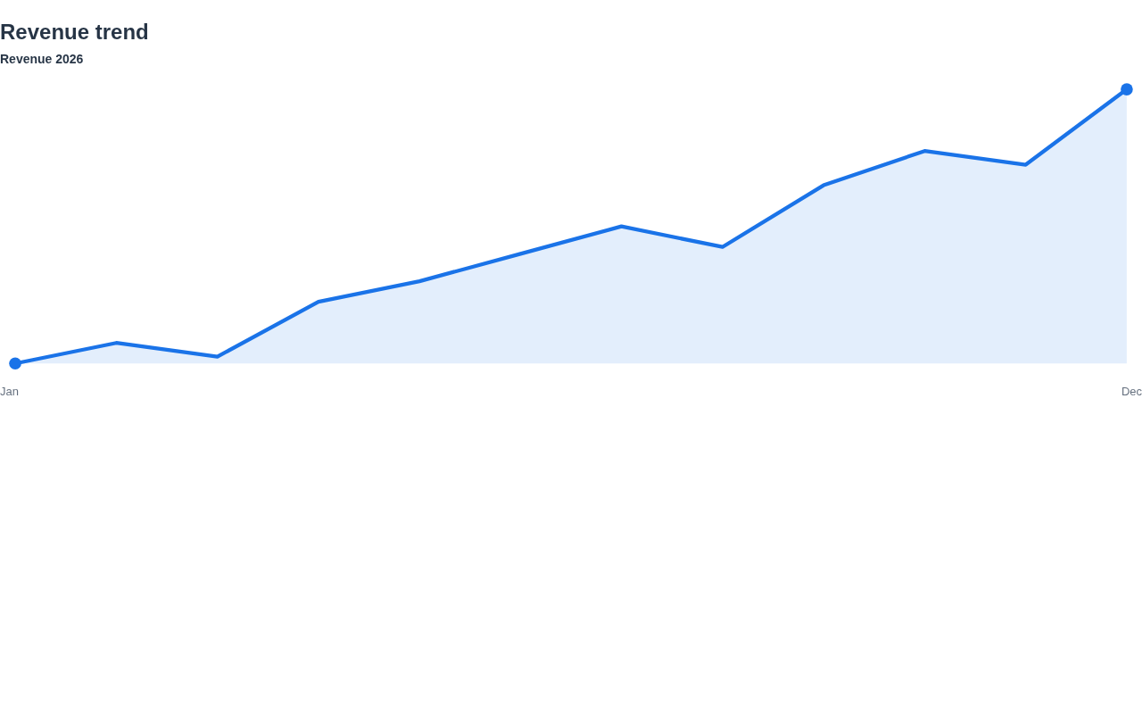
The renderer is dependency-free (inline SVG), themes through the standard CSS variables and works in dark mode. On mobile (React Native) and the IntelliJ plugin the series renders as a compact bar/line chart.
When to use it
Section titled “When to use it”Use a TrendChart for one series over time. For a tiny inline trend use a Stat sparkline; for multiple series, axes and interactivity use the Chart component. Demo: /trend-demo.